The facts now
Lead UX Designer
The Facts Now is a website that helps prevent young potential smokers aged 12-24 from becoming smokers by educating them about the harmful effects of tobacco.
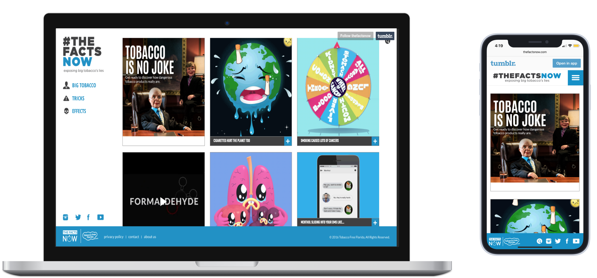
Current design
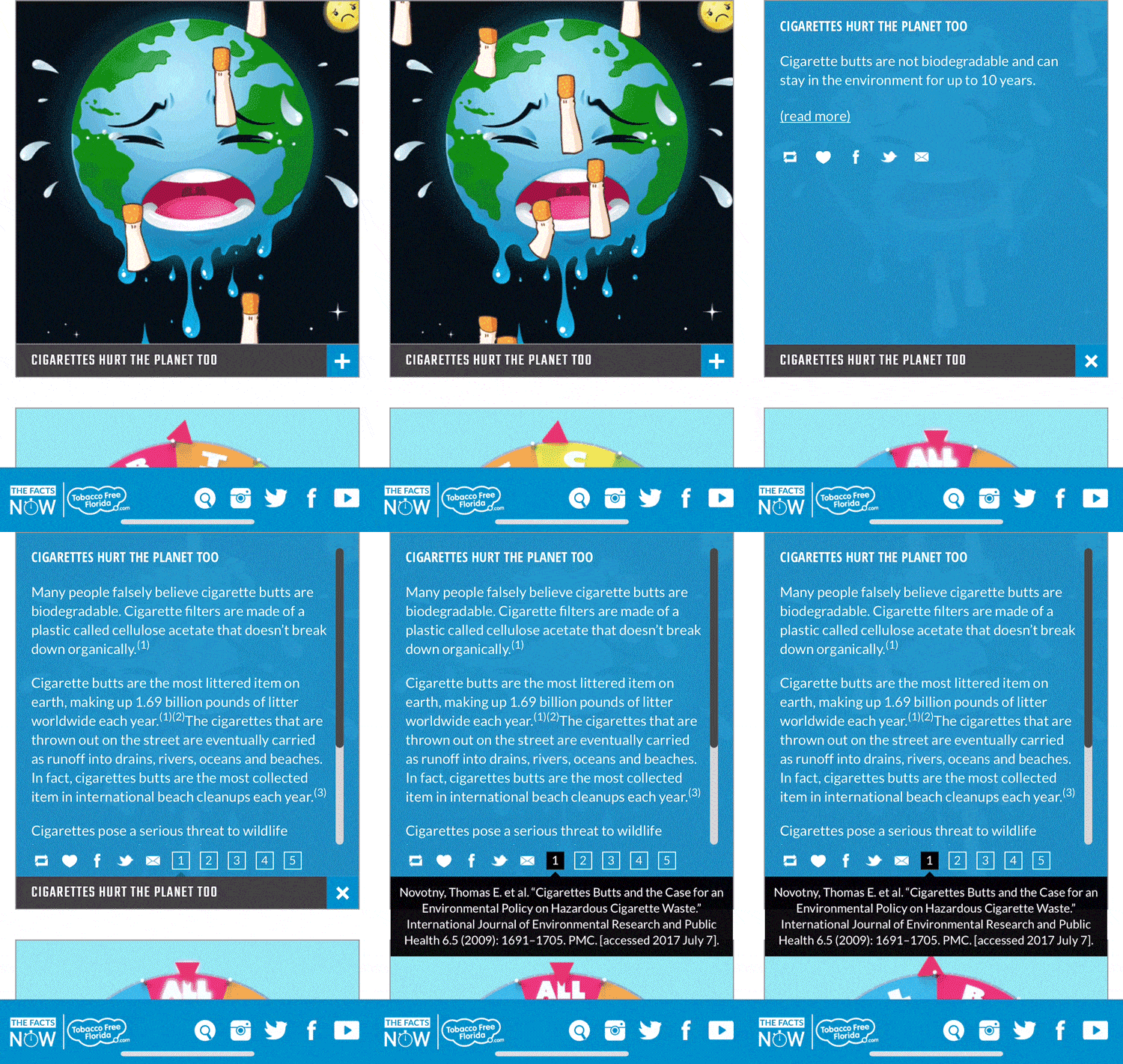
Fact Information
The problem
I noticed that the design of the website could be improved by asking the questions:
Why was the website built on Tumblr? As a millennial who is constantly learning about Gen Z, I found Tumblr to be an interesting choice. I don't personally know anyone who uses Tumblr anymore and, from my research about Gen Z, found that others in this group don't use it either. So I wanted to learn why they made this choice and identify the applications they are using so we can better relate to our consumer.
What does "+" mean? In most instances, the "+" means to add. On the website, the designers meant for it to communicate "open and read more information." This wasn't clear to me. It was not clear to others I asked.
How effective are the gif's and videos? The way the gif's and videos are laid out are on desktop prompted me to think that this could be hard to consume all at once.
Why do the users need to "work" for the information? If the website's goal is to provide easy-to-access facts about tobacco and what tobacco companies do, why should a user have to take an extra step and click the "+" sign to learn more facts about a specific gif or video.
Is the amount of copy per fact effective? There are 3 paragraphs crammed into each module. With the attention span of users and the size of cellphones, I wanted to see if the copy was hard to consume.
When sharing facts, the website gives options such as social media and email. Why is a favorites button (heart) shown in the social media section? Why were these social media options chosen for this demographic?
How does our target consume data? This information will help us design data that this demographic will be able to consume.
Where are they learning their data from? This helps us develop the look and feel of the site, and build a strategy that reflects their behavior, so we can bring them to our website.
It is clear how to search the website? The location of the search icon is not clear as you scroll, the search icon disappears, and on the mobile website, it doesn't function well.
Is it clear who Tobacco Free Florida is? On the website, 3 cumbersome paragraphs describe the organization. On mobile, the description doesn't show at all.
These questions prompted a request for a Usability Testing plan - which was approved.
Usability testing
We had 2 weeks to conduct usability testing for:
40 users between the ages of 12-24
70% Mobile 30% Desktop.
Located in Central Florida
Test Layout - questions that can be quantified:
General Questions - Scripted Questions
Undirected Flow Test - User will be given questions, instructions and actions to follow
Open Feedback - User shared all overall comments and suggestions
Goal:
To capture feedback and direction from our users by testing the current website. This usability test serves as a benchmark that will enable us to direct our efforts to improve the website.
What we want to learn:
How does our target currently get their information?
Which apps/websites do they use the most?
What content do they share, and how?
Website optimization explorations:
How to keep users from feeling overwhelmed by the modules
Which modules work for users (with and without volume)
What prompts users to click on a module to learn more?
Look and Feel:
Text and font
Module sizes
Amount of modules per page
Information location
Icons and their implied function
The search option - what would this demographic search for and what's the best way to find it?
How should we test?
Interview target members
Usability testing
A/B testing
Key learnings
Users had a difficult time navigating the website
Users were confused about who created this website and how to find information about them
Younger users found it hard to forward facts to friends
Search was not easy to locate or easy to use
"I had a tough time searching, like when I clicked here (pointing to the top search bar) I would automatically hit done and I thought it would go, cause that's what it does on other websites. Or you hit the magnifying glass. I didn't know you hit return to do it. It was kinda difficult."
Audience Insights:
Ages 12-17 are dominating mobile vs. desktop
Google is the go-to for information
Most users prefer to share websites they find via text message
Our total market primarily uses Instagram, Snapchat, and Facebook
"Younger kids don't have Facebook anymore. I don't have a twitter or a Tumblr. If you had Instagram, which I see Tobacco Free Florida has Instagram. But share it, it would be cool if you had an iMessage or a message to send."
Website Content insights:
Not clear who created the website or how they can find information about the organization, especially for mobile users
Amount of information provided on the "modules" is what the users are expecting
Users are not clicking into the different navigation tabs
The younger the user is, the less likely they are to explore and learn additional information via the "+" sign
"What's this add button?"
Look and feel insights:
Users found the website look and feel made it difficult to navigate
Illustrated modules performed well
Current design is a lot of scrolling and hard to focus
Change structure of the headlines and "+" sign
"It's somewhat organized but it's just like a feed of memes, I just think it could be organized better."
"It's very annoying to scroll back to the top"
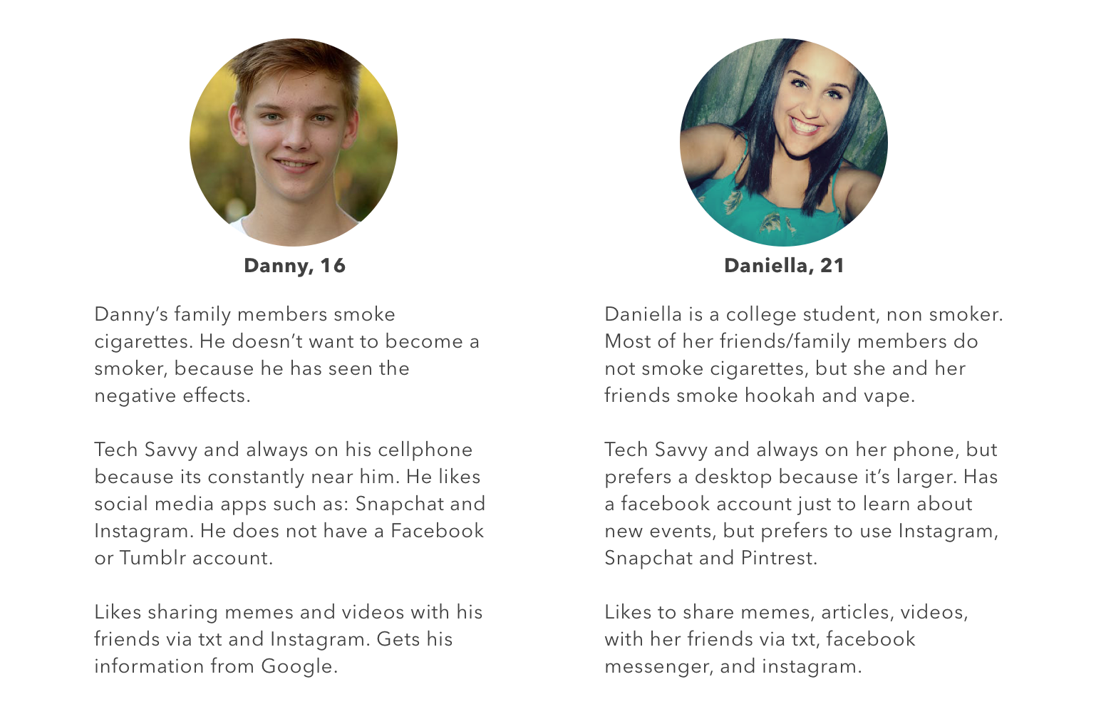
Personas
Recommendation
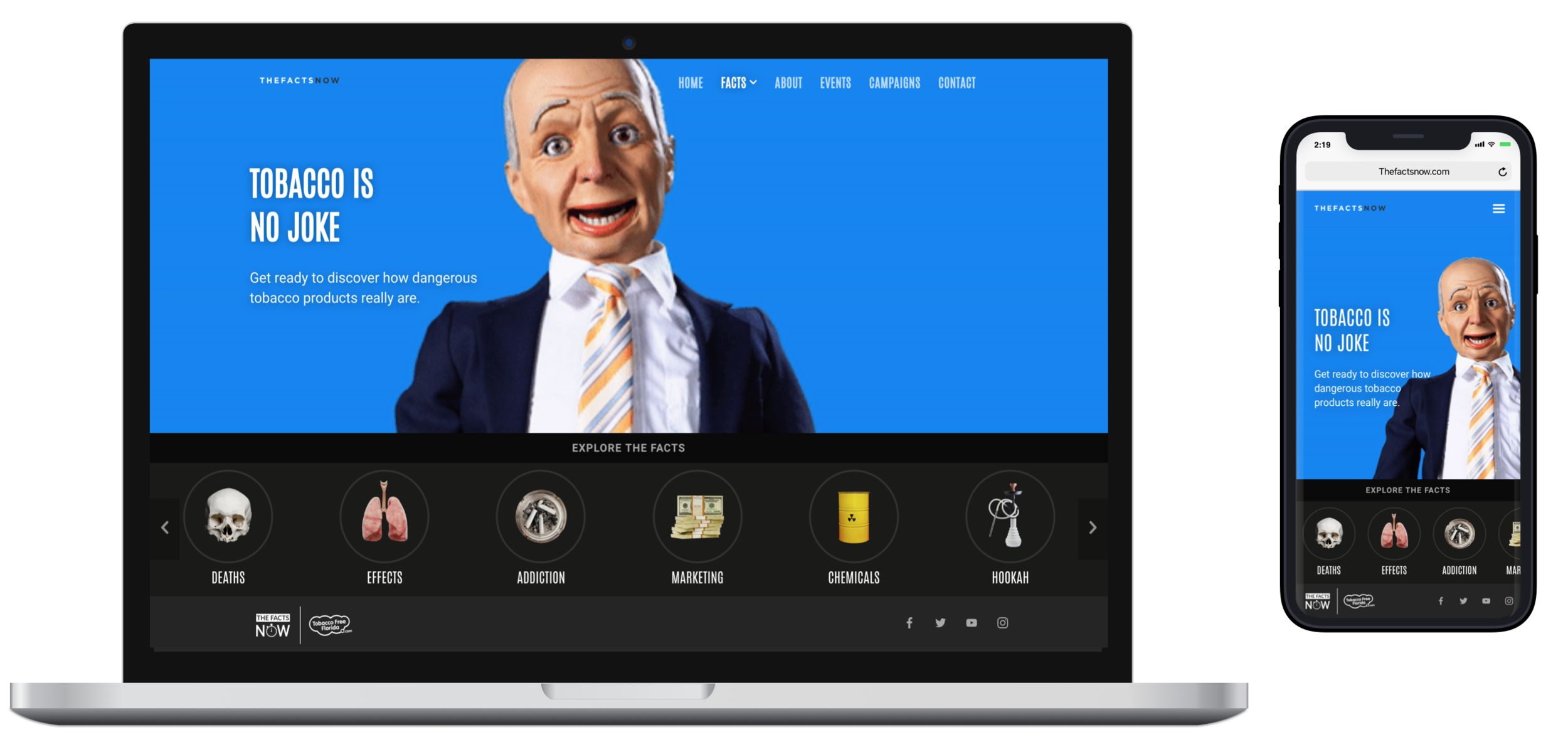
Total website redesign off of the Tumblr platform that will deliver the Prevention Information, in a manner that satisfies the different consumer needs across all platforms.
After sharing our findings and recommendation with the client, a redesign off the Tumblr platform was approved.
Ideation
Brainstorm Session:
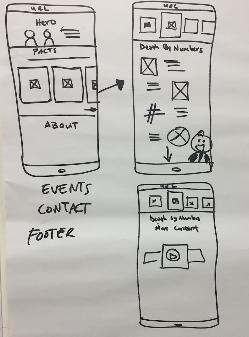
The Creative Directors and the User Experience Team brainstormed and collaborated on different ideas that would fit our target. We designed mobile first.
Low Fidelity - UX design
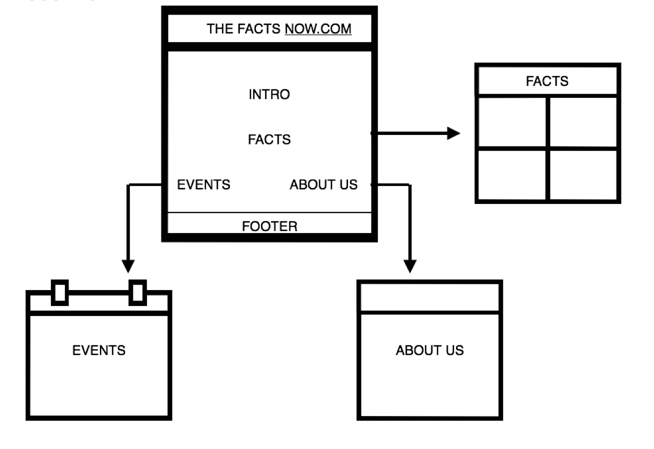
Sitemap
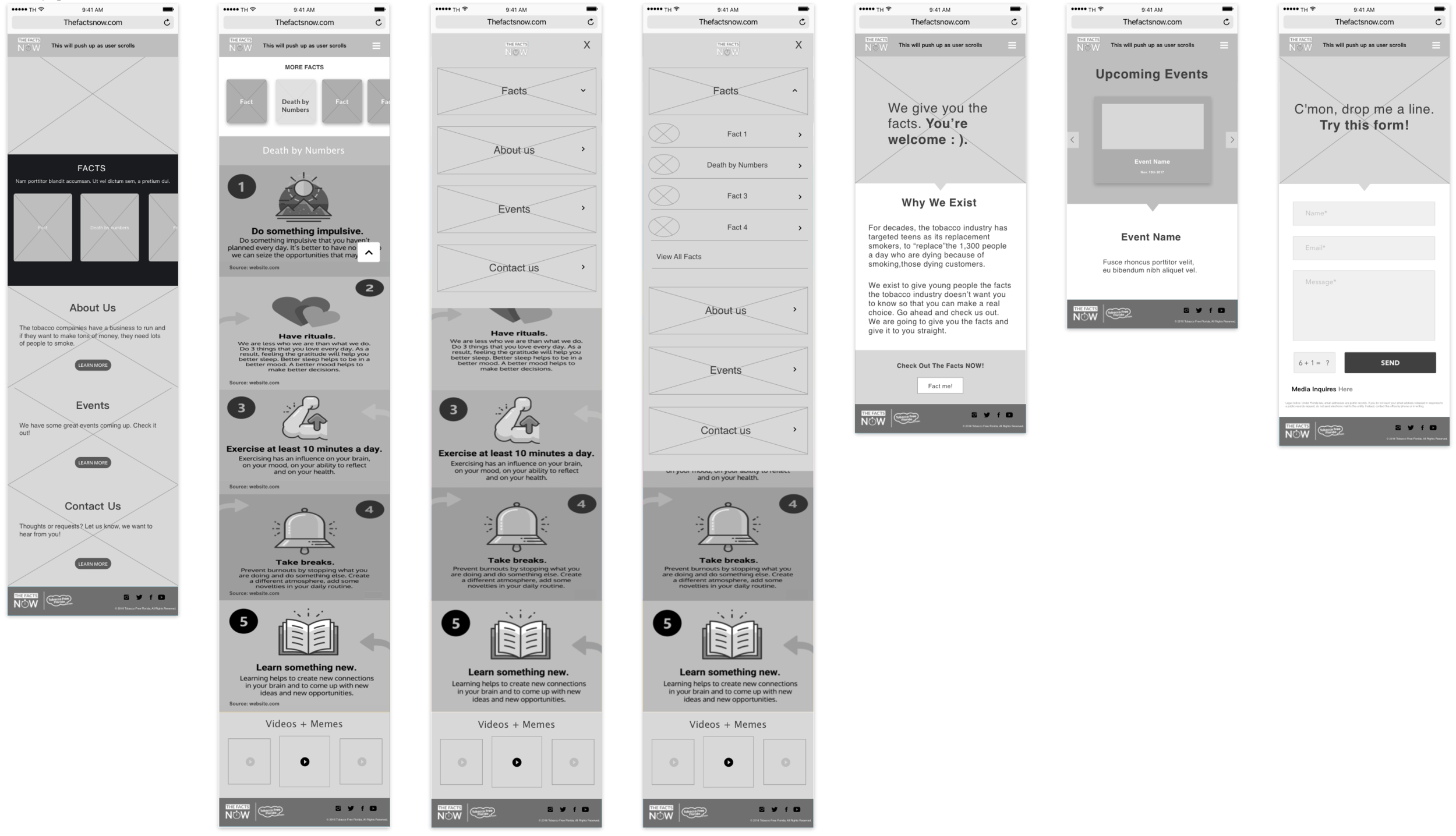
Wireframe
UI and Development:
We brought on a webdesigner/developer to assist us during the design process. I managed the rest of this project and collaborated during the UI design process and development to ensure UX strategies were being implemented.
Due to the quick turnaround, we decided to repurpose existing assets, such as gifs and videos, on The Facts Page. During the design process, we eliminated clutter to make the facts more prominent on the homepage.
Lastly, I made sure that the website followed ADA Compliance standards. This is what we came up with!
Checkout the live website: The Facts Now

