Royal Caribbean - FPMS War On Waste (WOW) Case Study
Lead Product Design
I was tasked with evaluating, updating and creating UX and UI for a website to help prevent food waste on cruise ships.
Background and challenge
A proof of concept website was created assist chefs on board to see how much food waste was happening. Due to it’s limitations regarding future needs such as the ability to create menus, track food needs and create a forecast for future menus, a new website needed to be created to assist with reporting and tracking.
The development of this new website began before a designer was hired, requiring research and rework when I was added to the team.
Research
Gaining a comprehensive understanding of how the kitchen and food distribution system operates was important. We achieved this by engaging with chefs and individuals who had direct experience in the ship’s kitchen.
Learnings
The website requires 2 states: Ship and Shore. Each experience is different.
The website required lots of time and steps to accomplish tasks
Not the easiest to read
Lots of horizontal scrolling with hidden items (i.e. pencil to edit at the end of a scroll)
The absence of a hover state also added an extra layer of complexity to the user experience
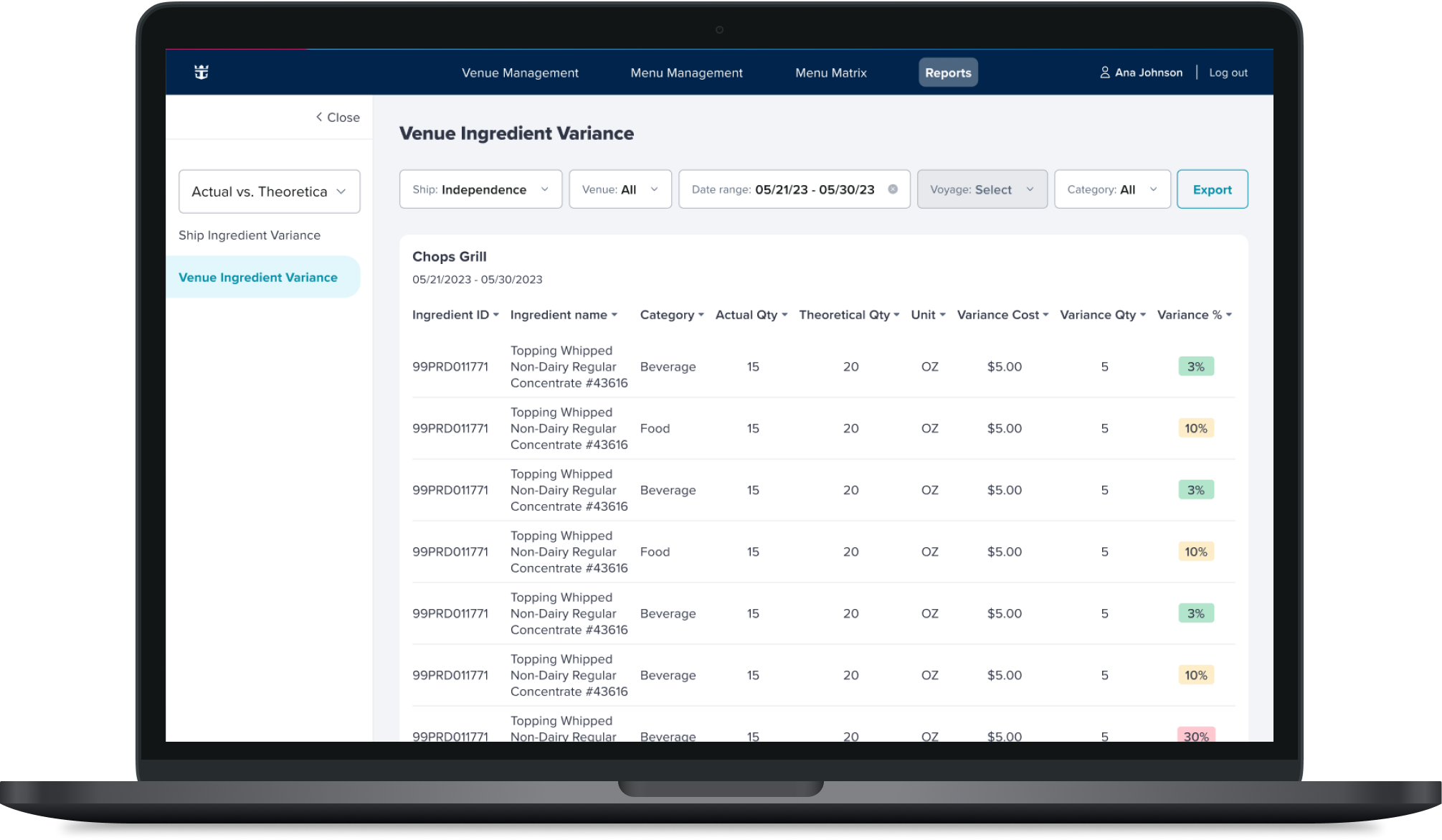
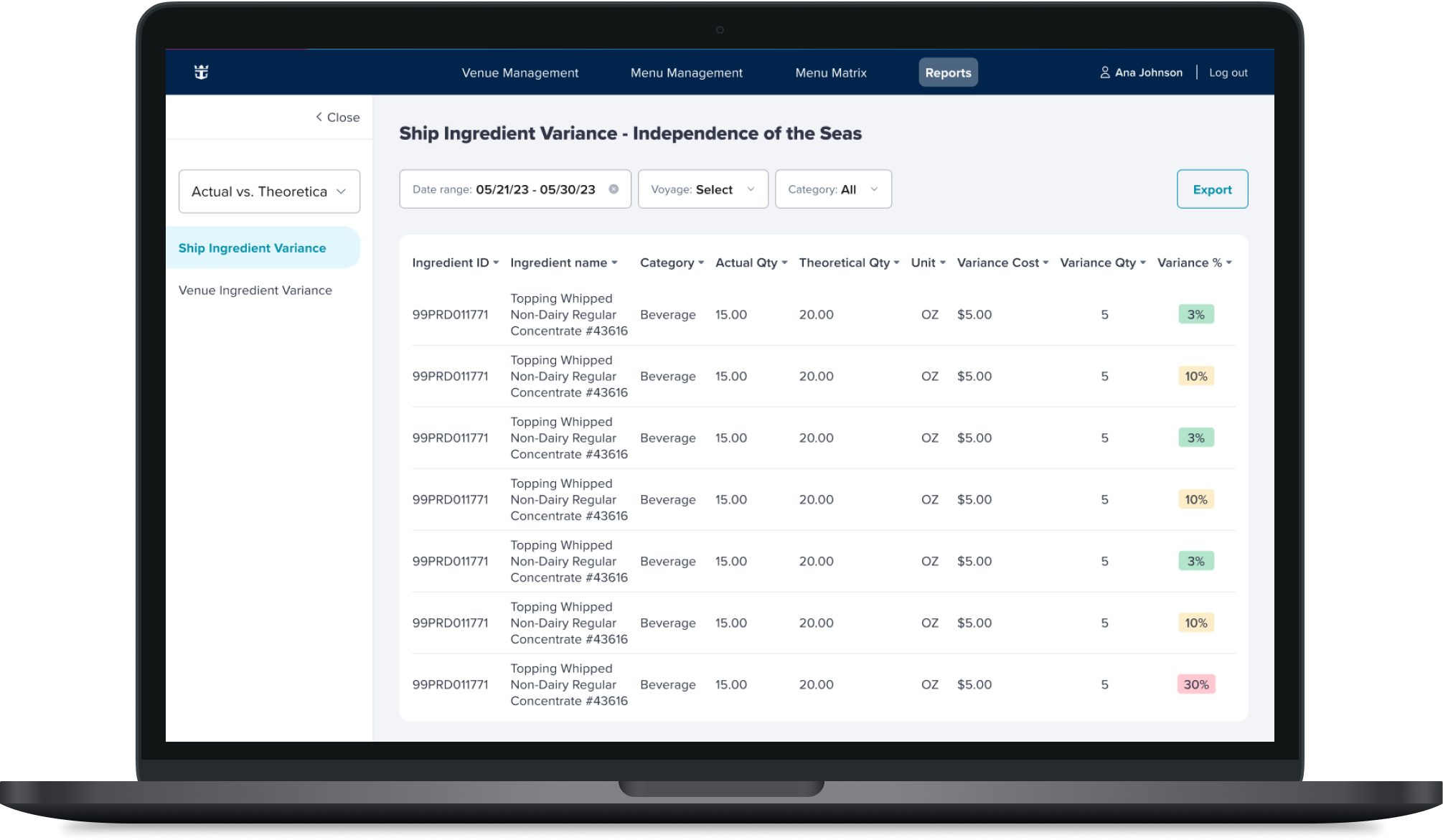
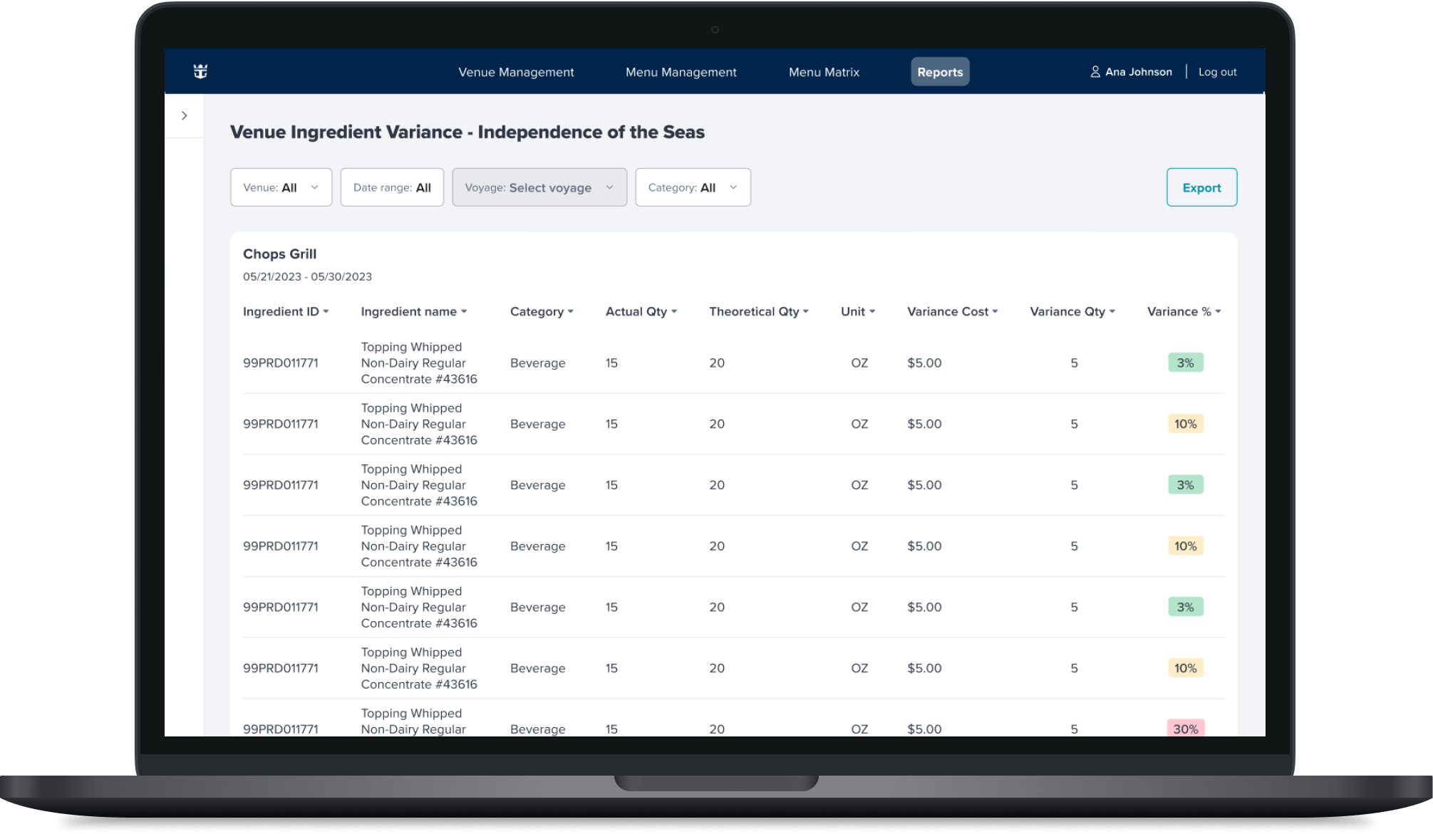
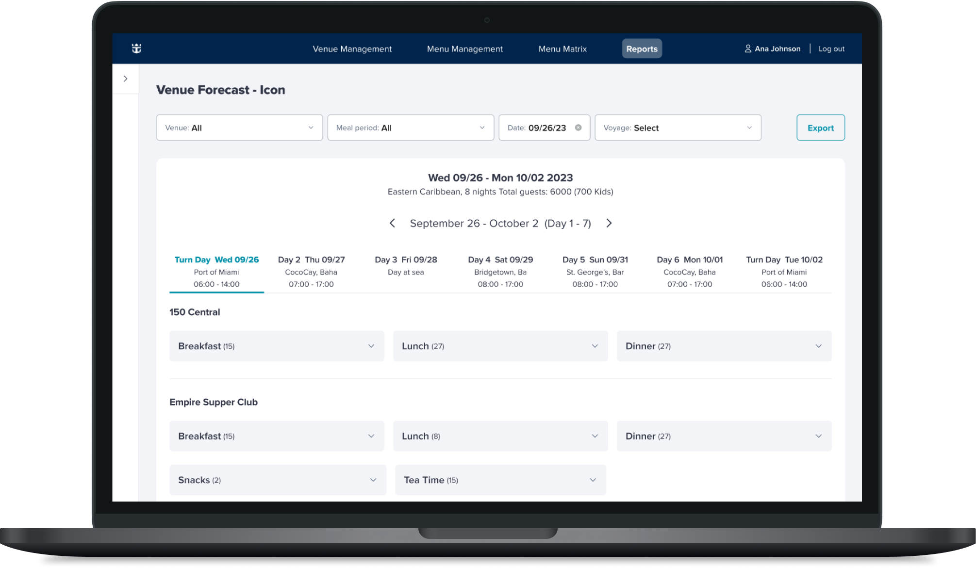
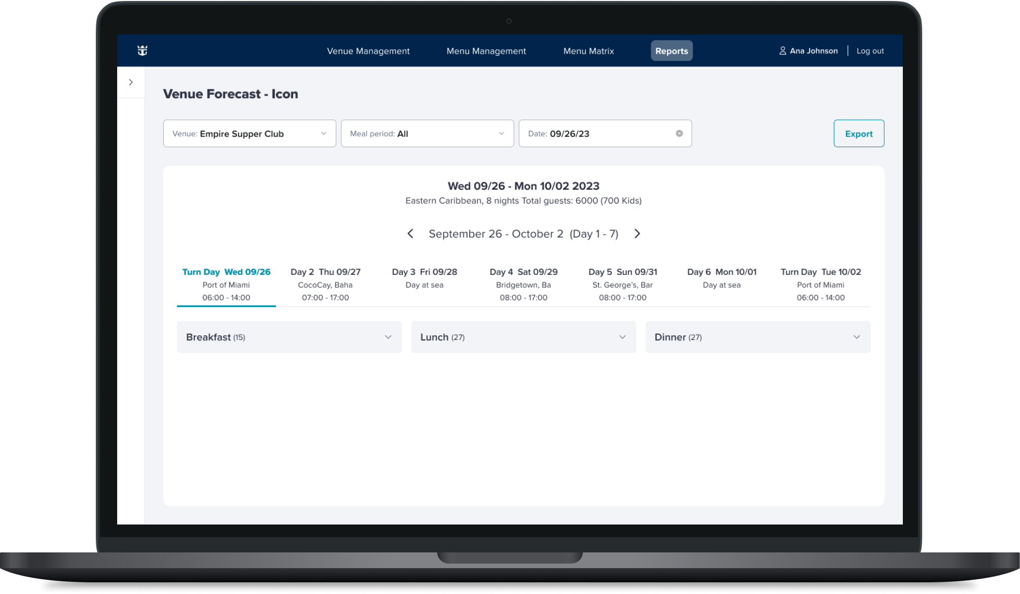
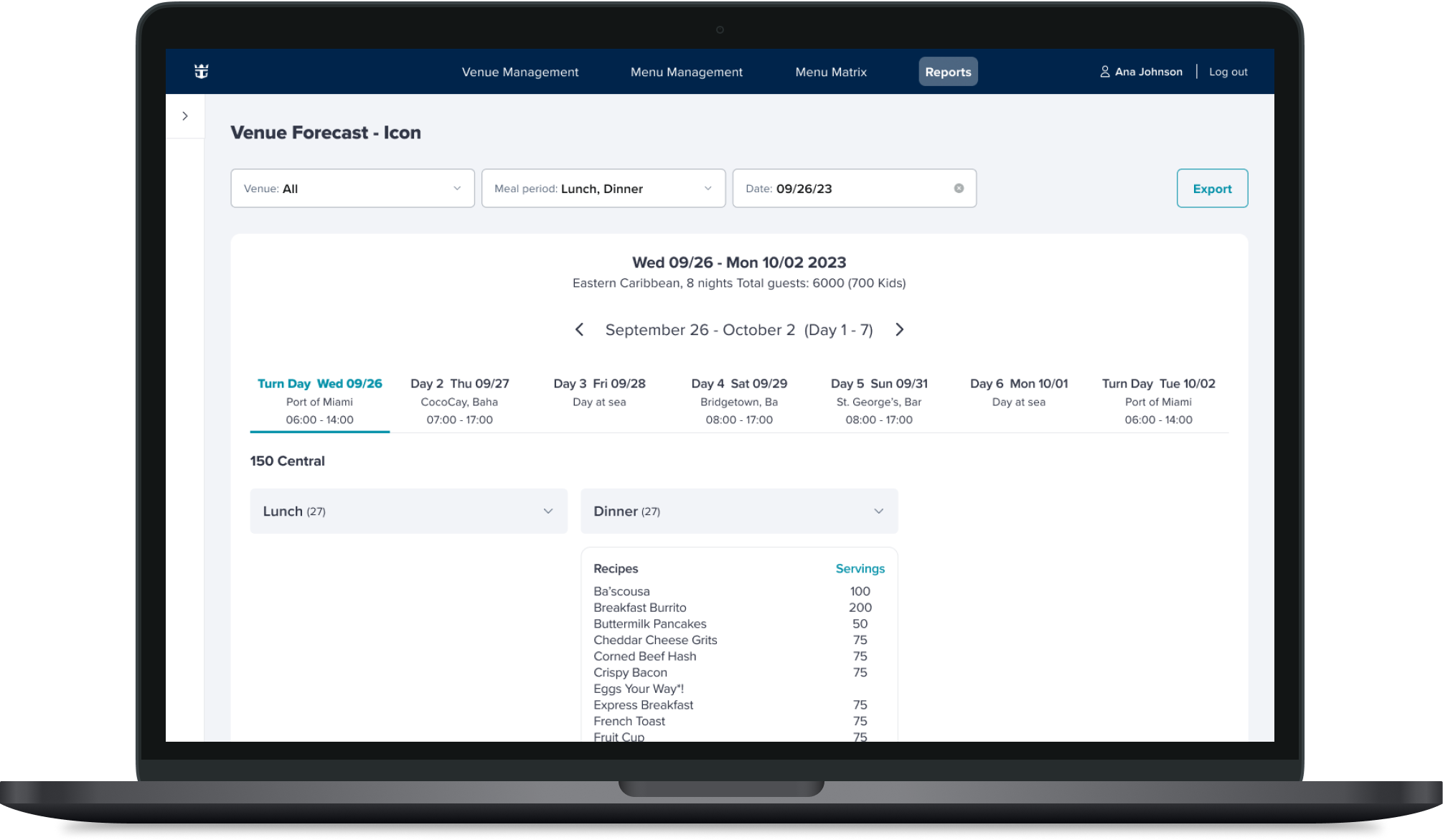
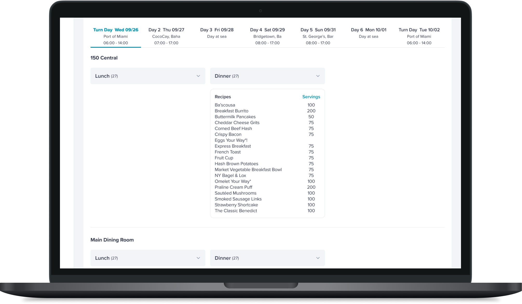
Need for a reports and forecast section
Current Design
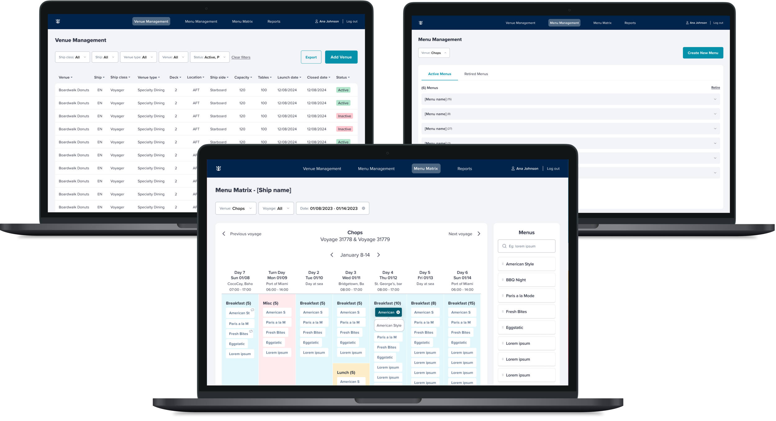
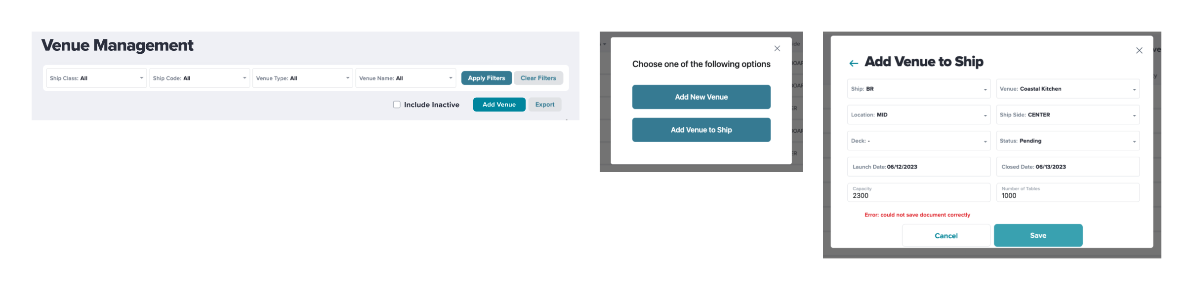
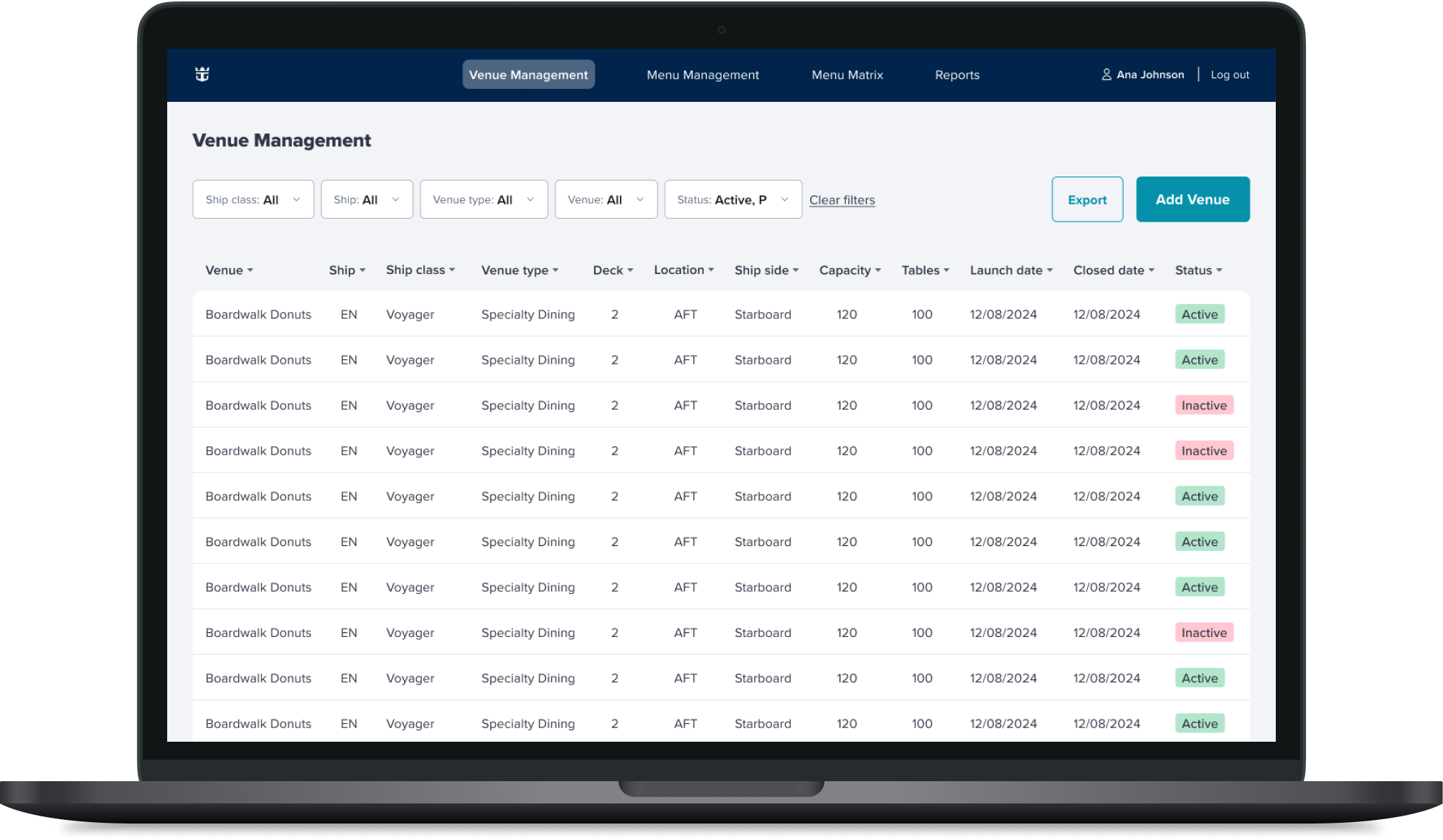
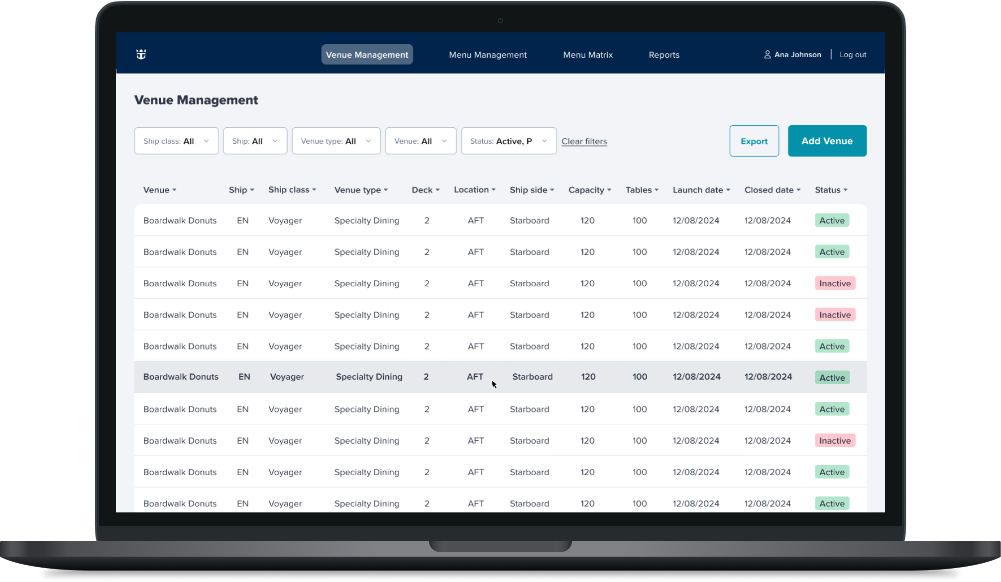
Venue Management
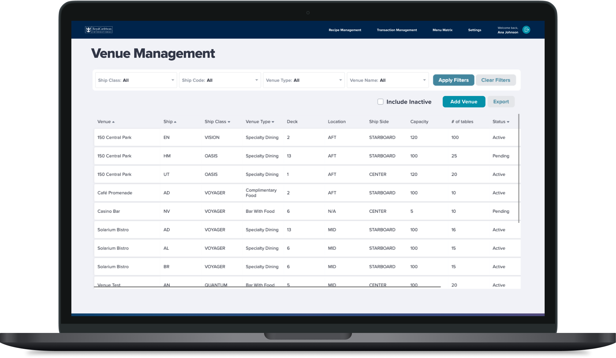
Venue Management Homepage
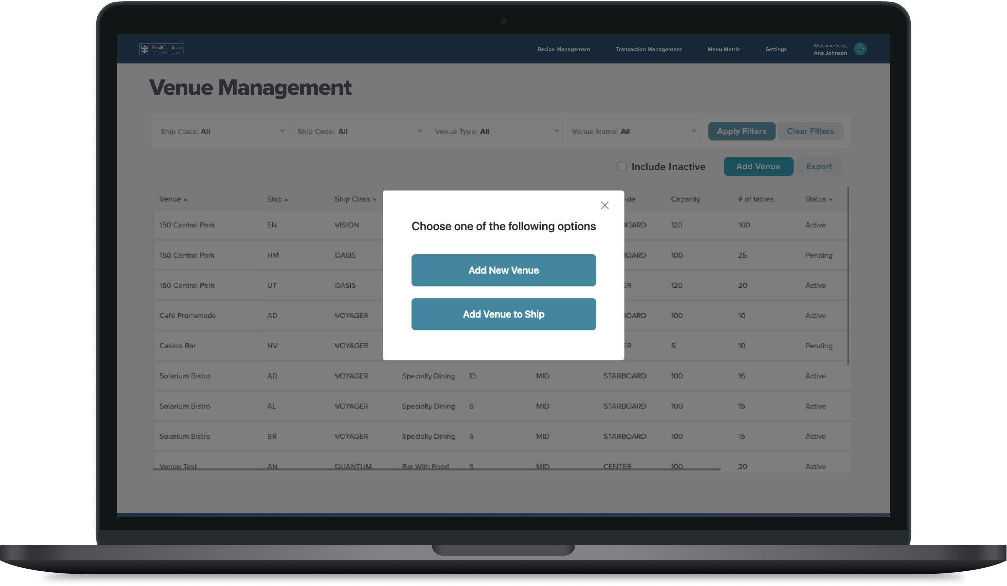
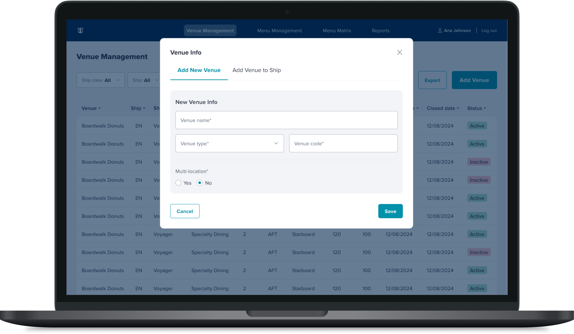
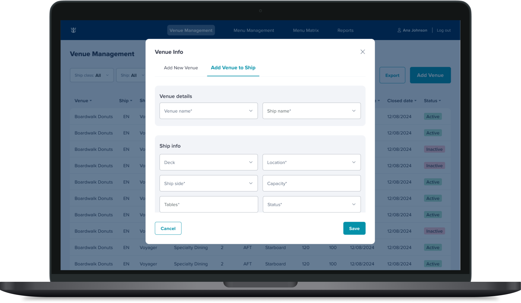
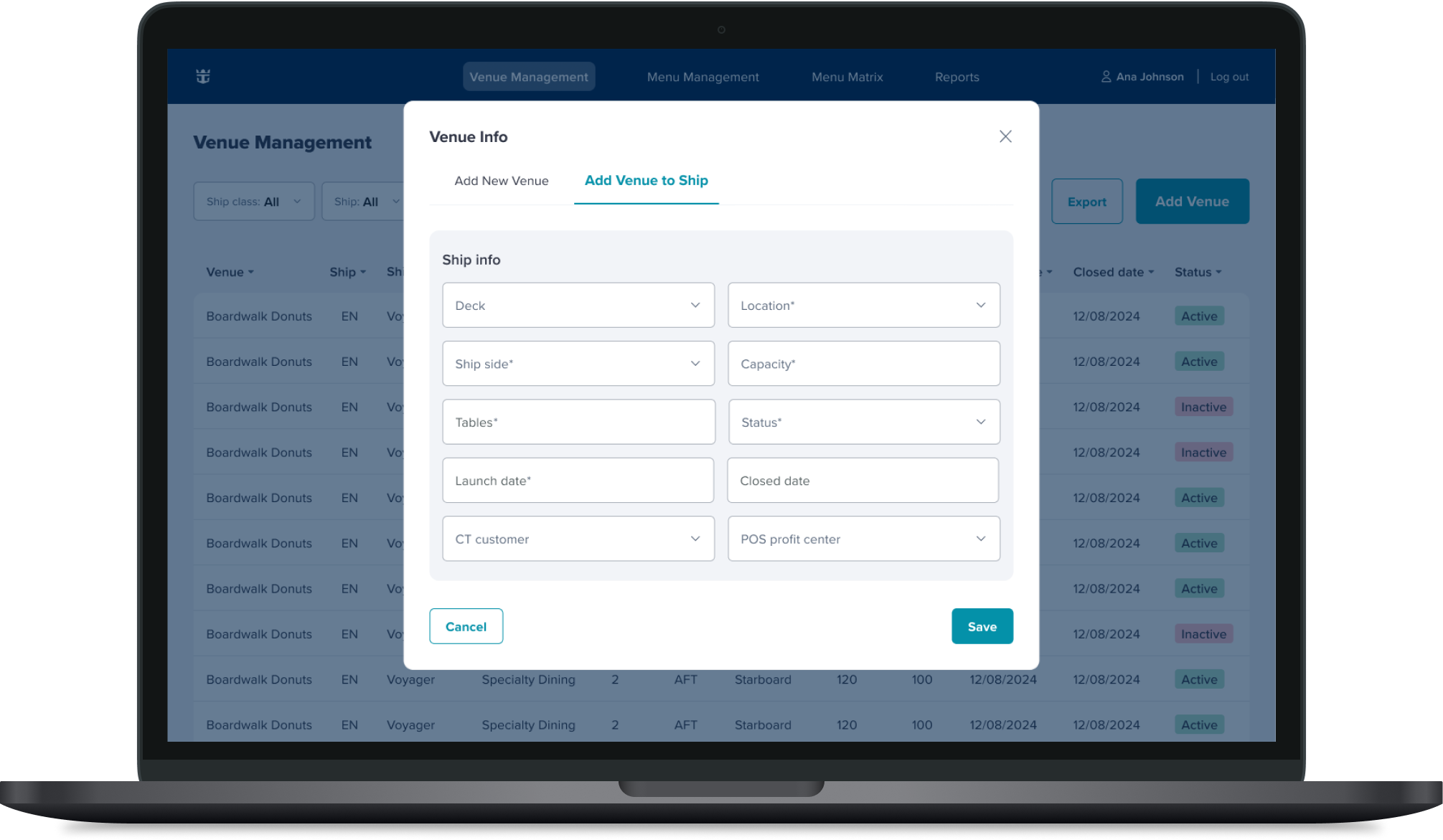
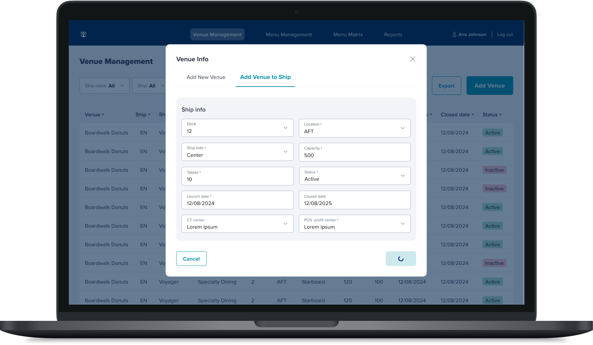
In order to add a venue, you must select “Add Venue” CTA which leads to this modal
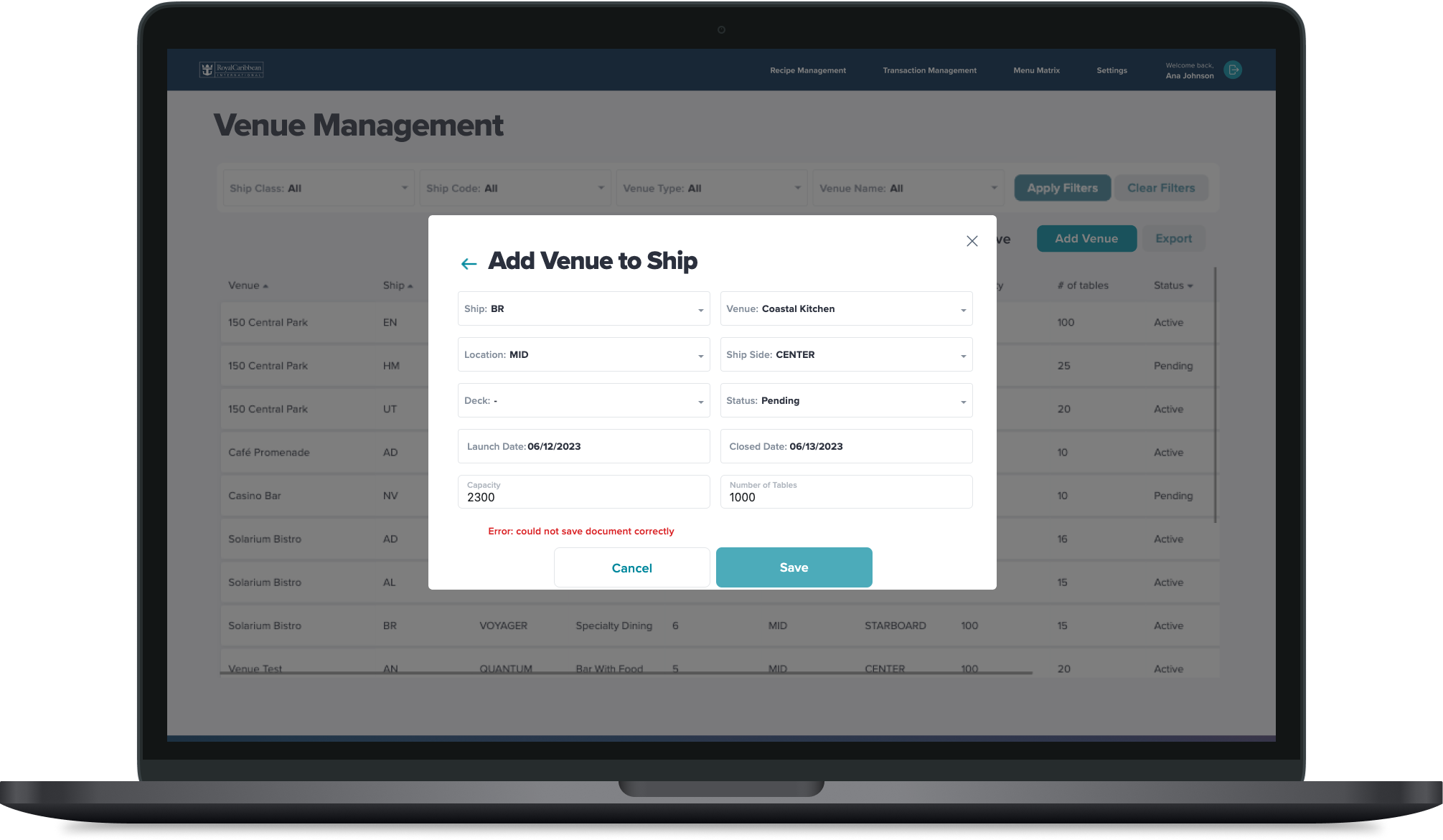
What the second modal looked like
There are extra steps and inconsistent UX structure. Input fields, some info goes right/left and other put the info below.
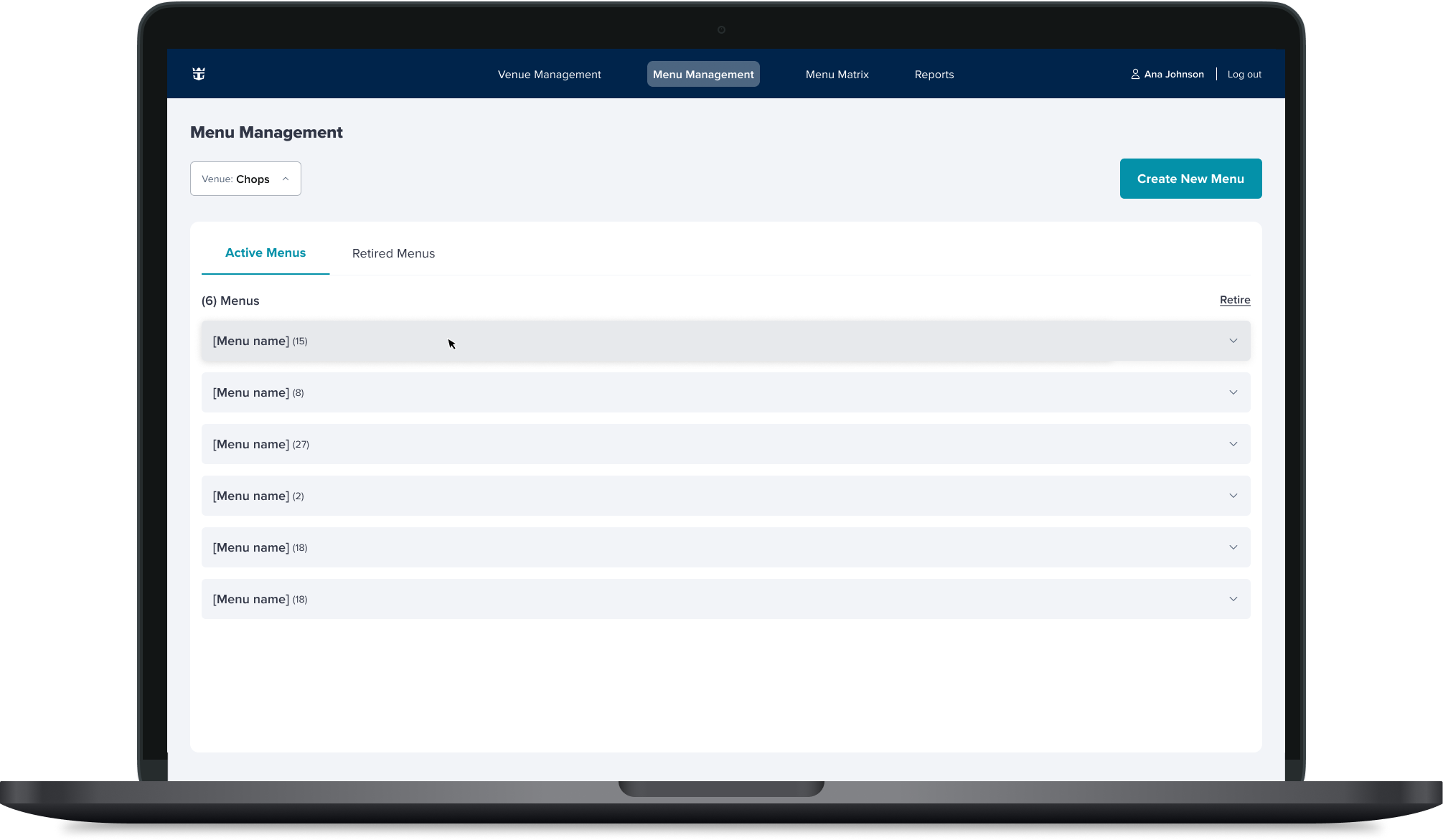
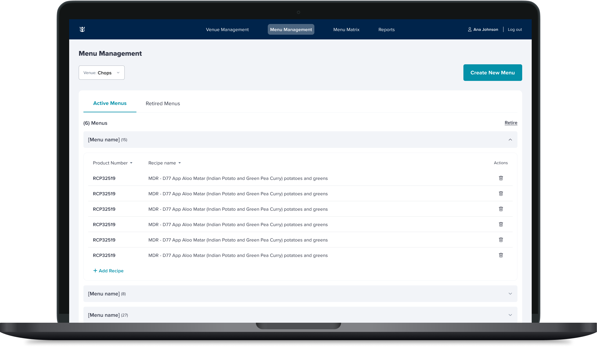
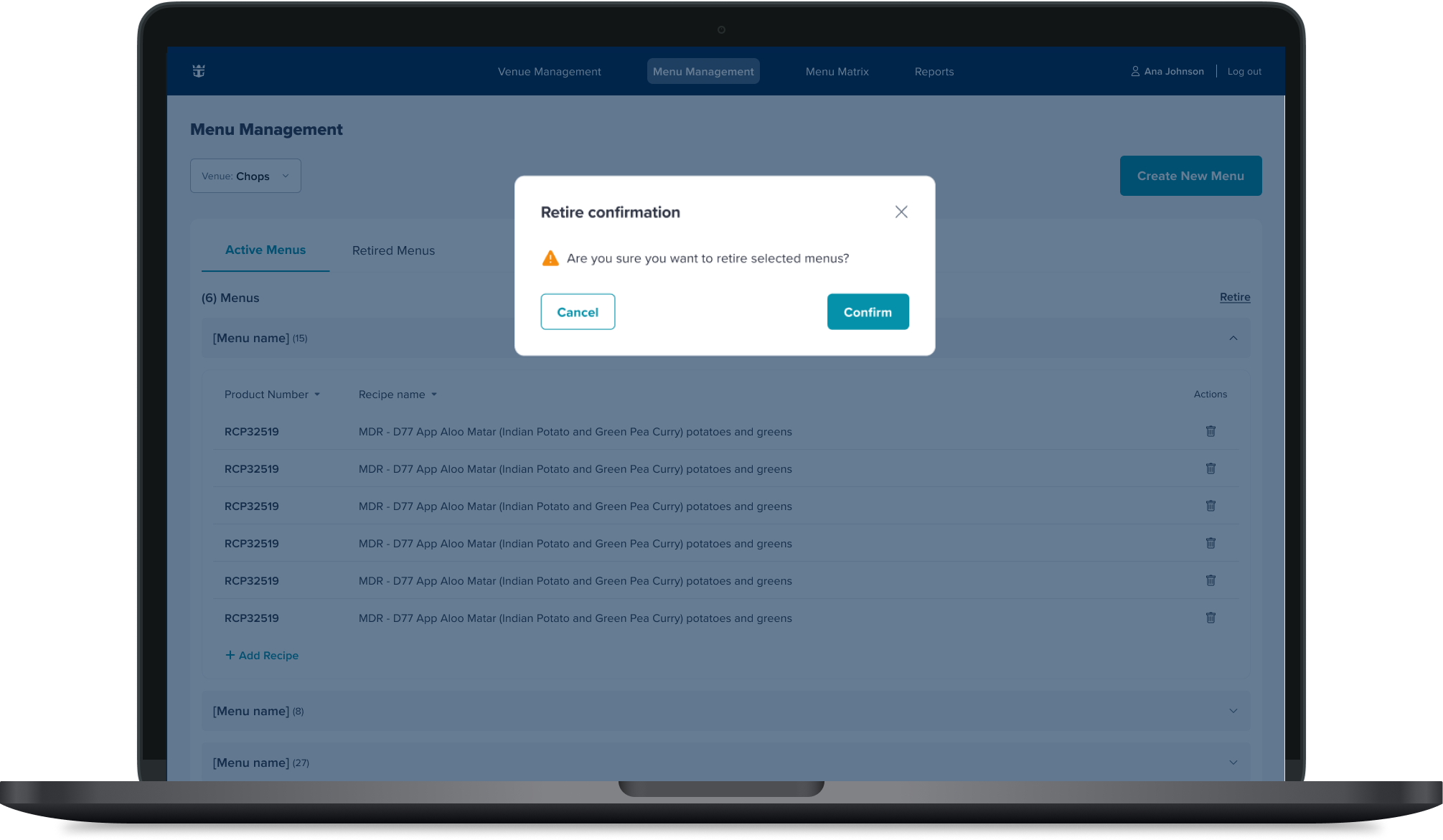
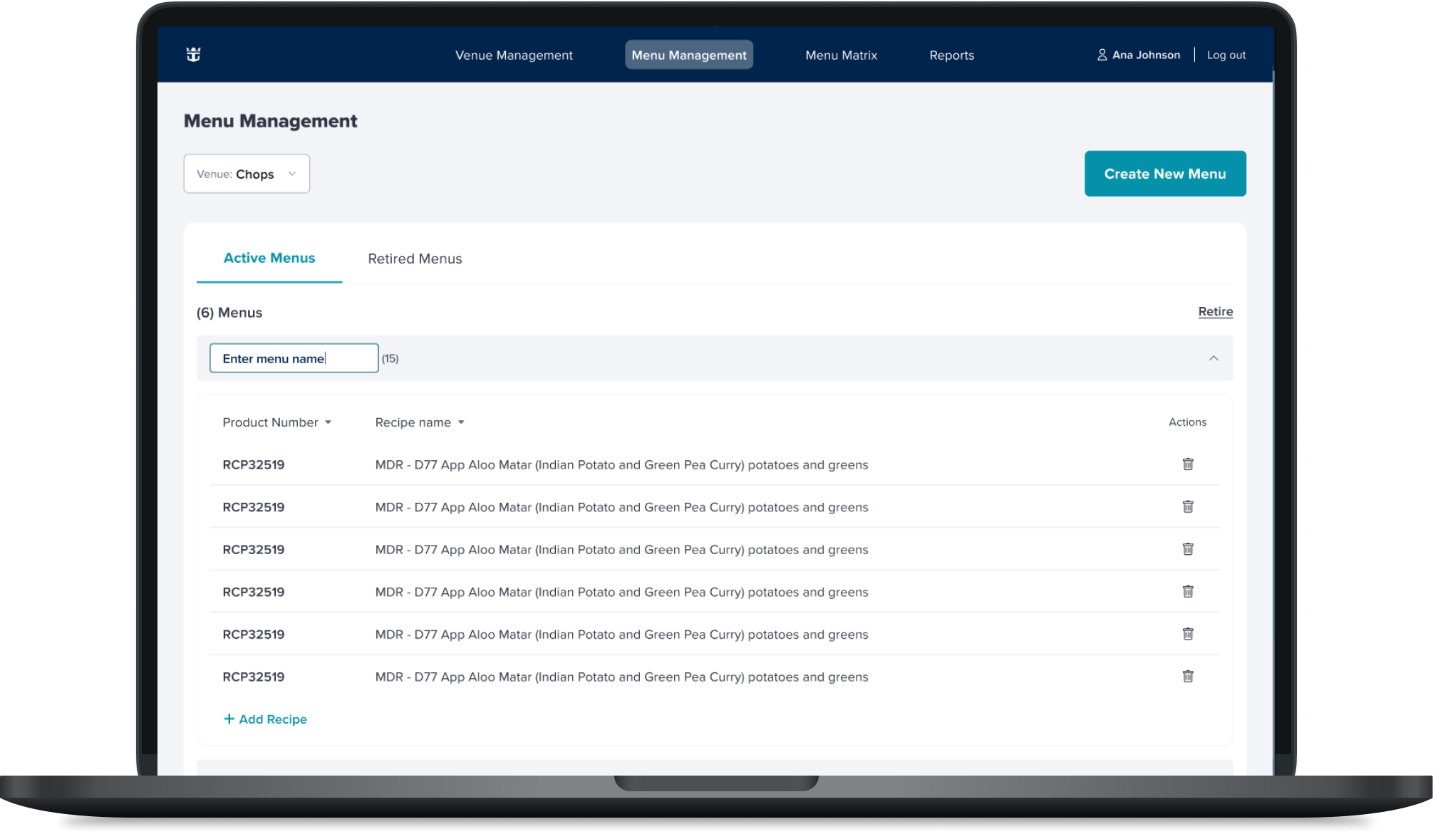
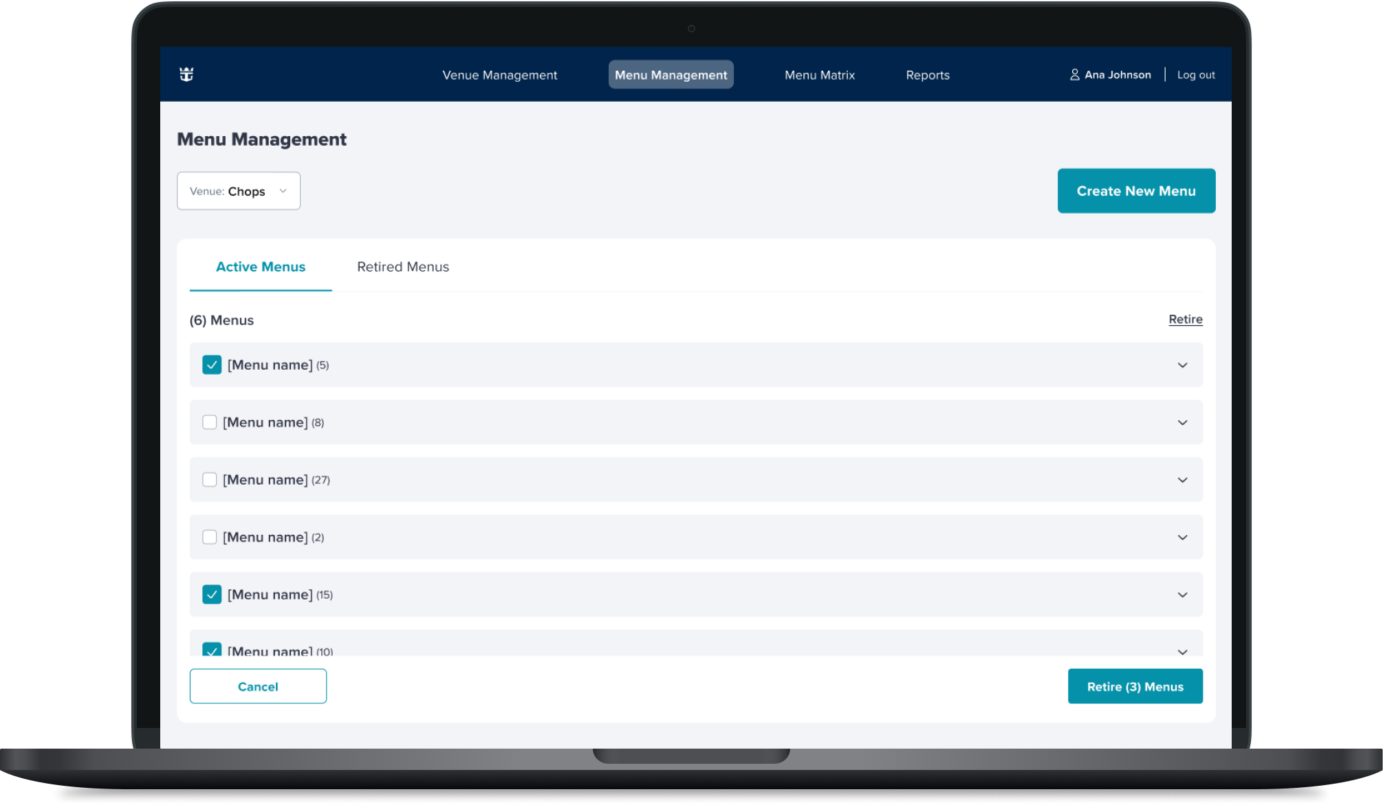
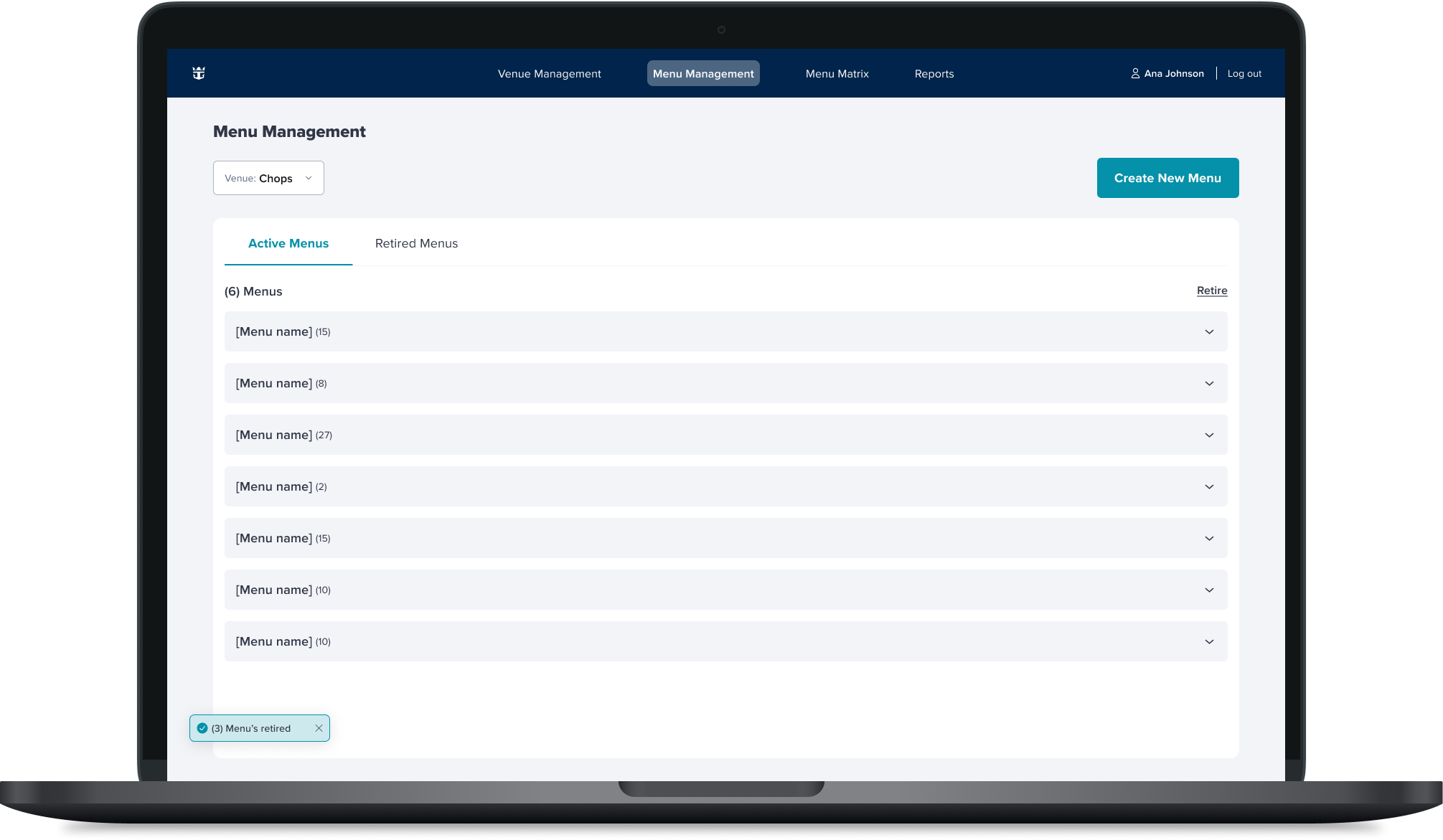
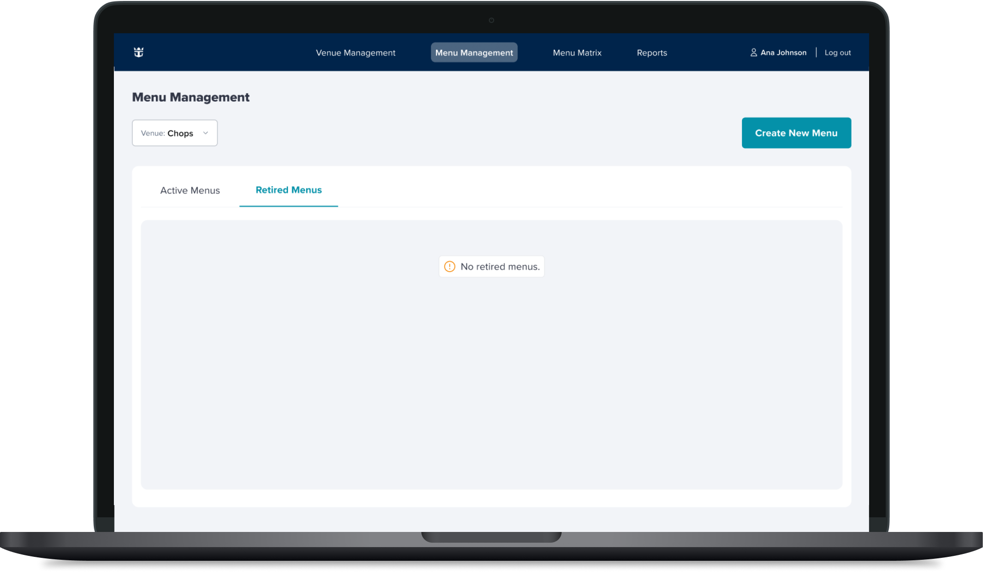
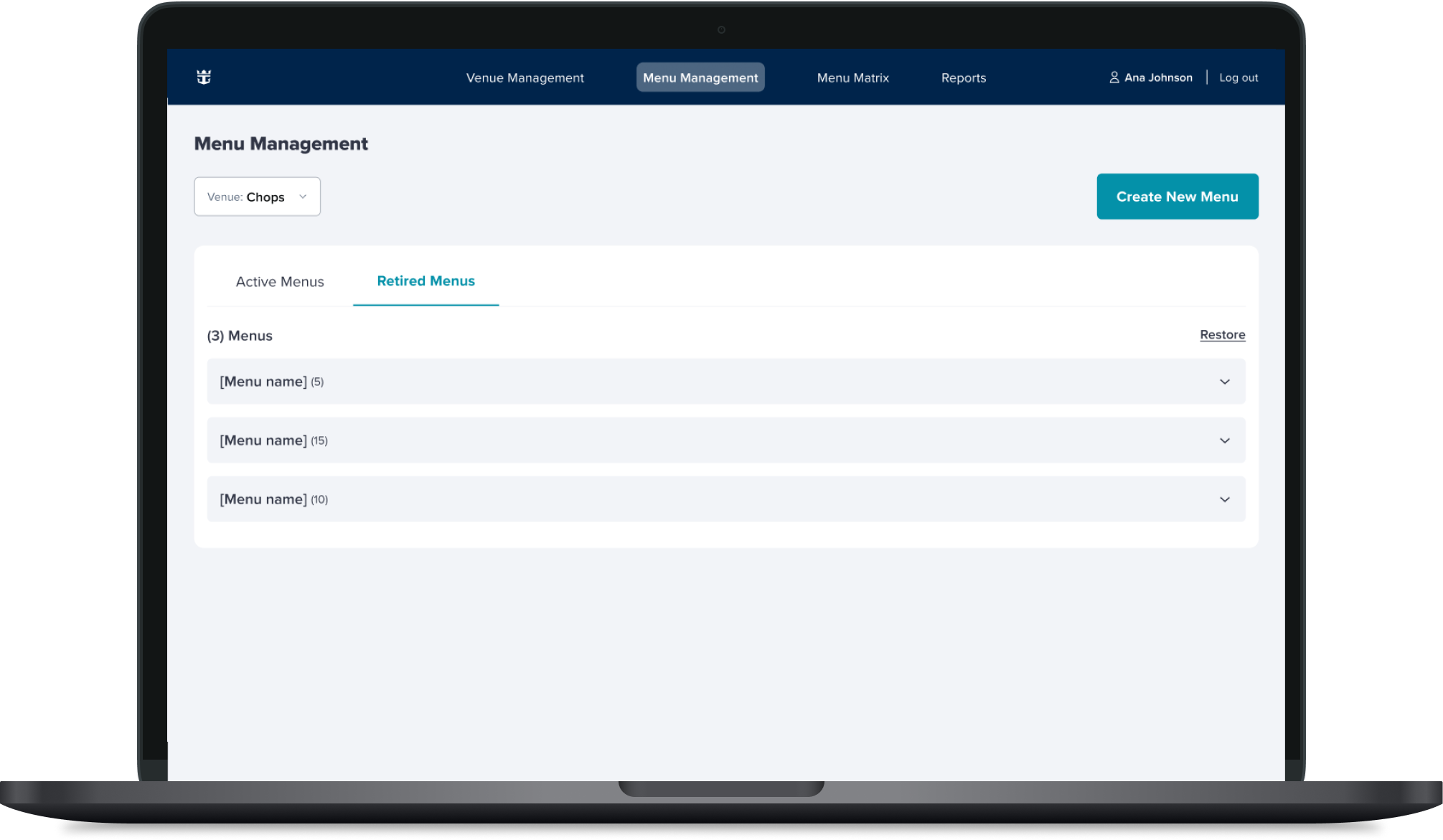
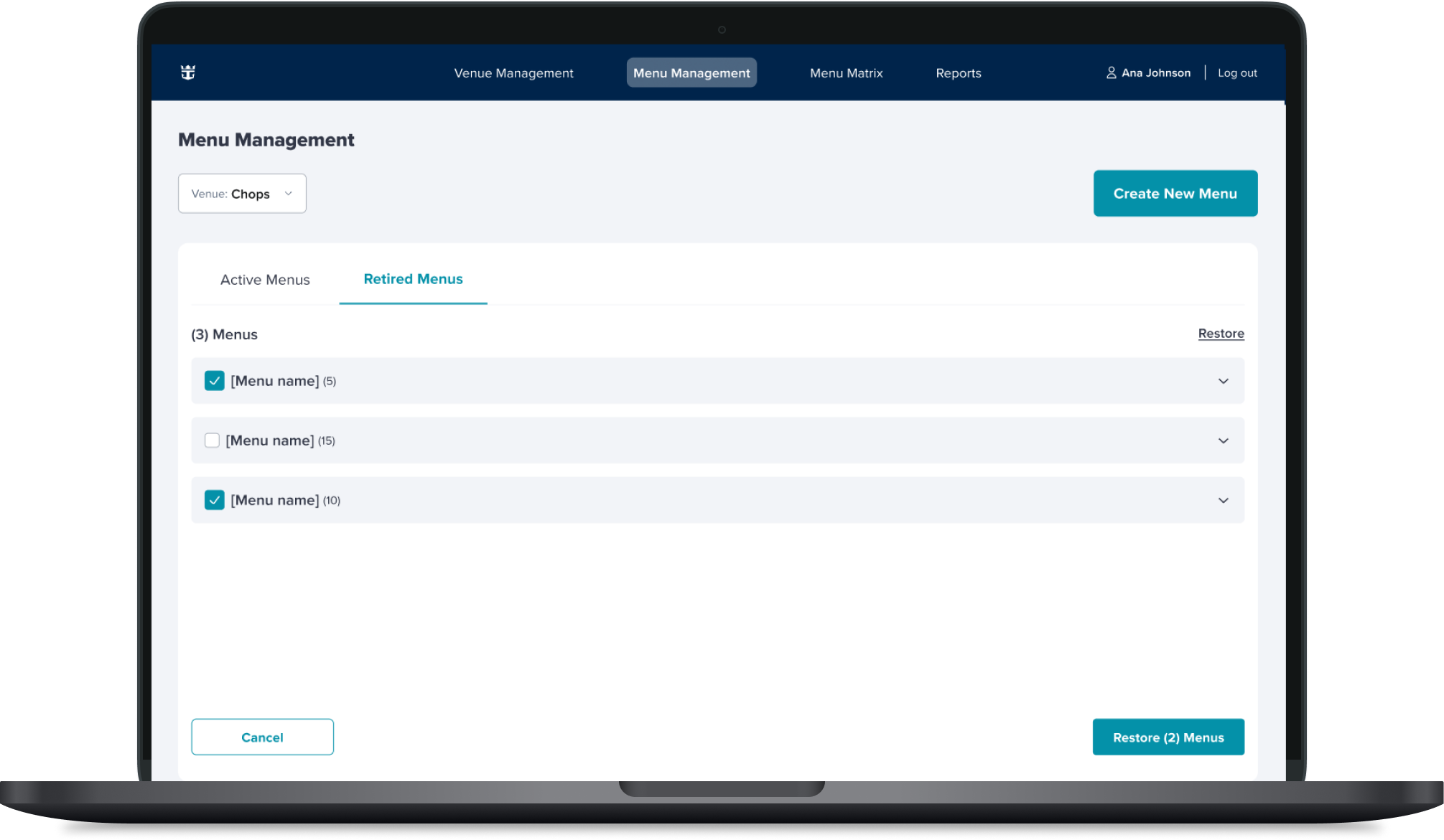
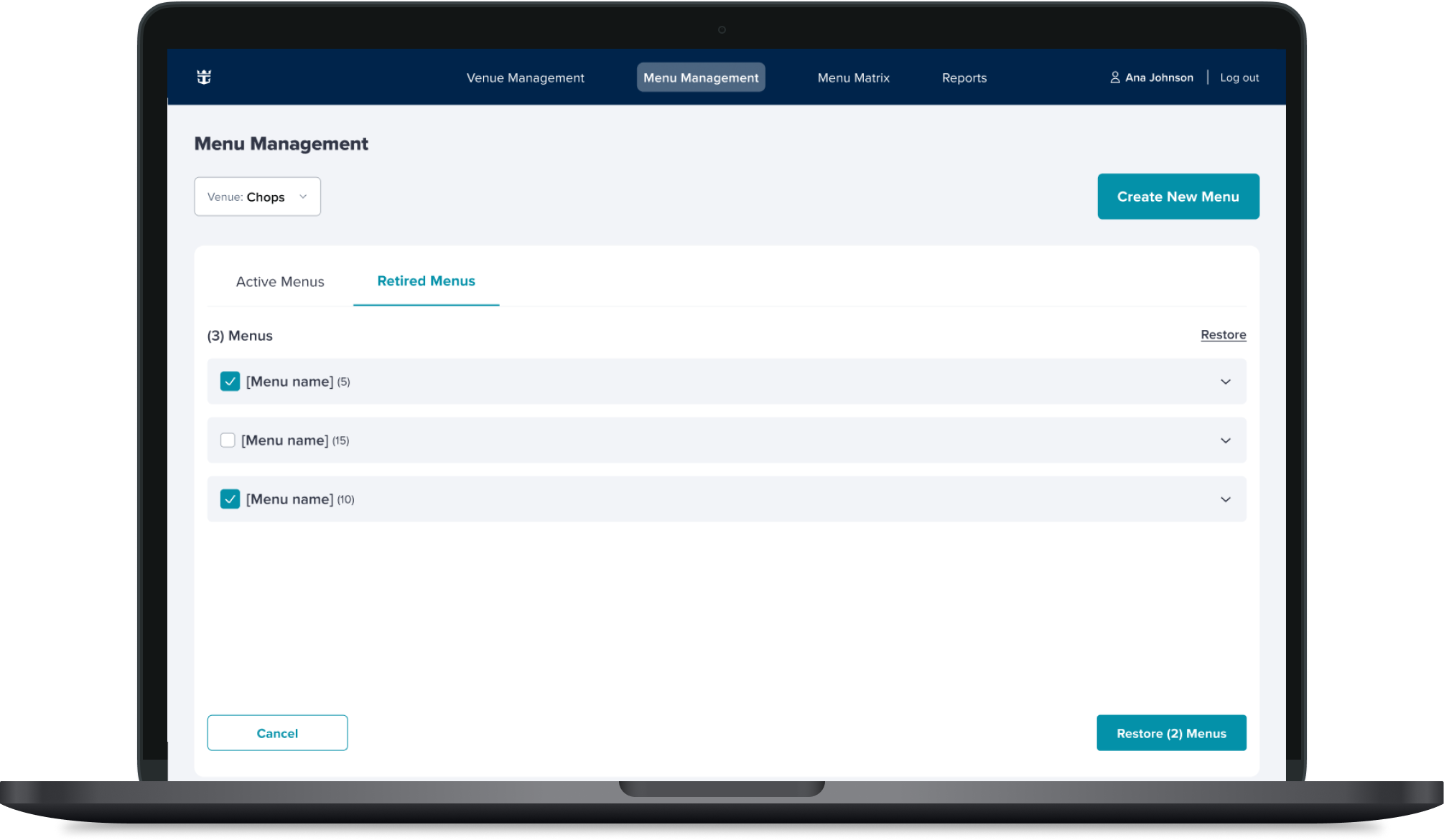
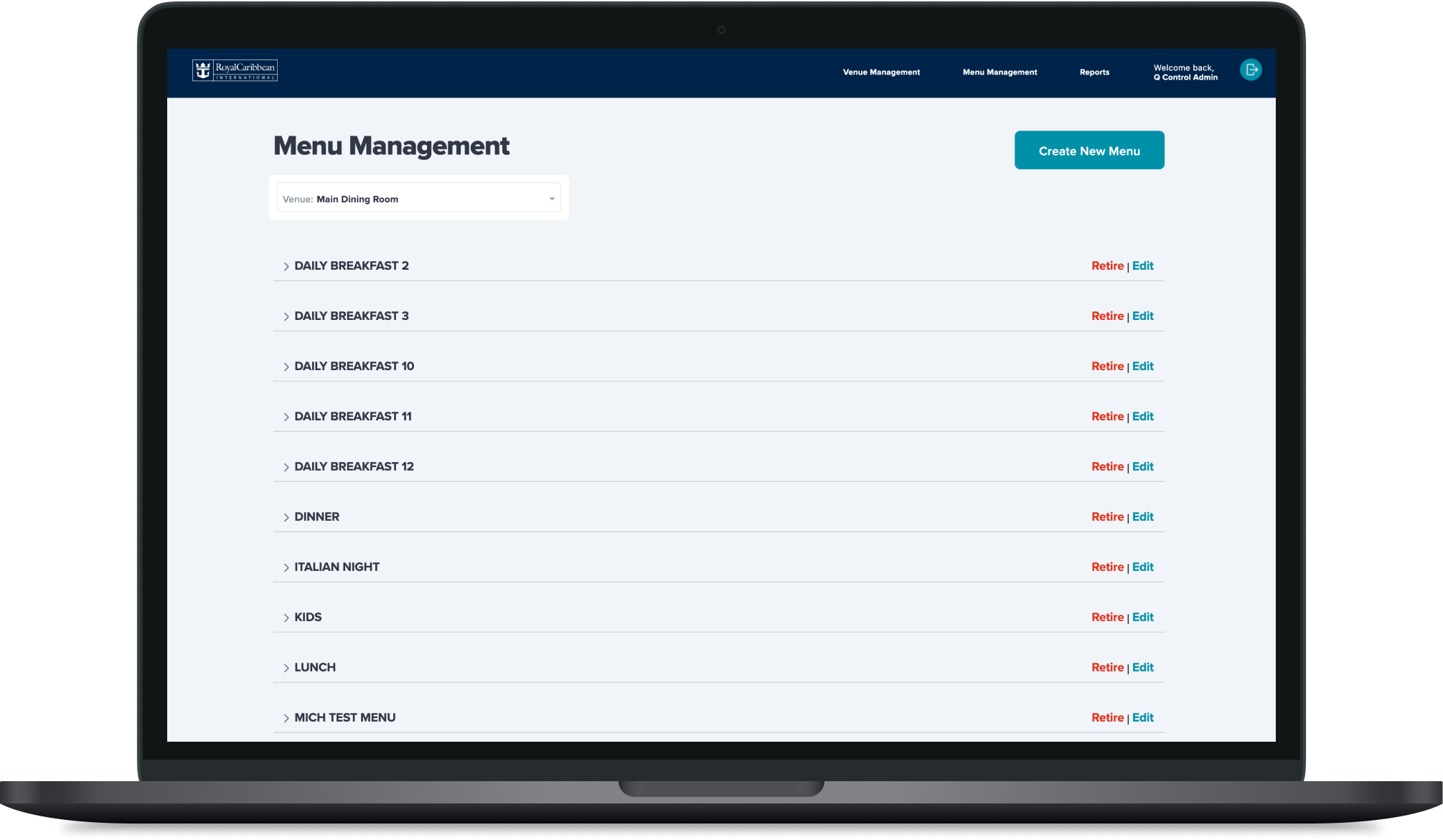
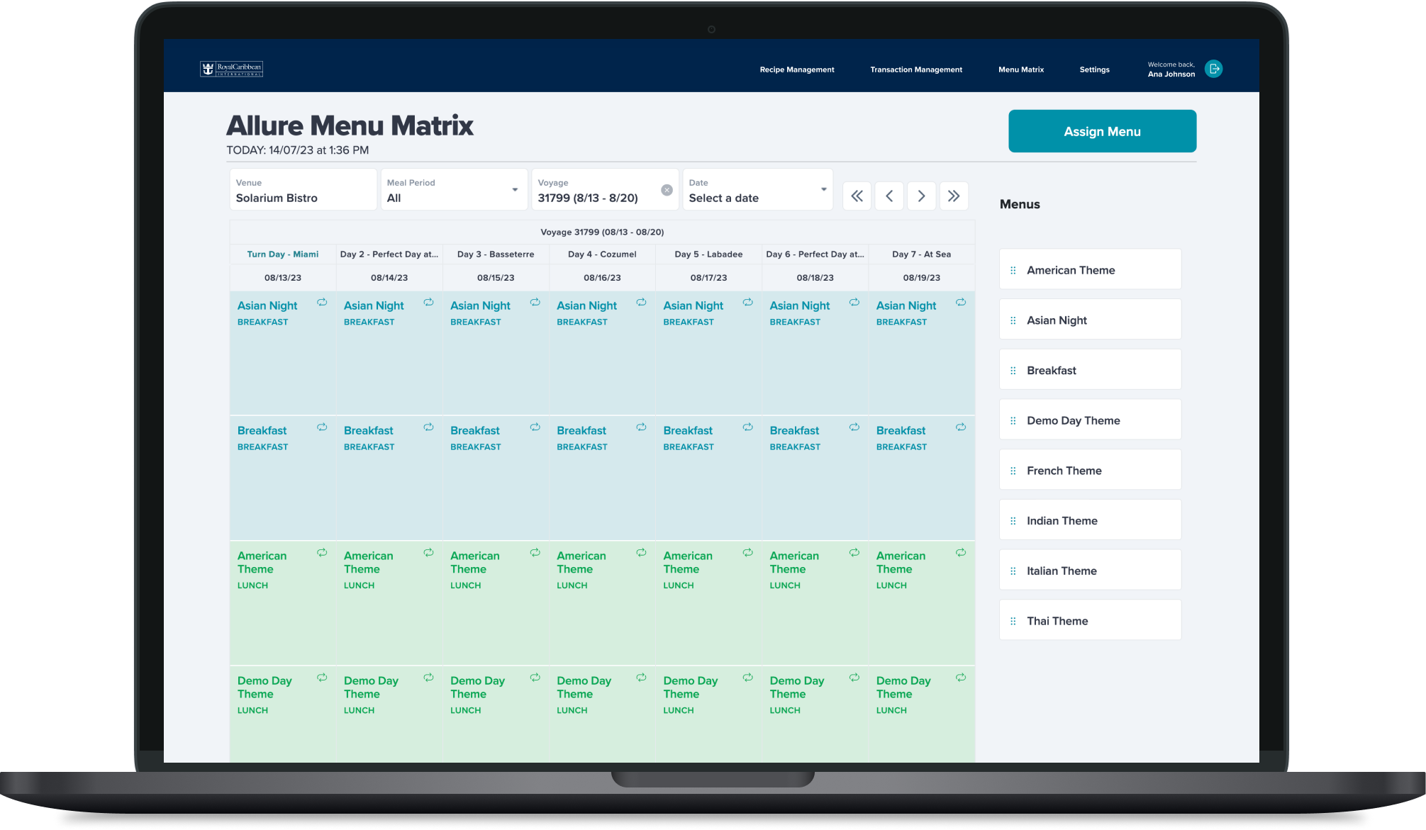
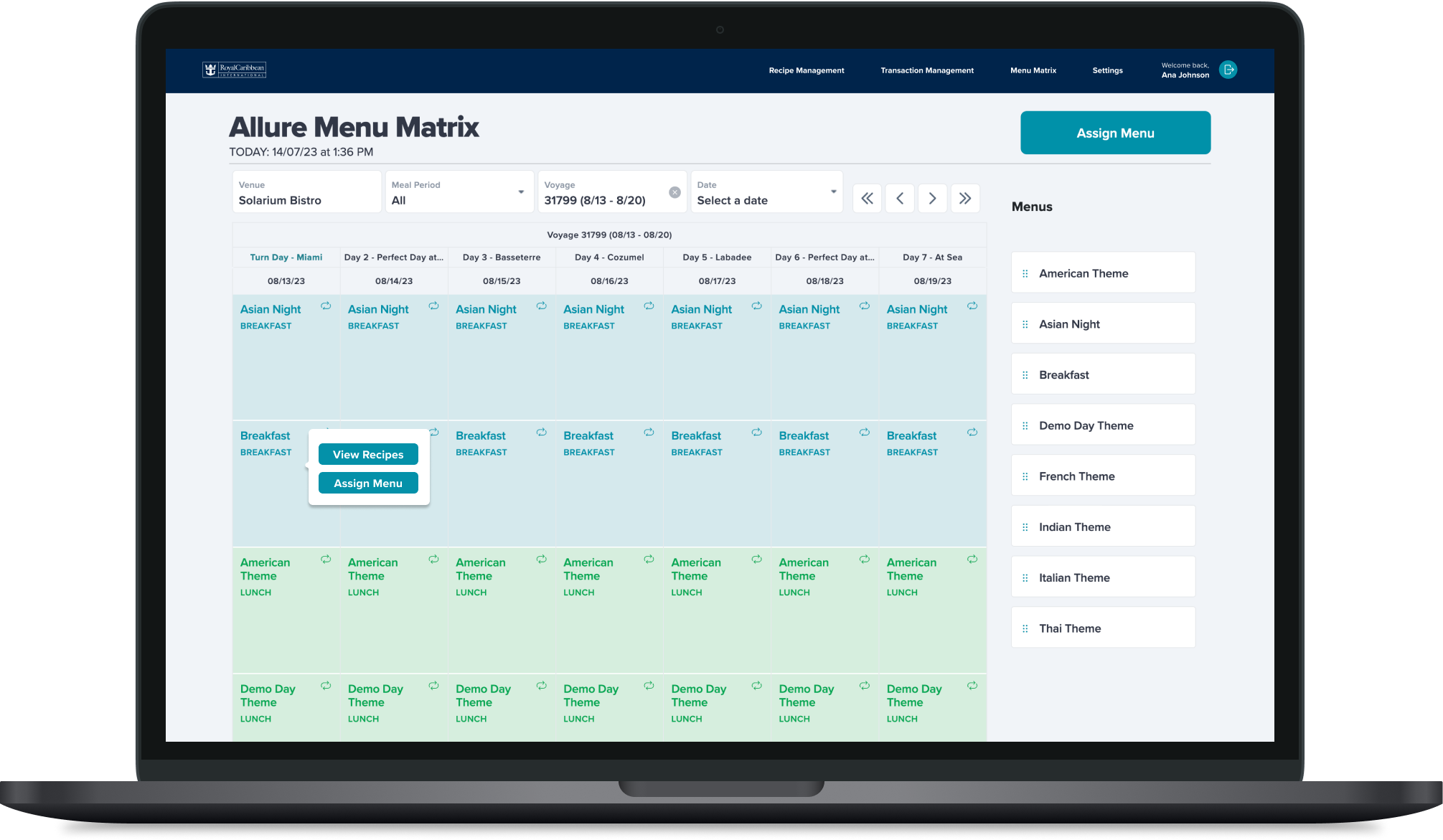
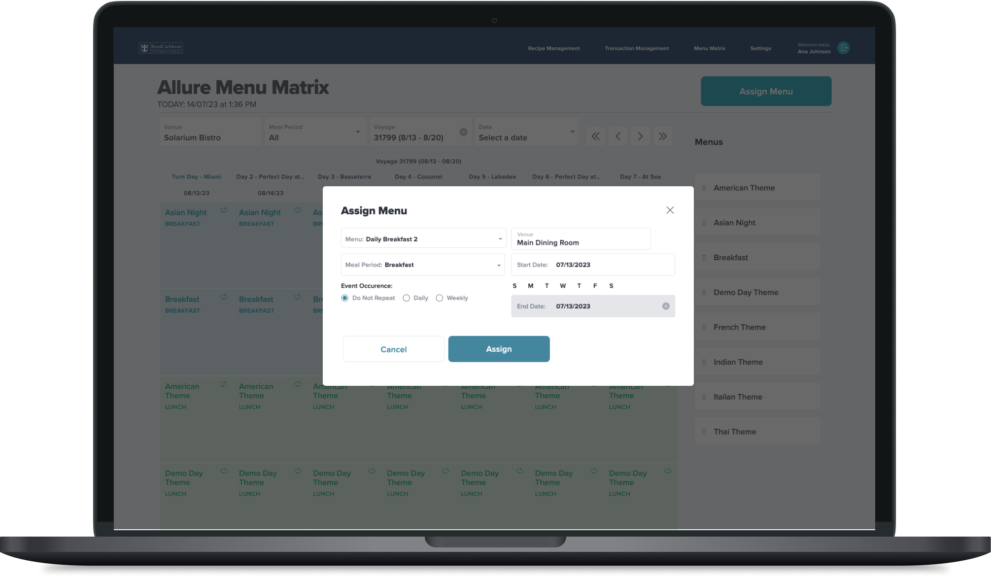
Menu Management
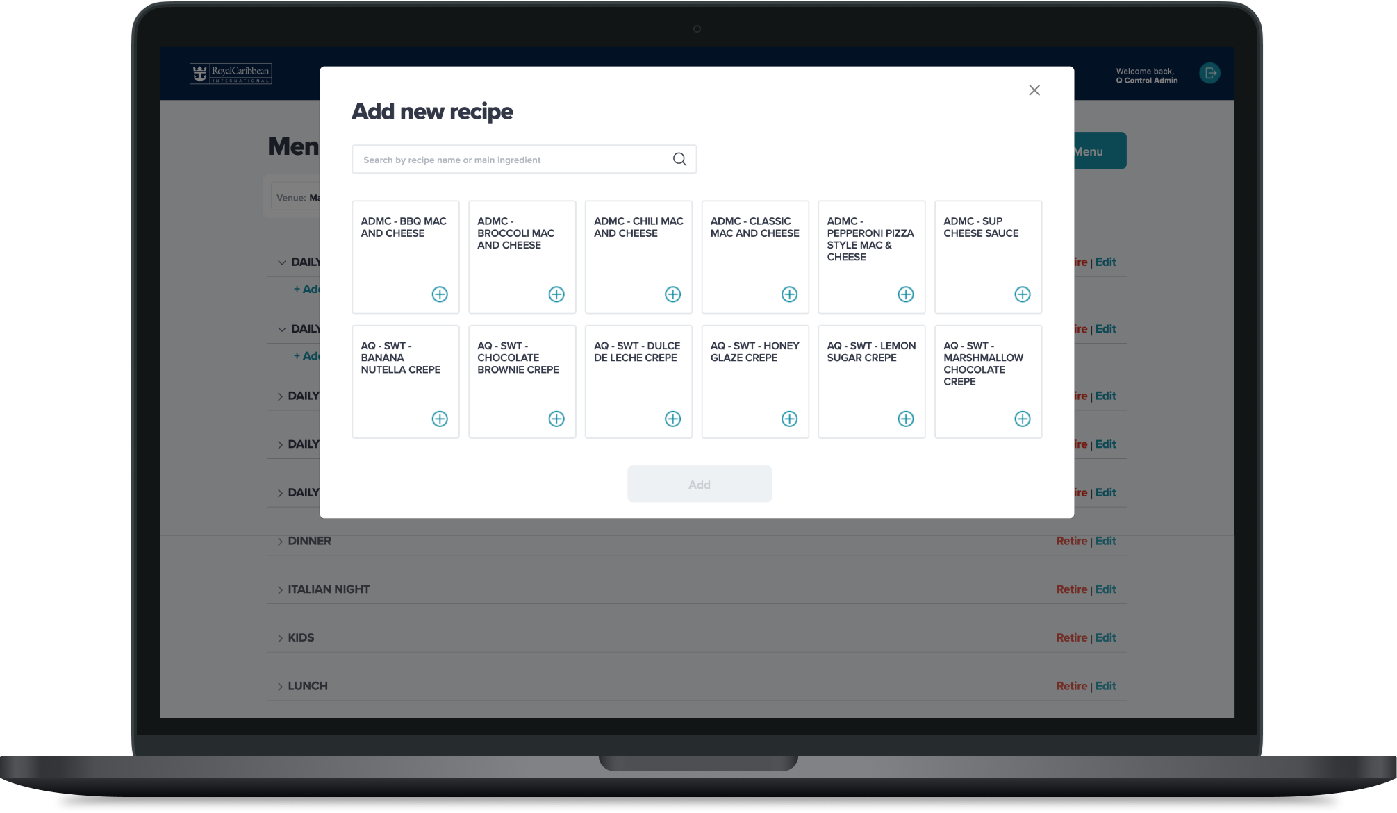
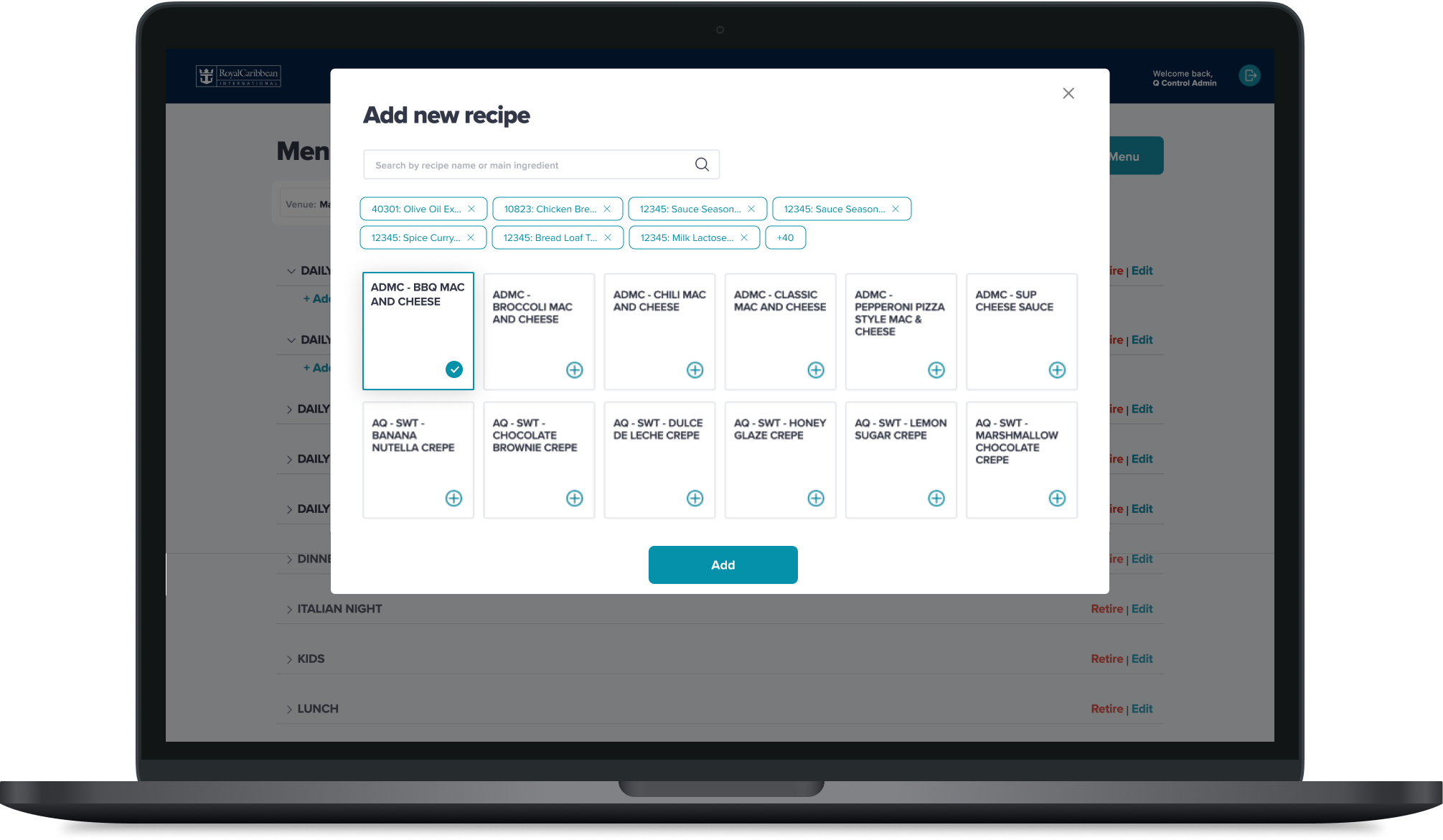
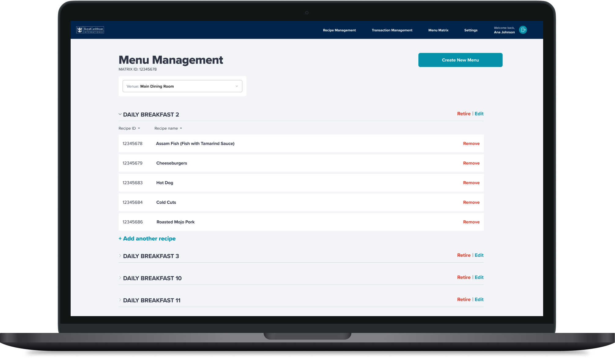
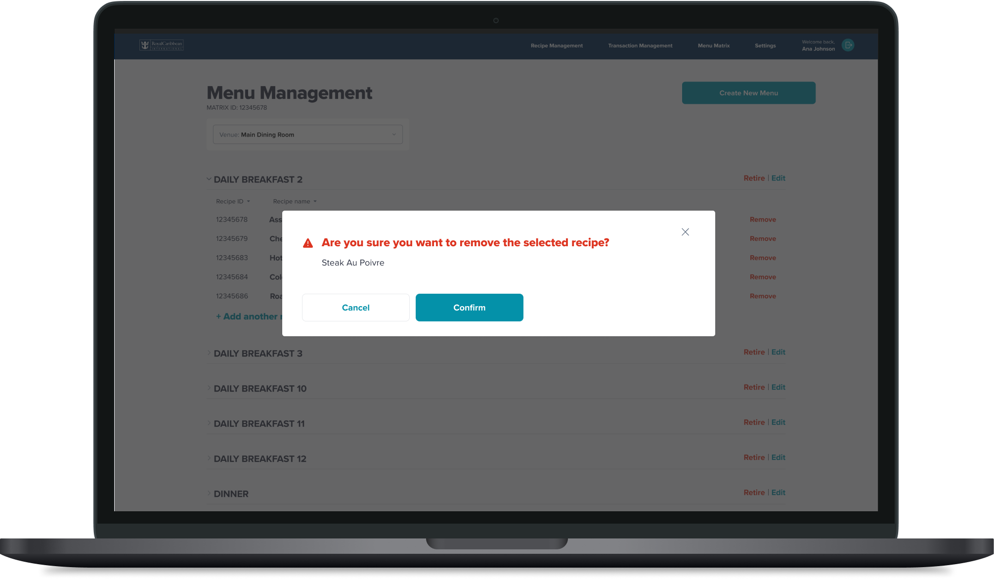
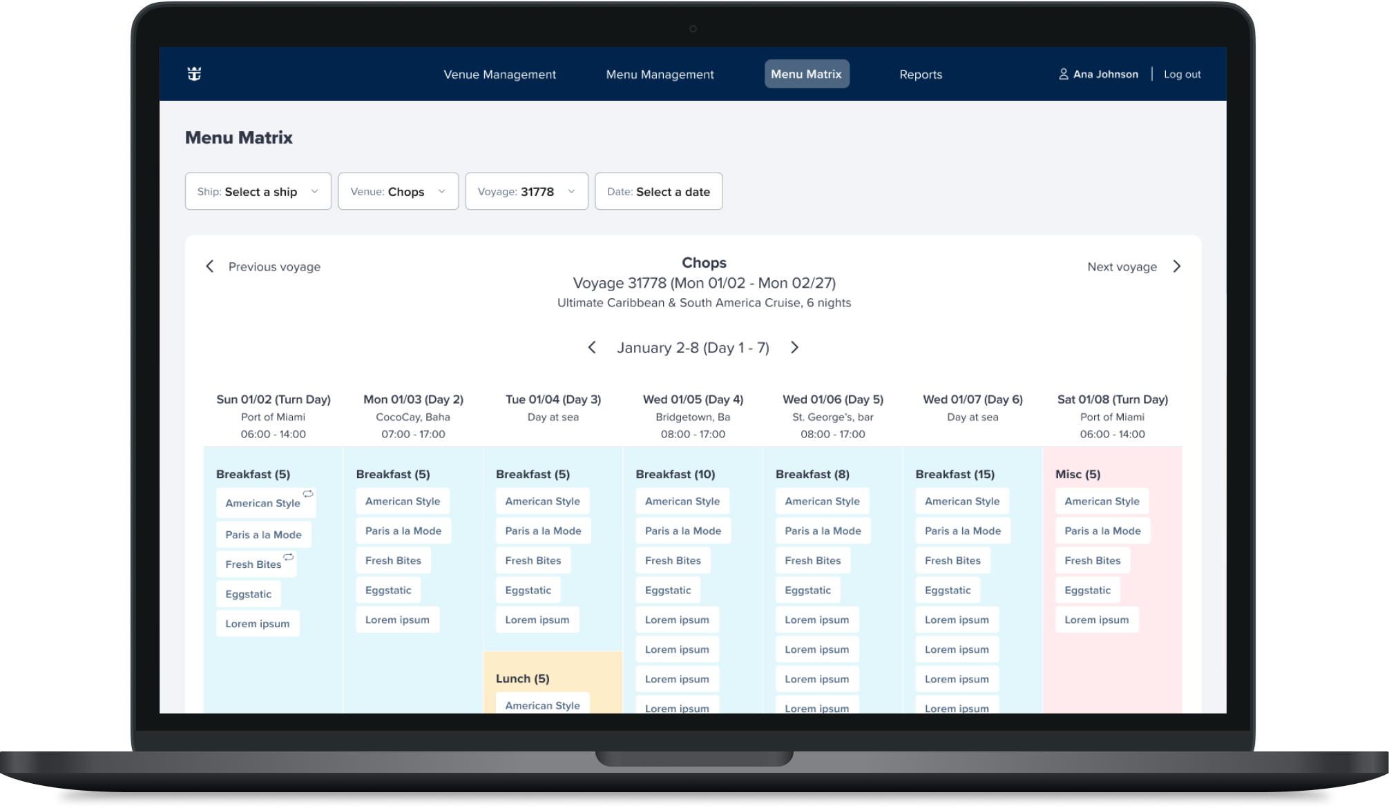
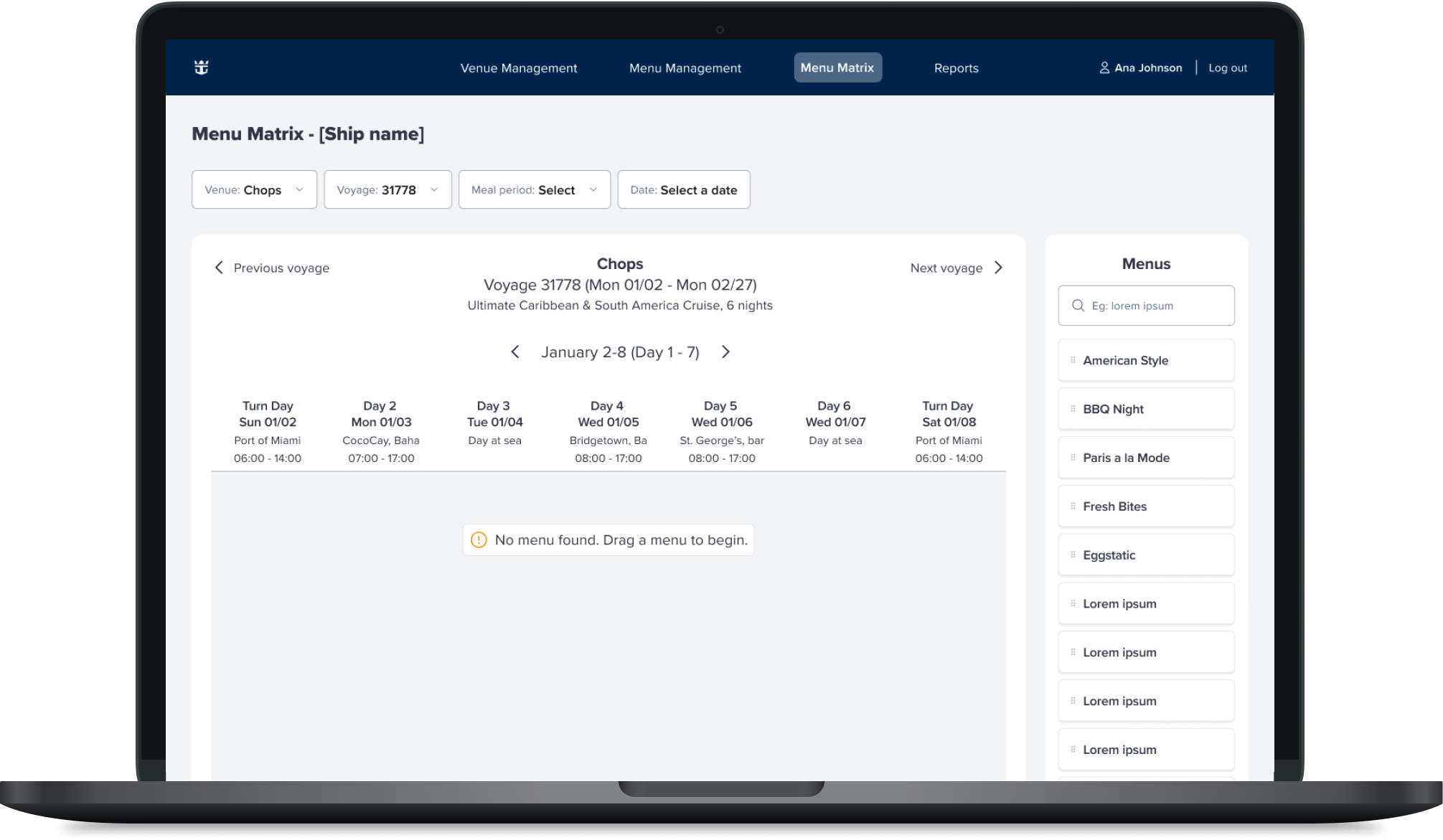
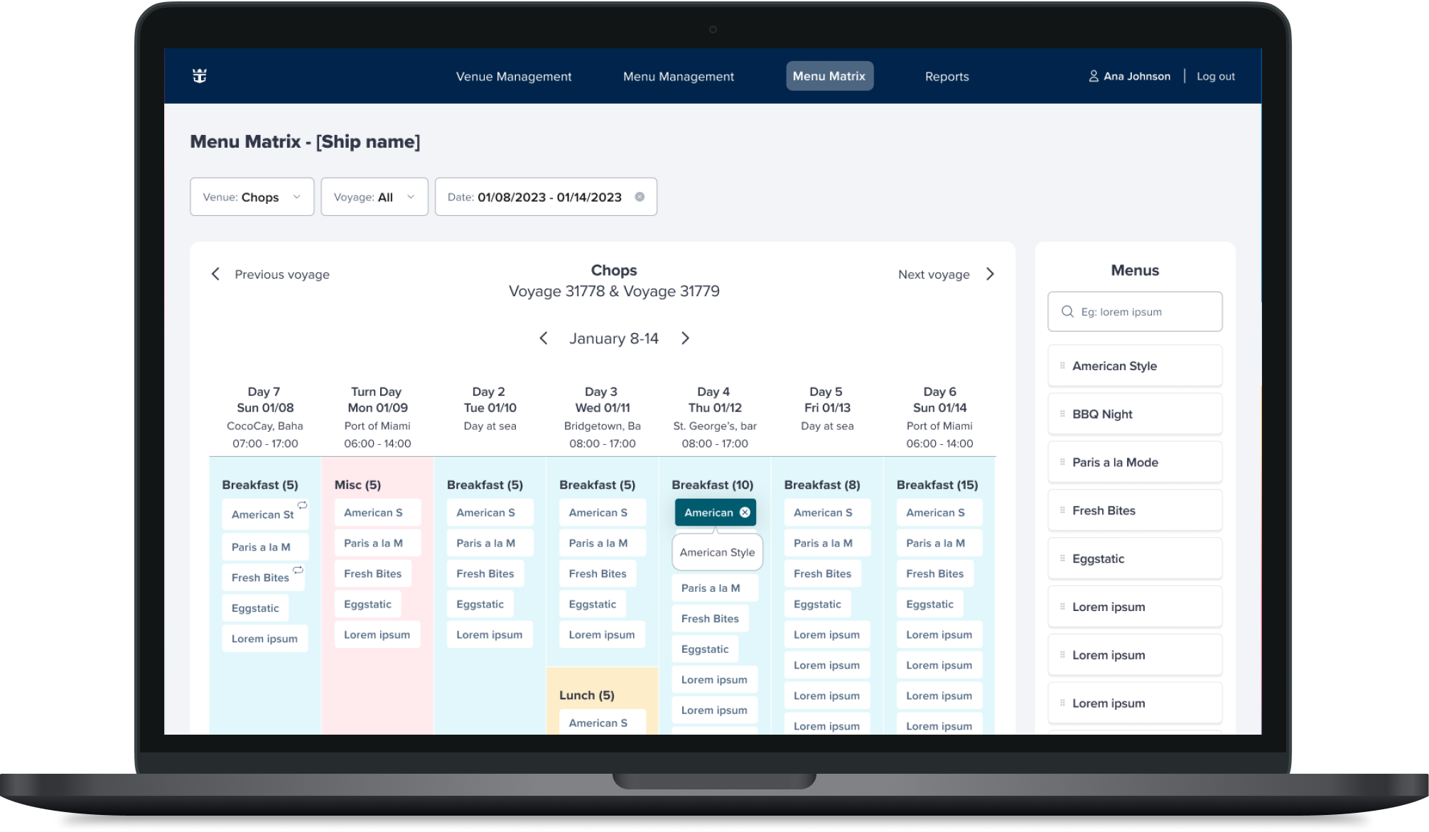
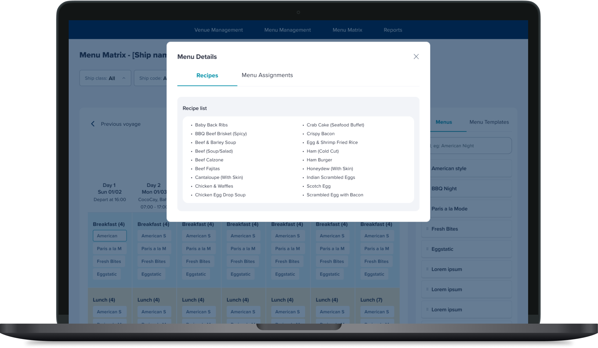
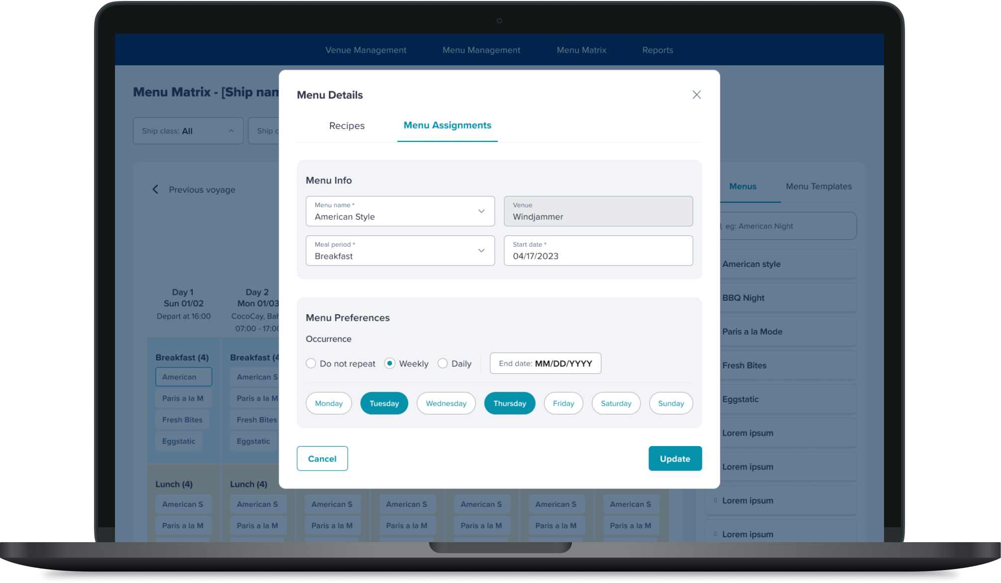
Menu Matrix
Wireframes and re-design
Created a component library for assets in Figma
Cleaned up the UX and UI
Made the headers smaller, so it wouldn’t take up so much of the page
Removed the amount of CTA’s on the page
Updated functionalities to make it easier to use and cleaner
Included status as a dropdown (active vs. inactive)
Gave the page a hover state with the ability to edit rows by clicking on them
Made drop-downs and input fields consistent
Removed the model over modal
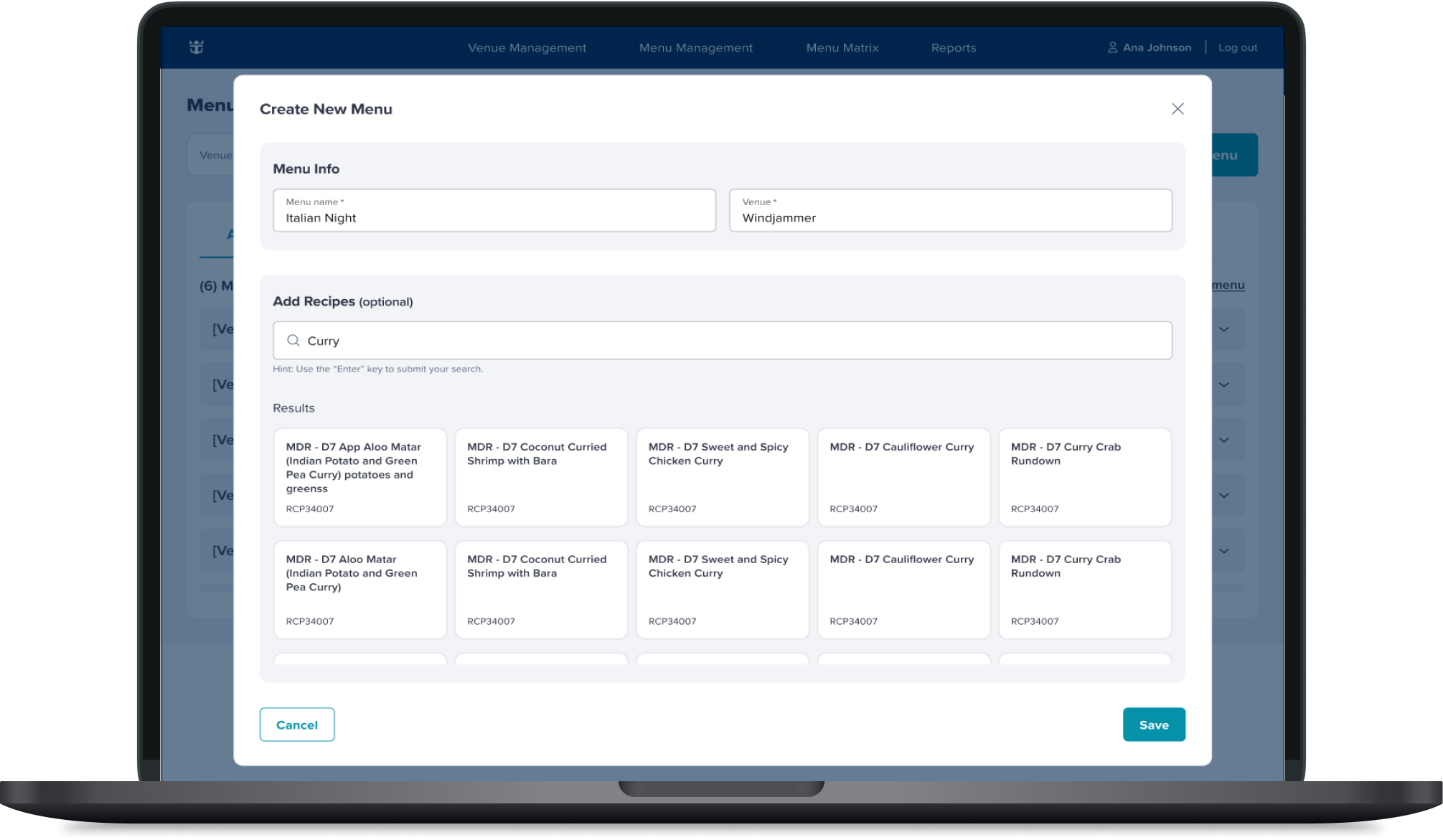
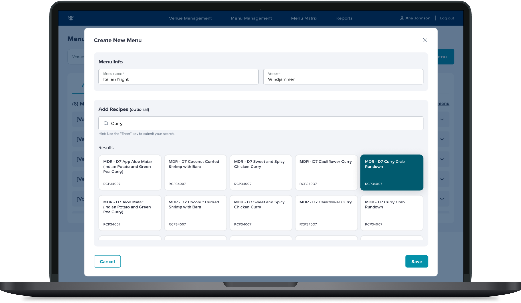
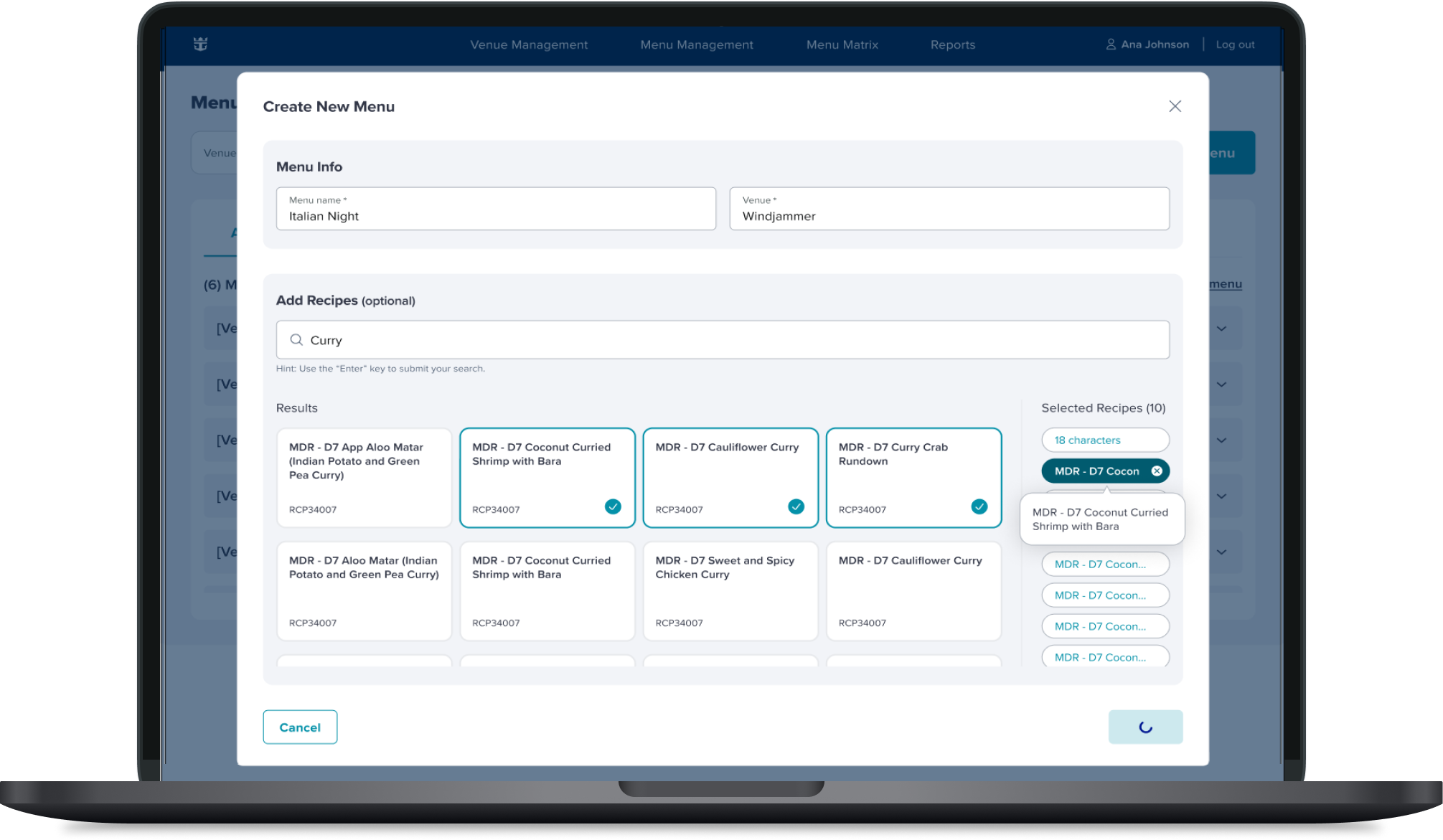
Created a new UX flow to retire menus
Moved the selected recipe pills to the side of the modal to give more room for the user
Venue Management
Menu Management
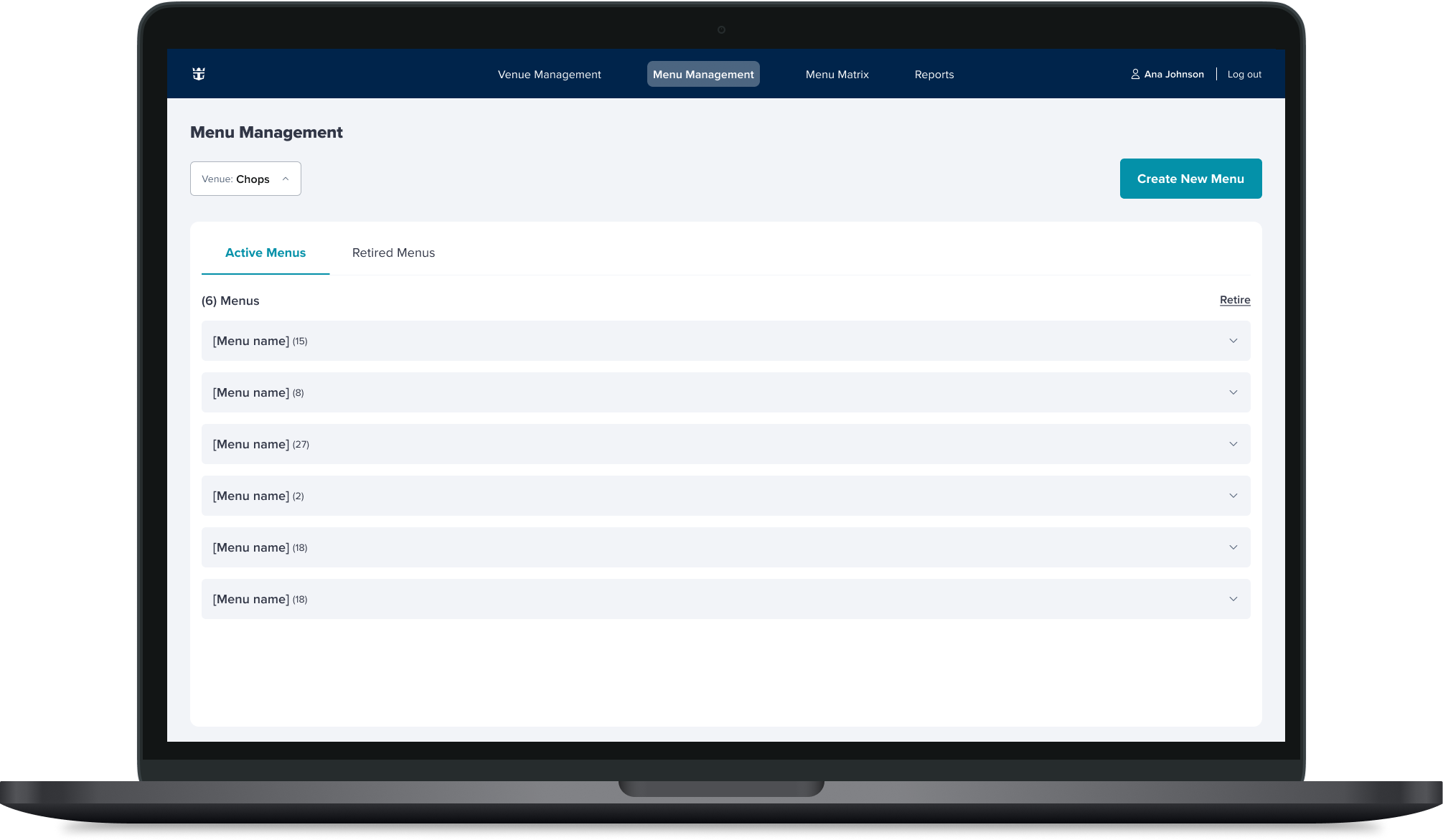
Menu Mangement page