Universal Redesign Case Study
Lead Product Design
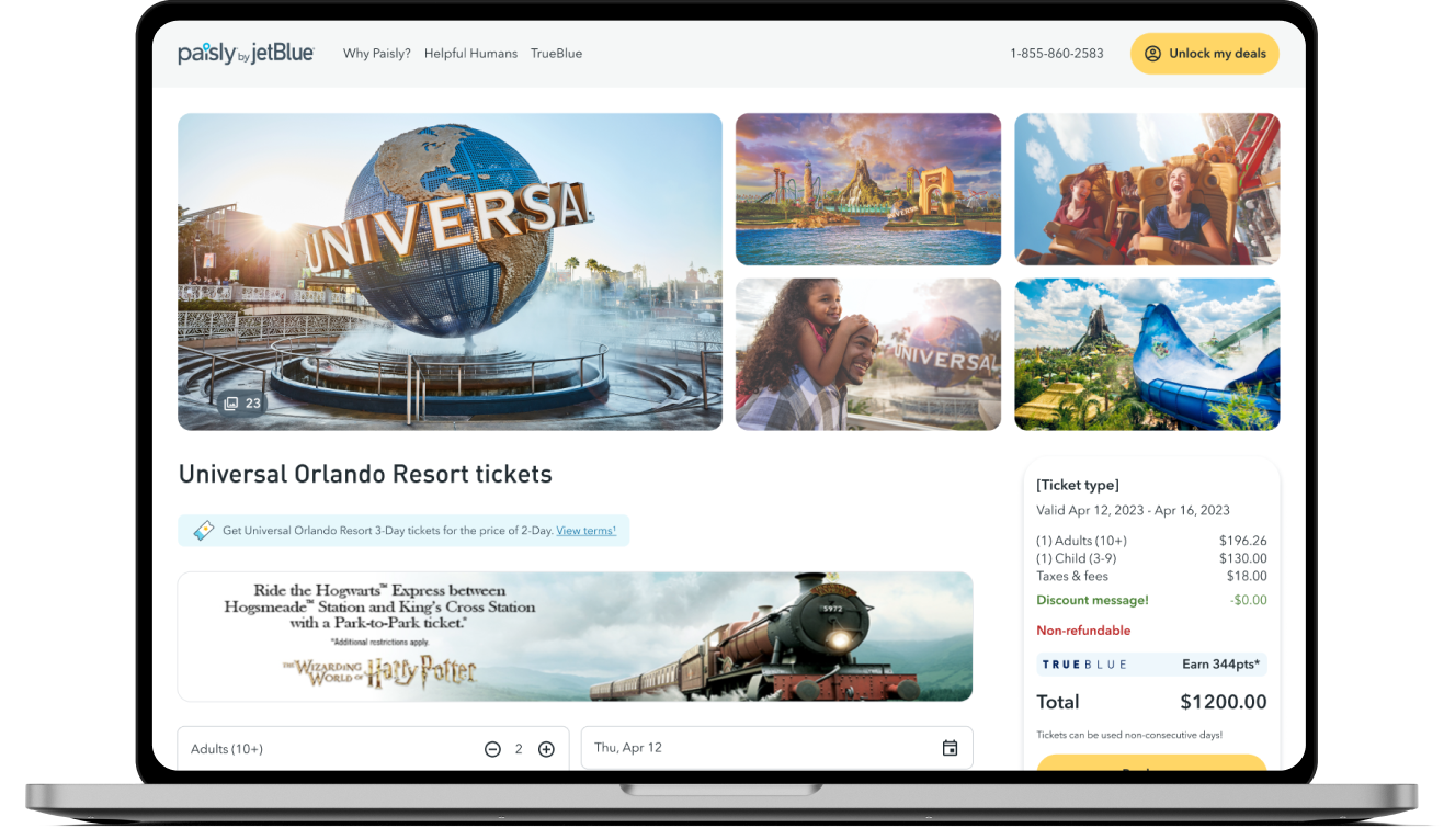
I was tasked with updating the look and feel of the Universal product detail page on Paisly to make it more visually appealing and user-friendly. This was successfully accomplished by using research, competitive analysis, user testing, and wireframing.
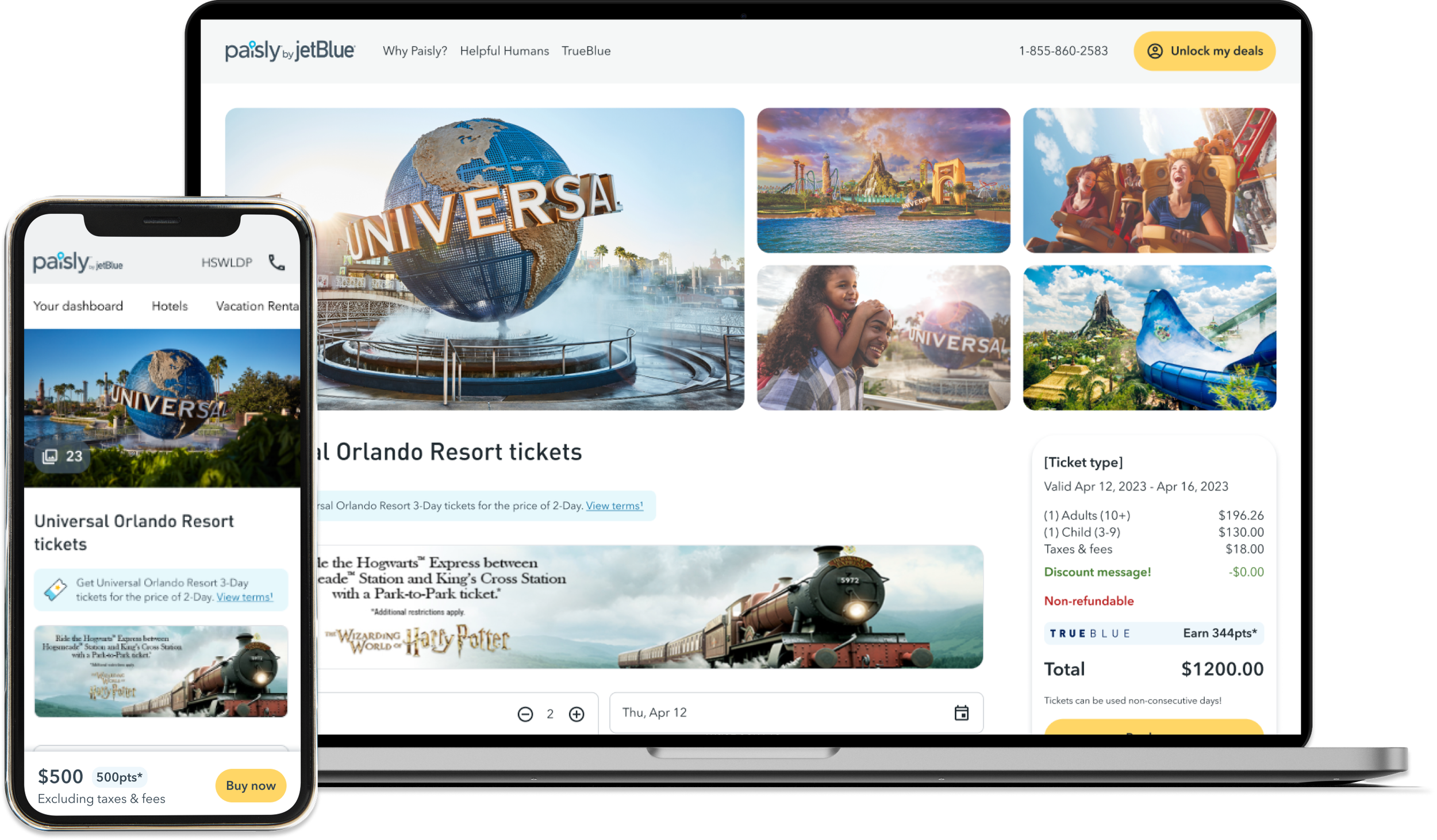
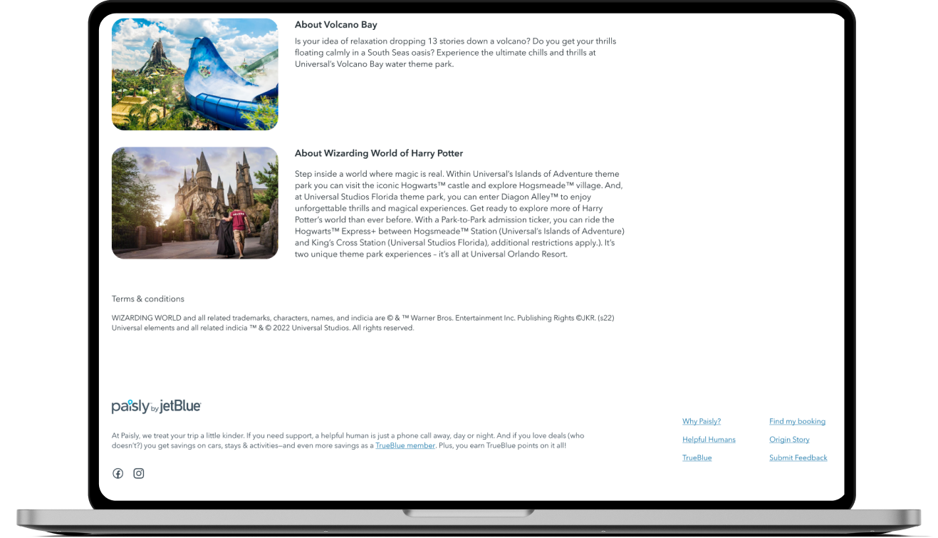
Current designs
Research
To begin the design process, I conducted research to understand user needs and pain points, as well as the competitive landscape. I reviewed website analytics to identify areas of the Universal product detail page that were causing drop-offs, conducted user testing, and analyzed customer care feedback to better understand user frustrations.
Key indicators from performance evaluation
Hogwarts Express is a big driver for conversion
Universal parks are only available for JetBlue customers who buy a ticket to Orlando
The “2-Park 3-Day Park-to-Park Program Ticket Adult” was the most popular ticket sold in 2022
Additional learnings:
Confusion which parks were included with each ticket
Users found the current Universal product detail page to be cluttered and confusing, with too many ticket options that had confusing names
Users found it difficult to understand the pricing and value of the different ticket options
Ticket details were hidden from view
Breakdowns are important to these users
Users shop by date
Users have specific parks in mind when they start their search
Users repeatedly asked which parks have access to the Hogwarts Express train
Wireframes
Using these insights, I worked with the development team to create a redesigned Universal product detail page that addressed these pain points. The design included the following key features:
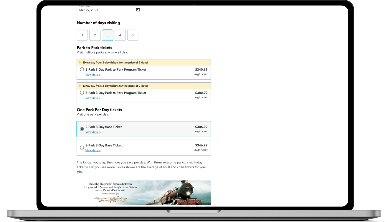
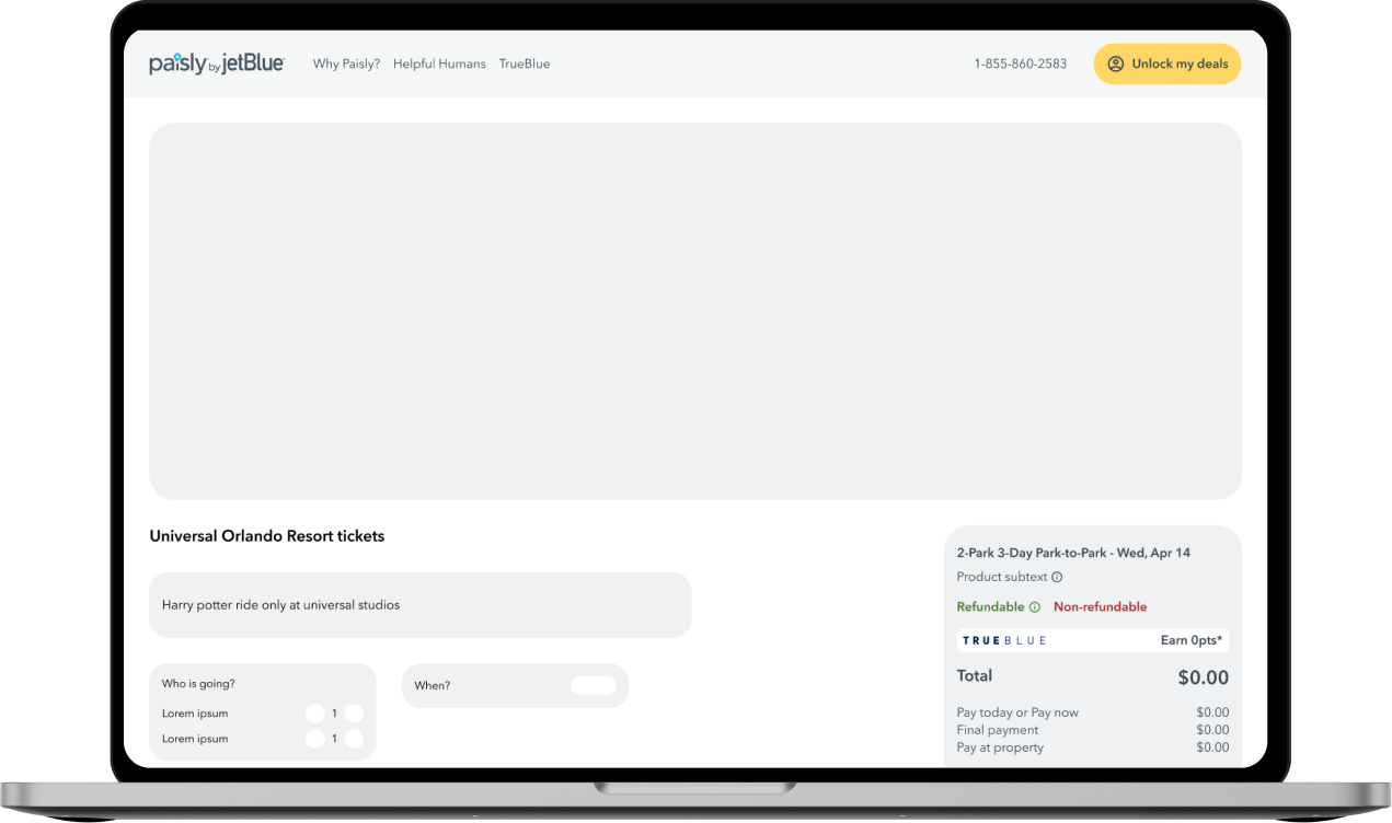
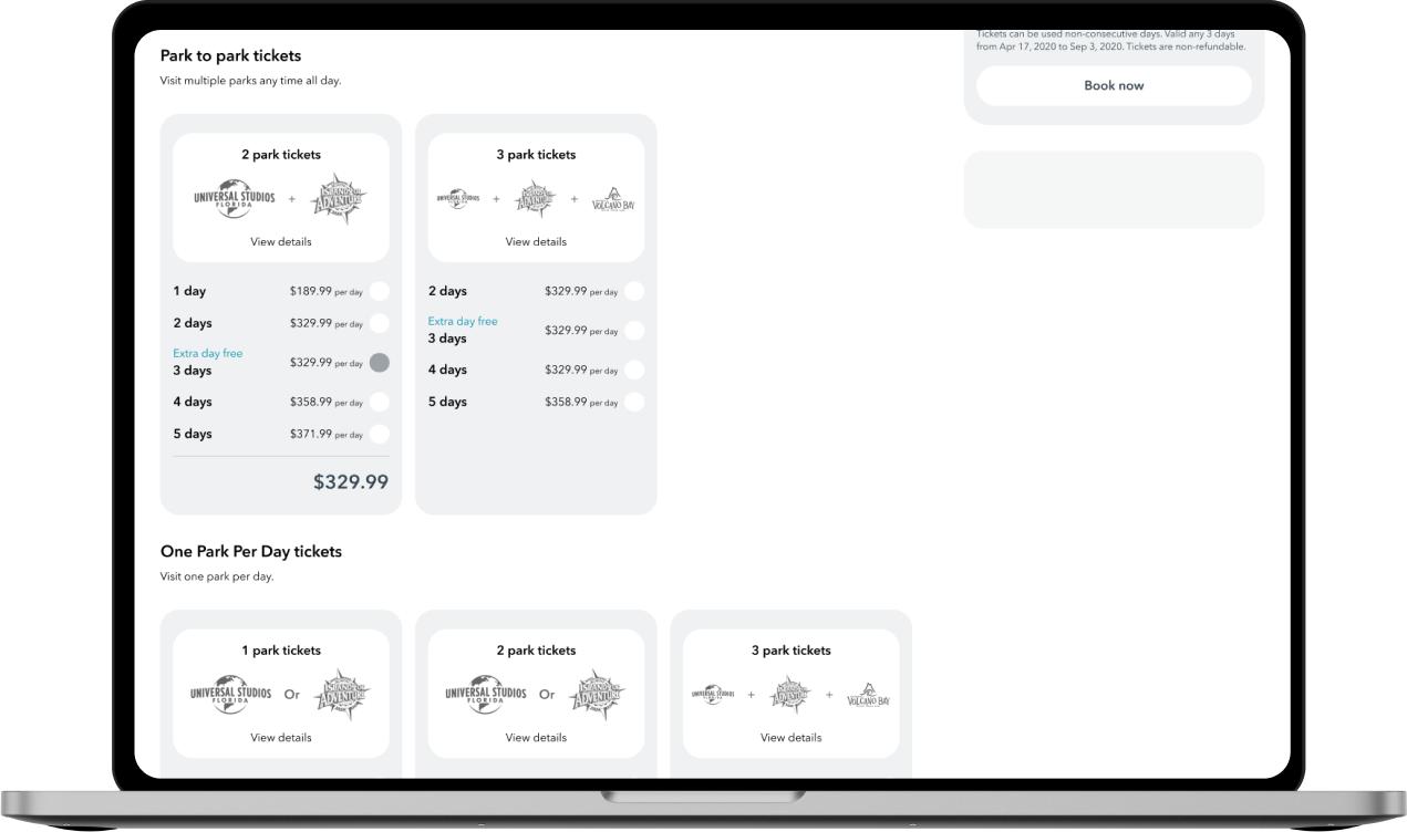
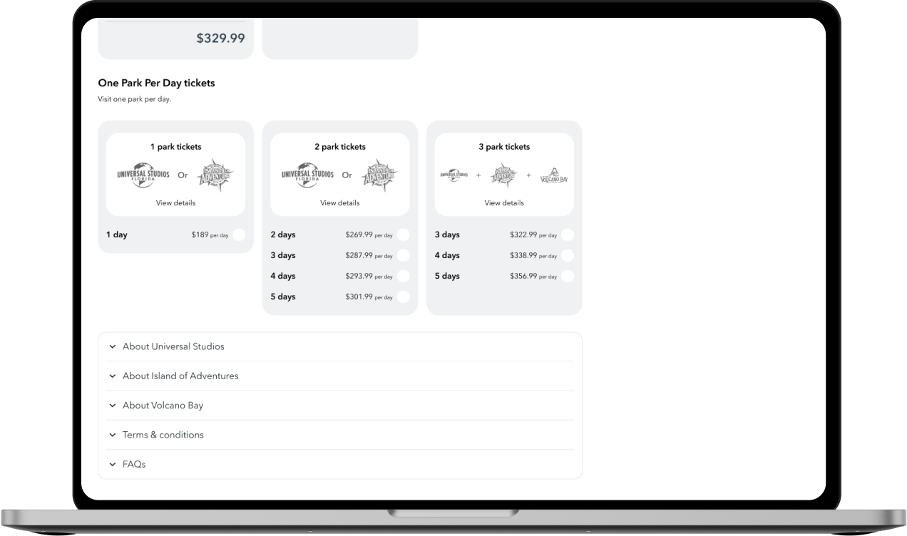
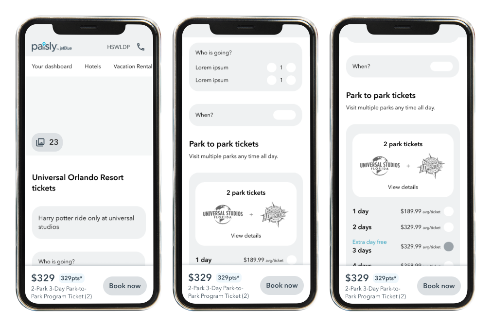
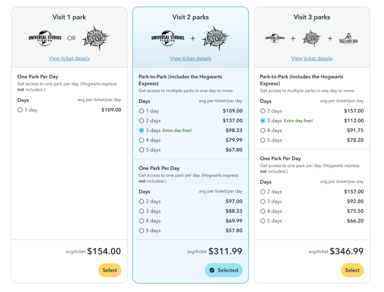
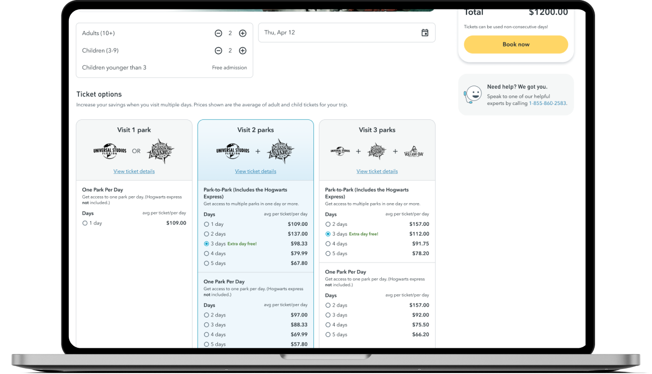
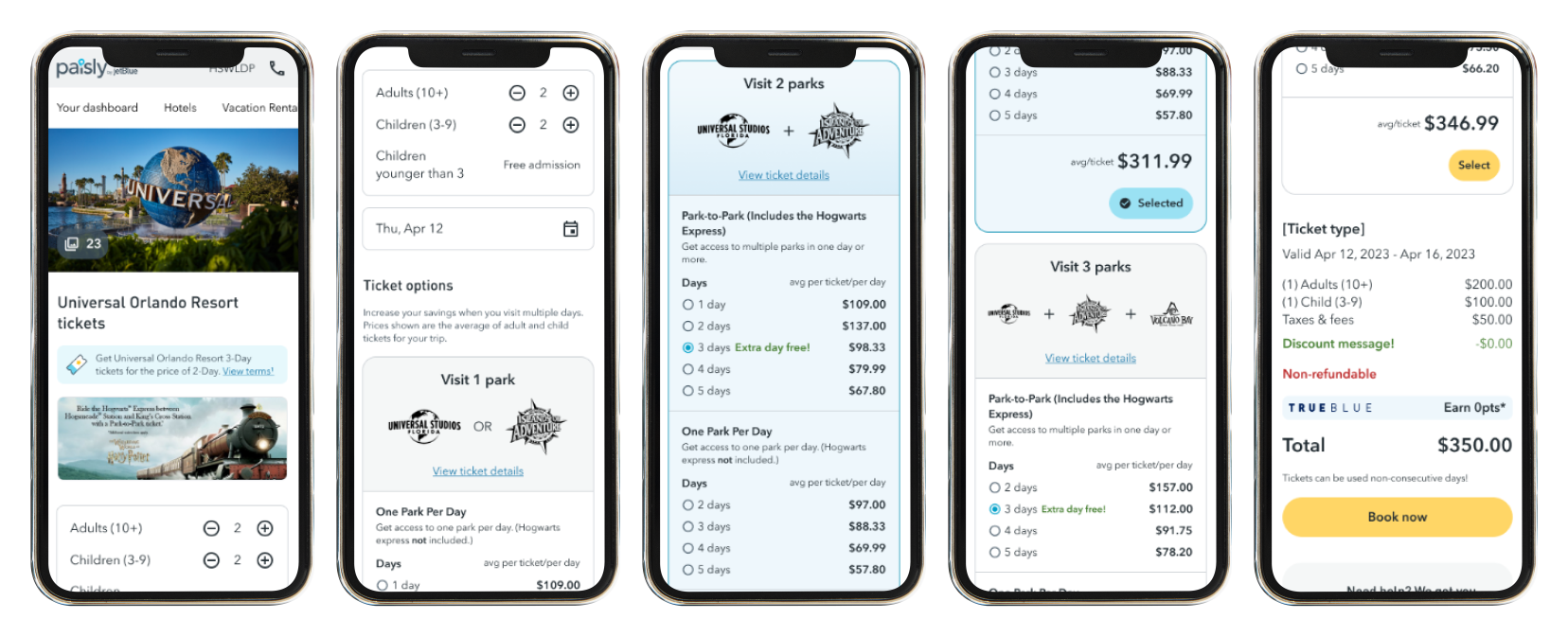
Simplified ticket options: I created a more streamlined interface that laid out the tickets by the type and number of days. I also added the parks each ticket type will take you to - this helped users understand the differences between each ticket option, so they could choose the one that was right for them.
Clearer pricing and value: I worked with the customer care team to develop clearer pricing and value messaging for each ticket option. This included highlighting the different features and benefits of each ticket type and showing the savings that users could receive.
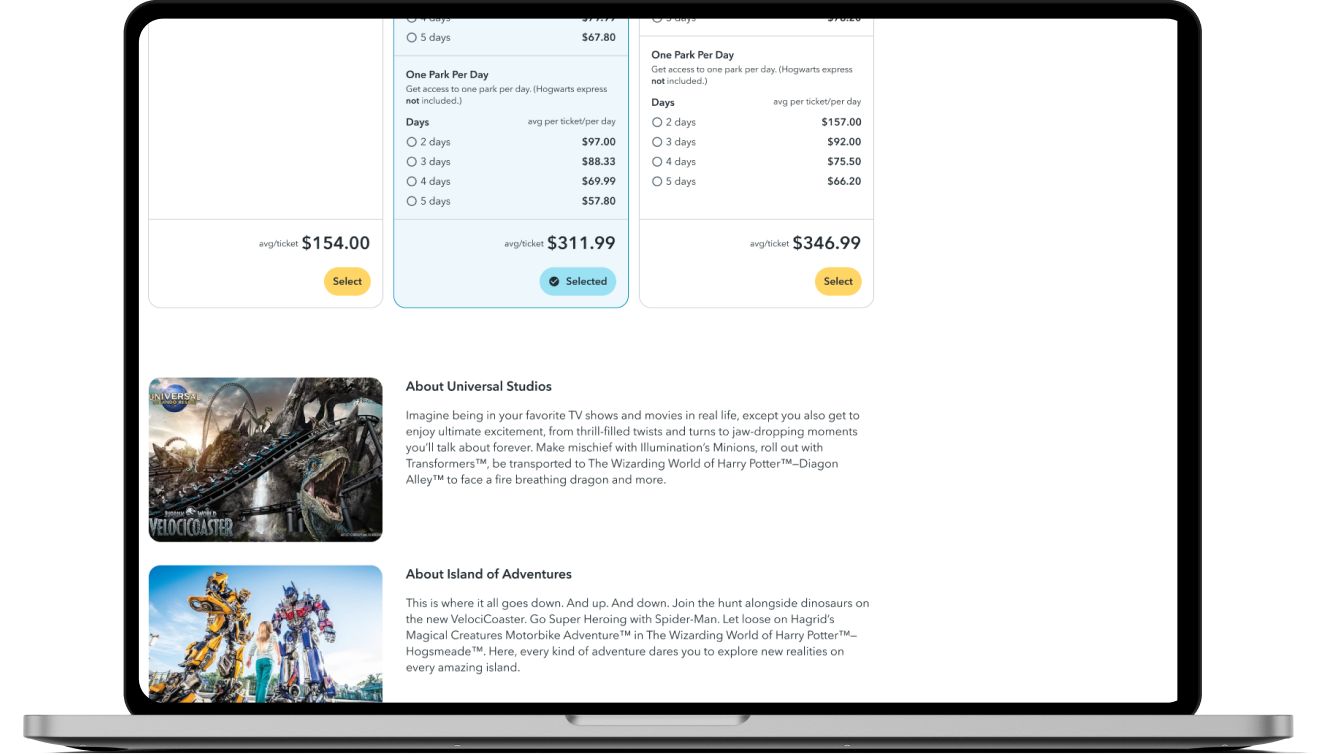
More user-friendly design: The new design had a more modern and user-friendly aesthetic, with clear calls to action and easy-to-understand pricing information.
User testing
User testing was conducted to ensure that the new Universal product detail page was effective and easy to use. We tested with both existing and new users to get feedback on the design and made adjustments based on their feedback.
Additional improvements based on testing:
Listing parks that have the Hogwarts Express
Showing ticket types by day rather than by ticket names
We worked with the development team to make these adjustments and retested the design to ensure that it met user needs.
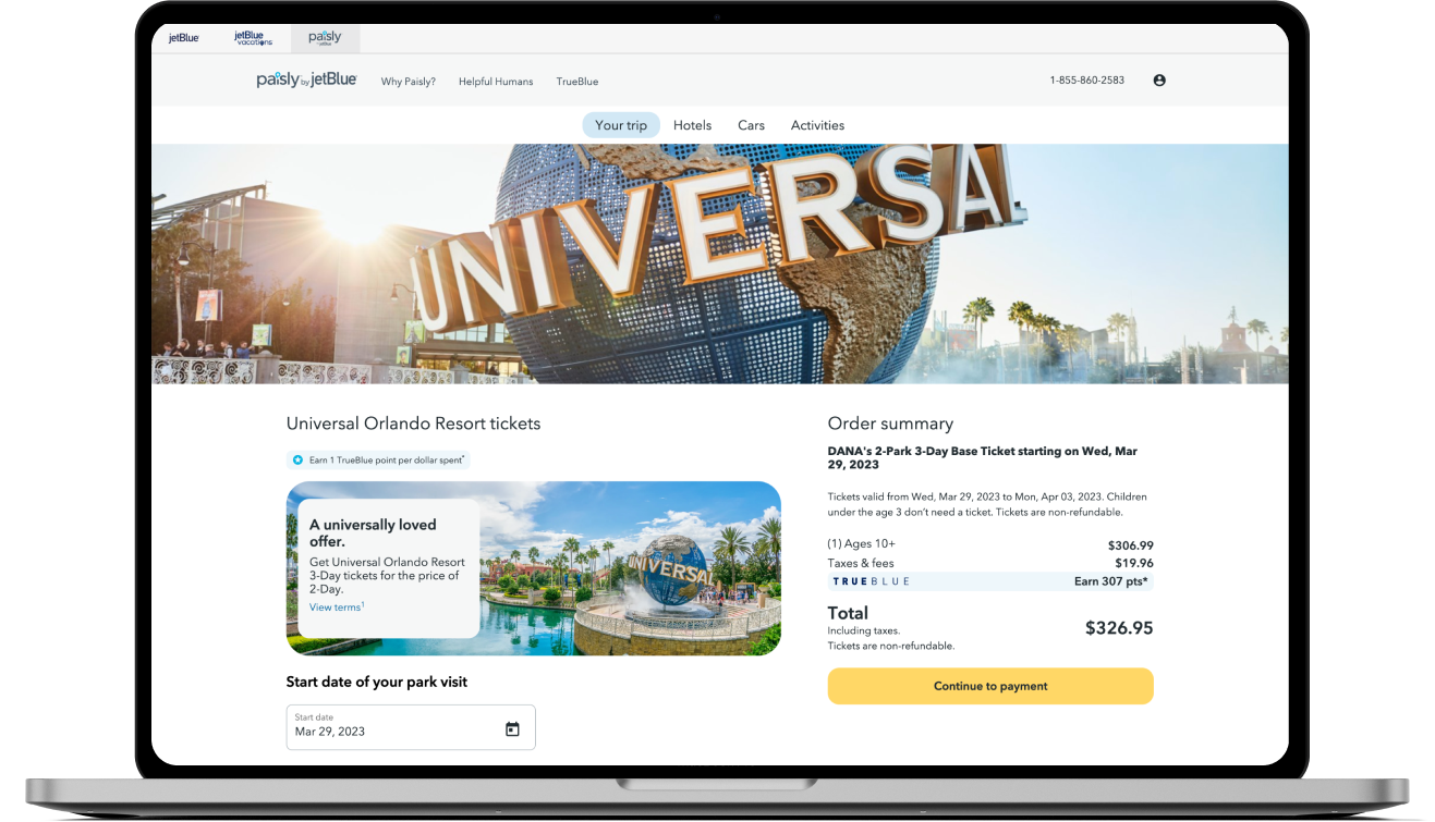
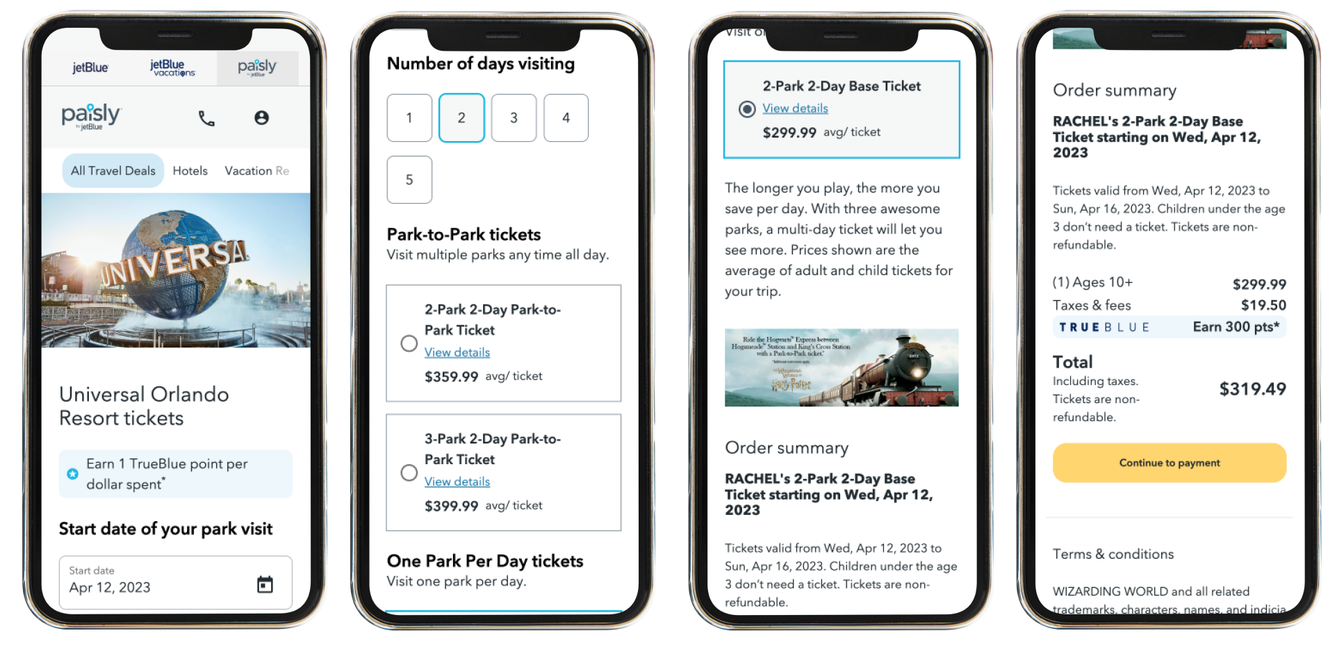
Final designs
Outcome
By using data and feedback from the customer care team, conducting user testing, and working closely with developers, we were able to create a more effective and user-friendly Universal product detail page for our theme park's website.

