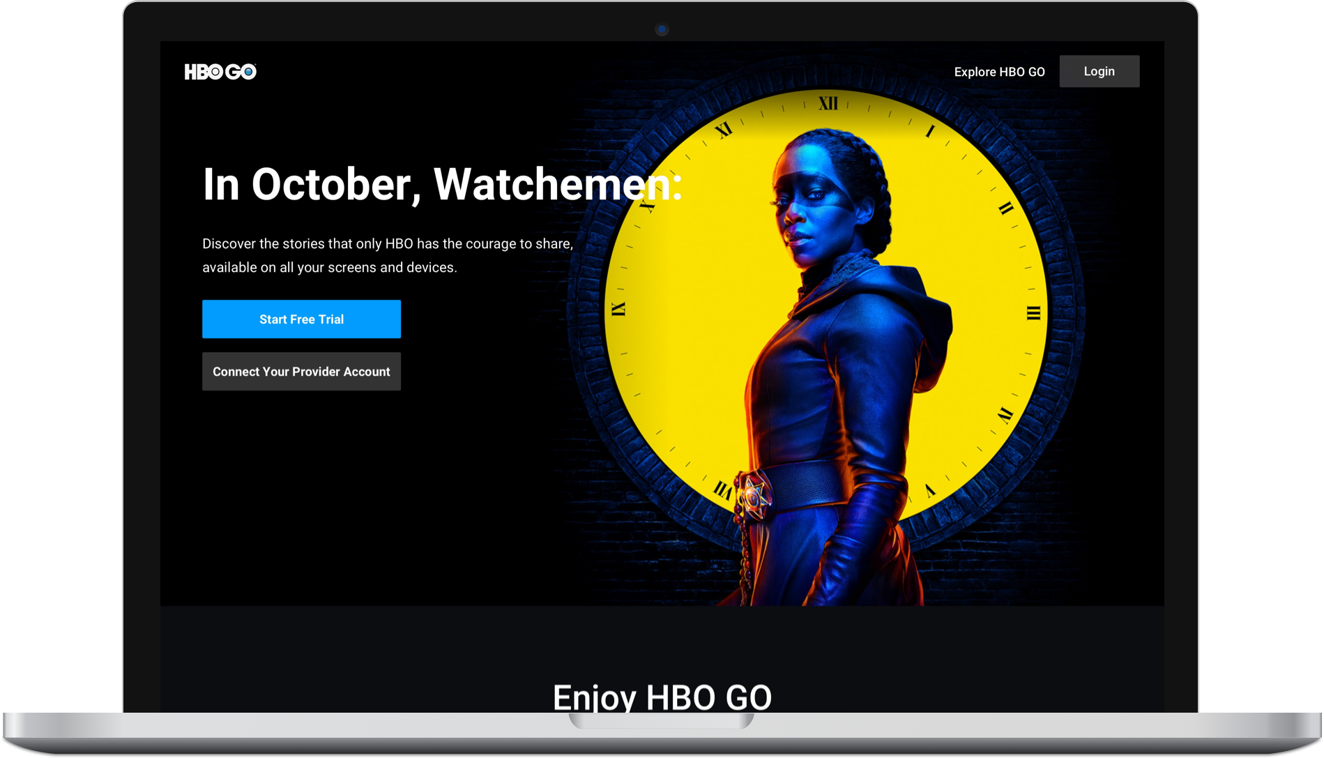
HBO GO Paywall
UI/UX Designer
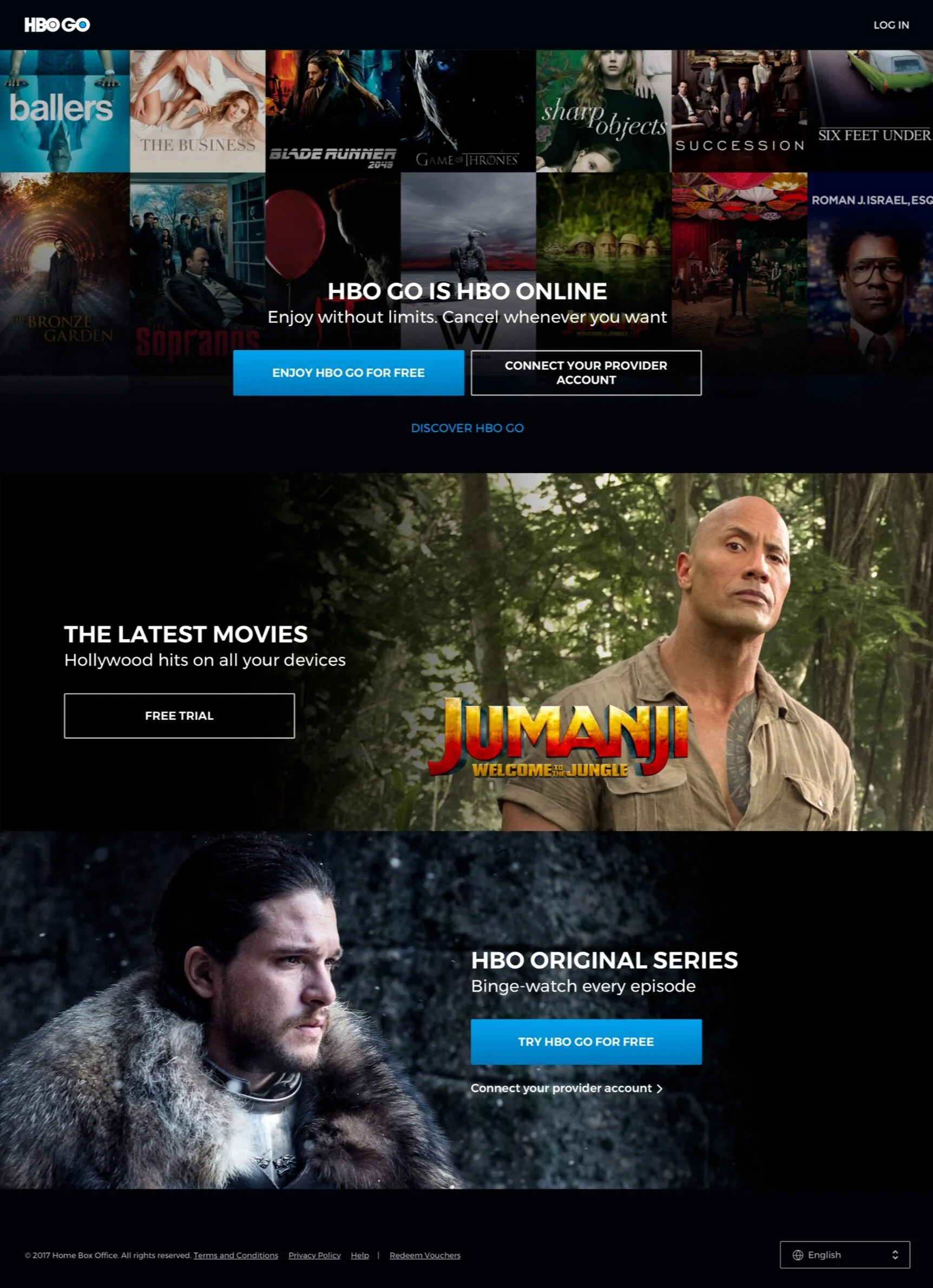
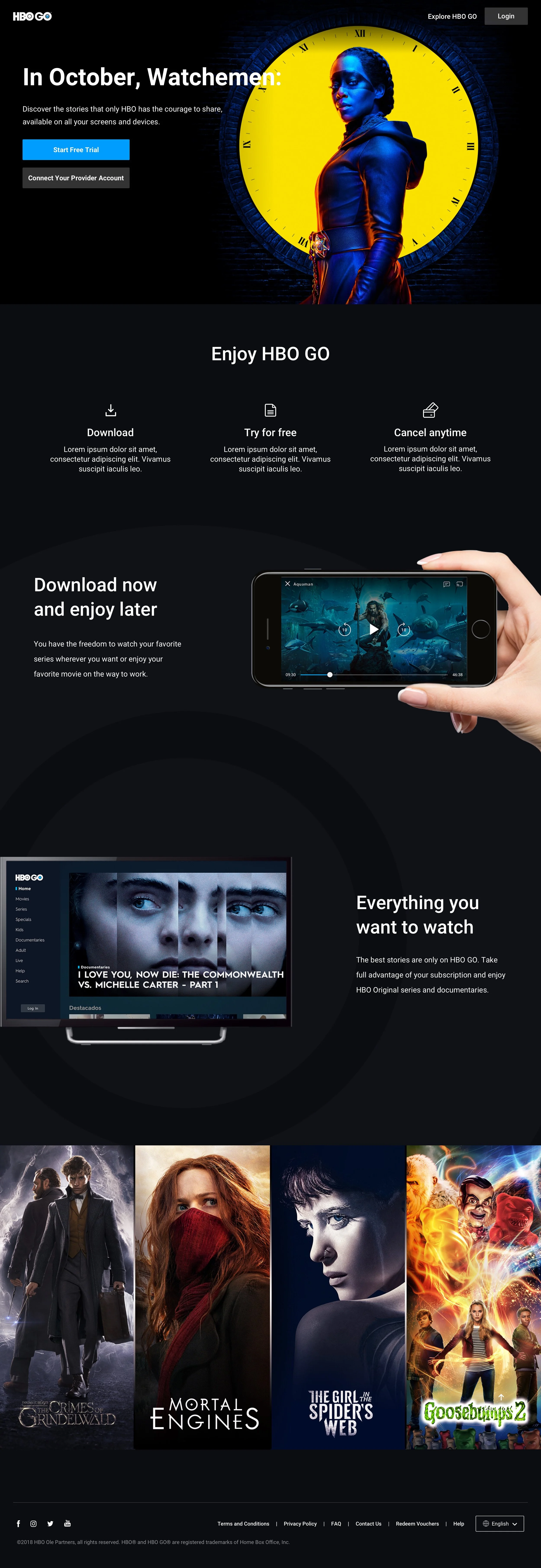
We noticed that our paywall was only showing content. HBO is known for content, but we believe it’s important to also give users information about features and pricing.
The problem
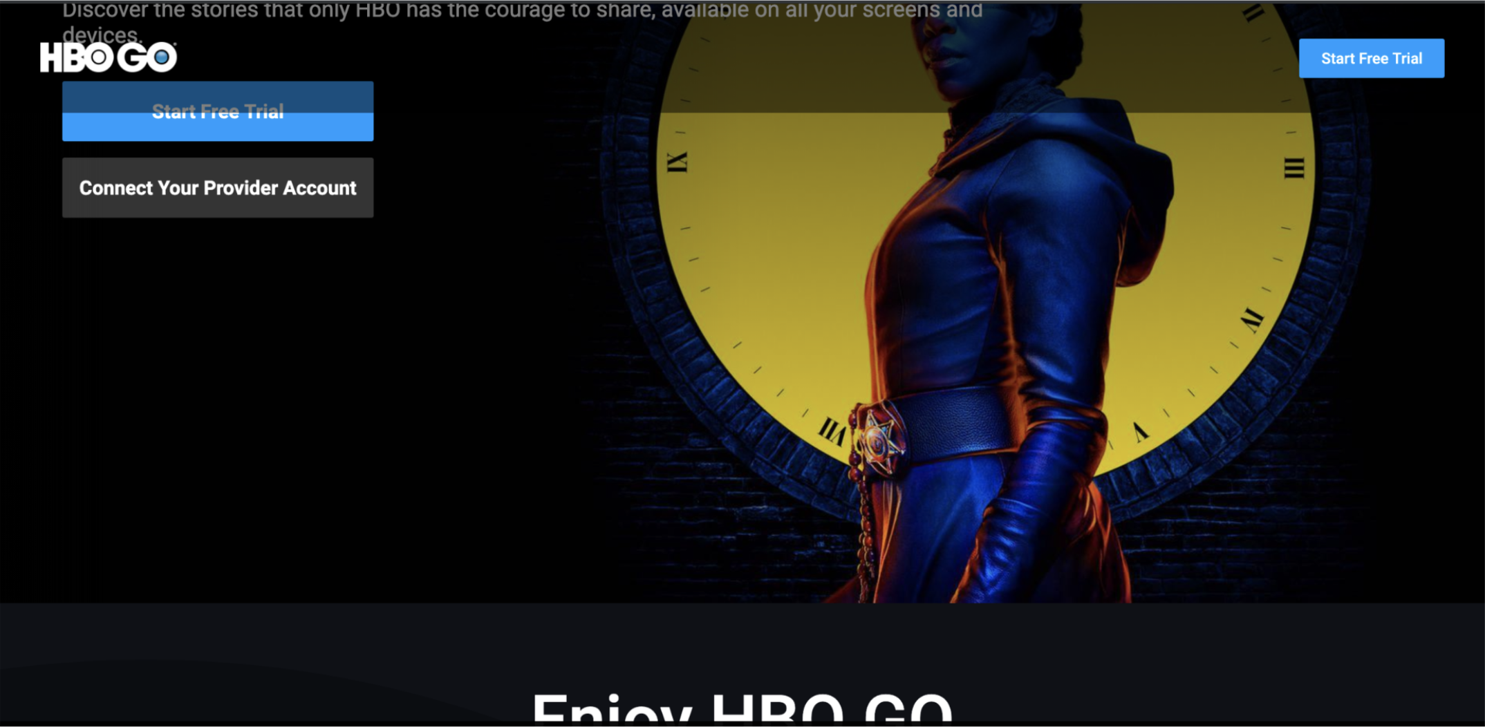
The paywall page was not responsive, so some users had difficulty getting login in and other buttons.
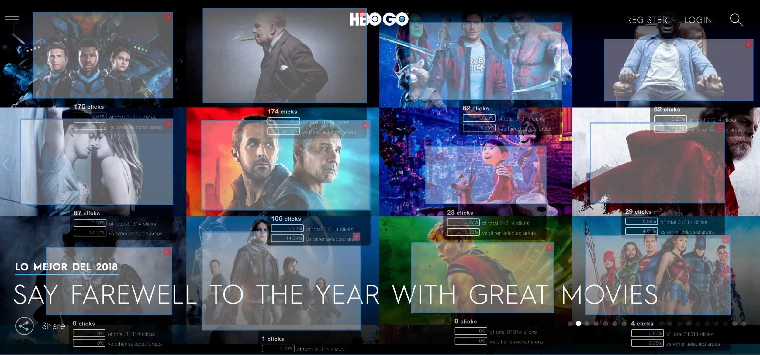
Our paywall was using a grid image that highlighted user behaviors. After viewing a similar page that displayed a grid image (see below, left), we observed that users attempted to play content by clicking on non-functional images.
Research
Learnings
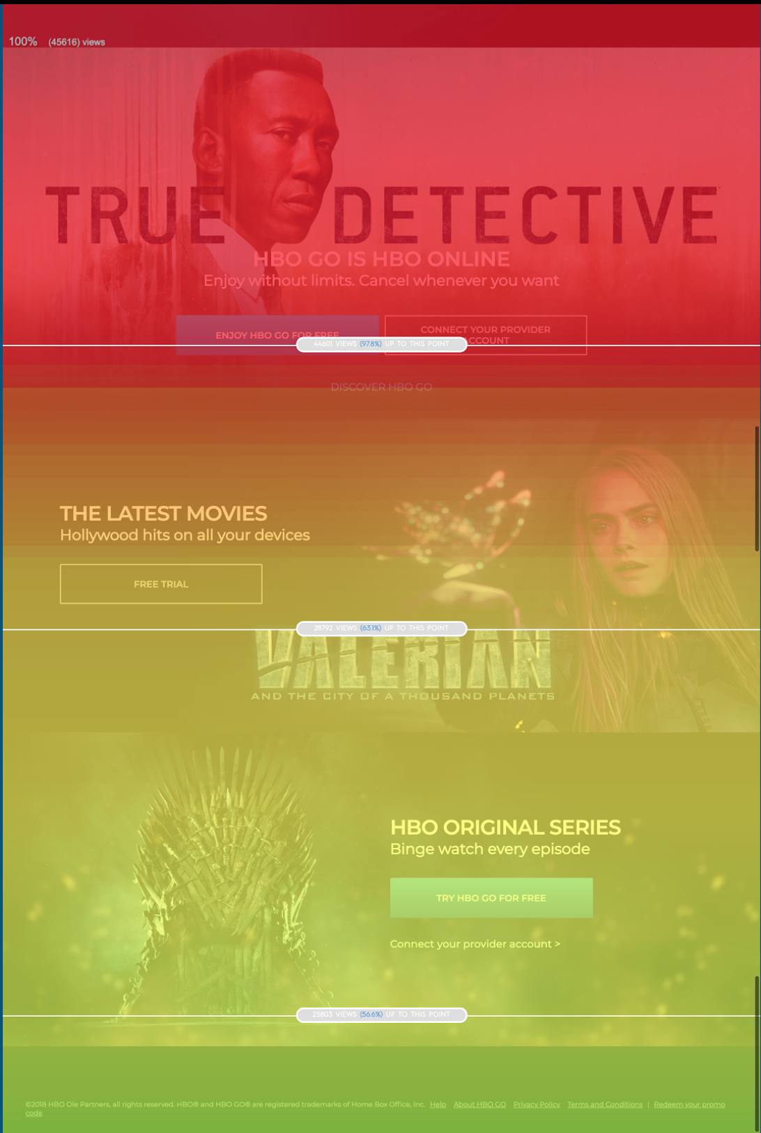
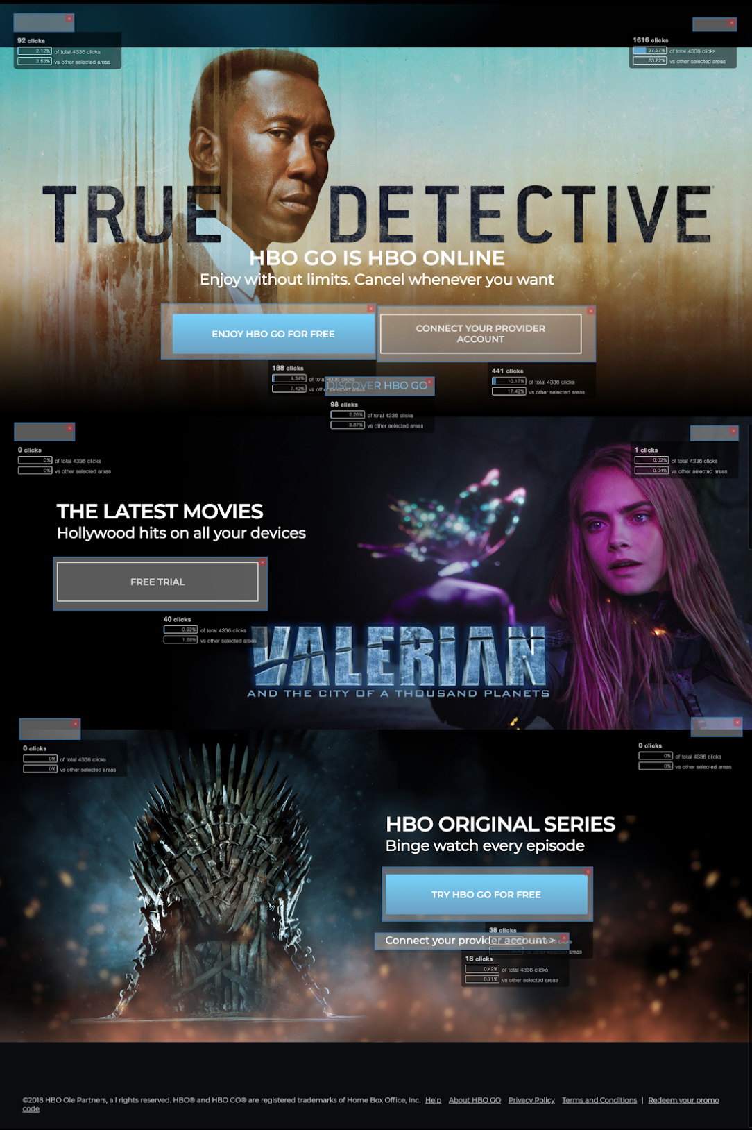
What we learned from analytics: new users were not scrolling all the way down to see all of the information, and were not clicking on the CTA’s in each row.
Users want to learn about the type of content they can watch
Features are important to list, ie: Downloading, Background Play, Original Media, Unlimited Content
Users want to know about pricing upfront
Users are not afraid of scrolling to read the information on the page
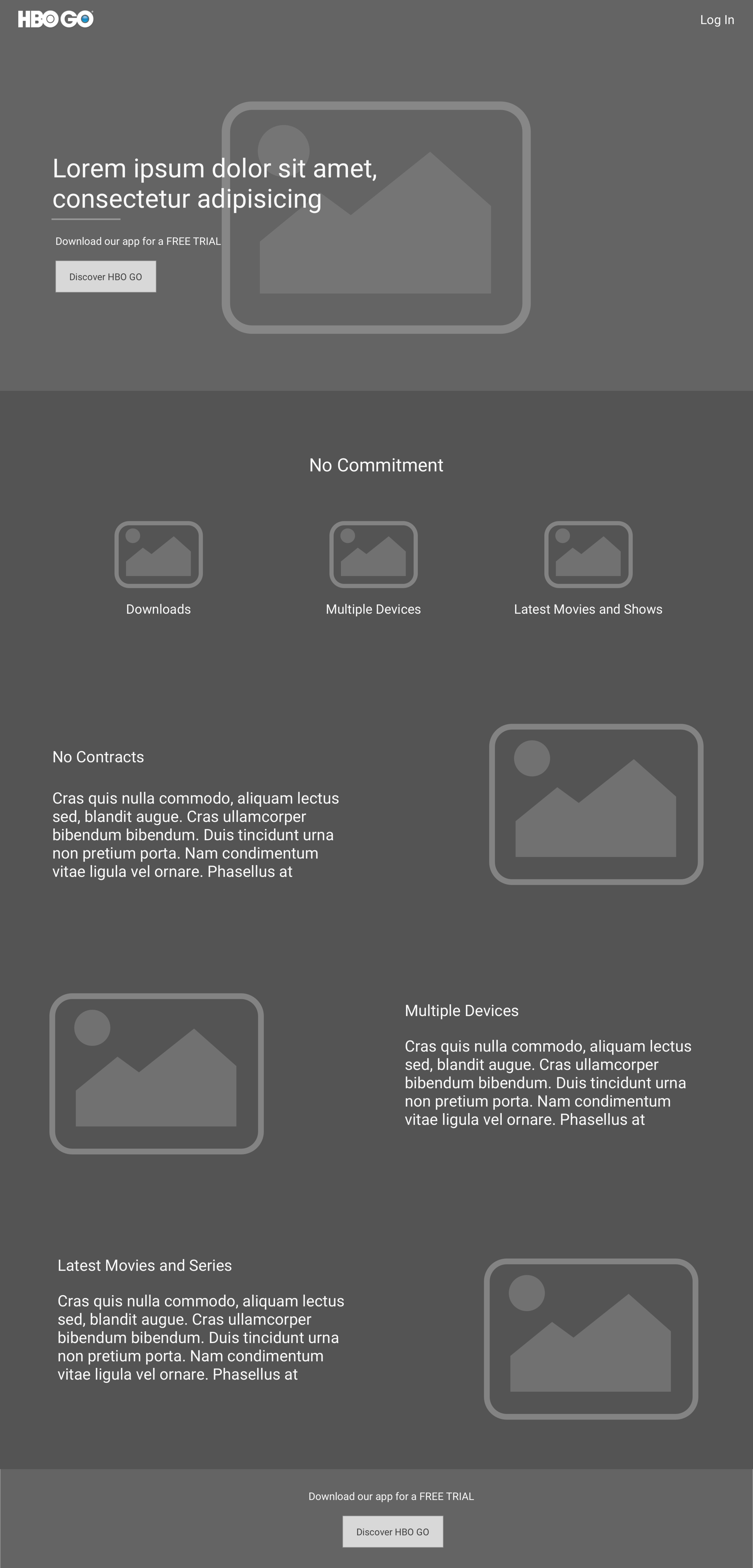
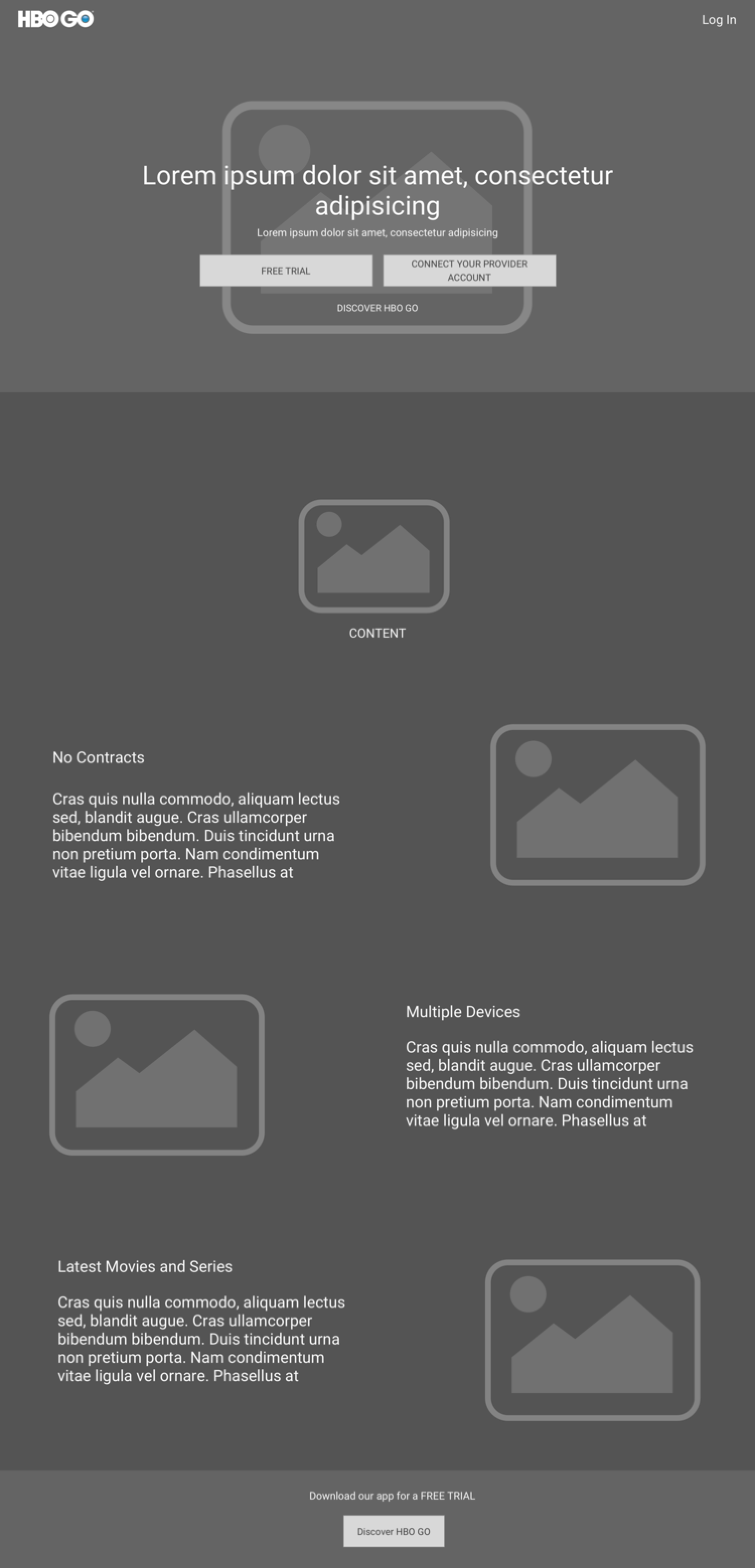
It was brought to our attention that personalized pricing per country would be challenging as pricing changes often and, currently, could not be accommodated on the landing page / paywall. Taking that into account, we started the wireframe process.


