HBO GO Xbox One
UI/UX Designer
Design HBO GO for Xbox One containing a seamless user experience HBO users are accustomed to.
Research
Questions to verify:
Who are our users?
What streaming services do users use on Xbox One?
How do they interact with the controller?
Answers:
Our users range from young teens to mid - 40s
Popular streaming apps Netflix, Hulu, Sling TV, Amazon Video and Pandora
Users interact with the controllers in the following way:
Personas
Learnings
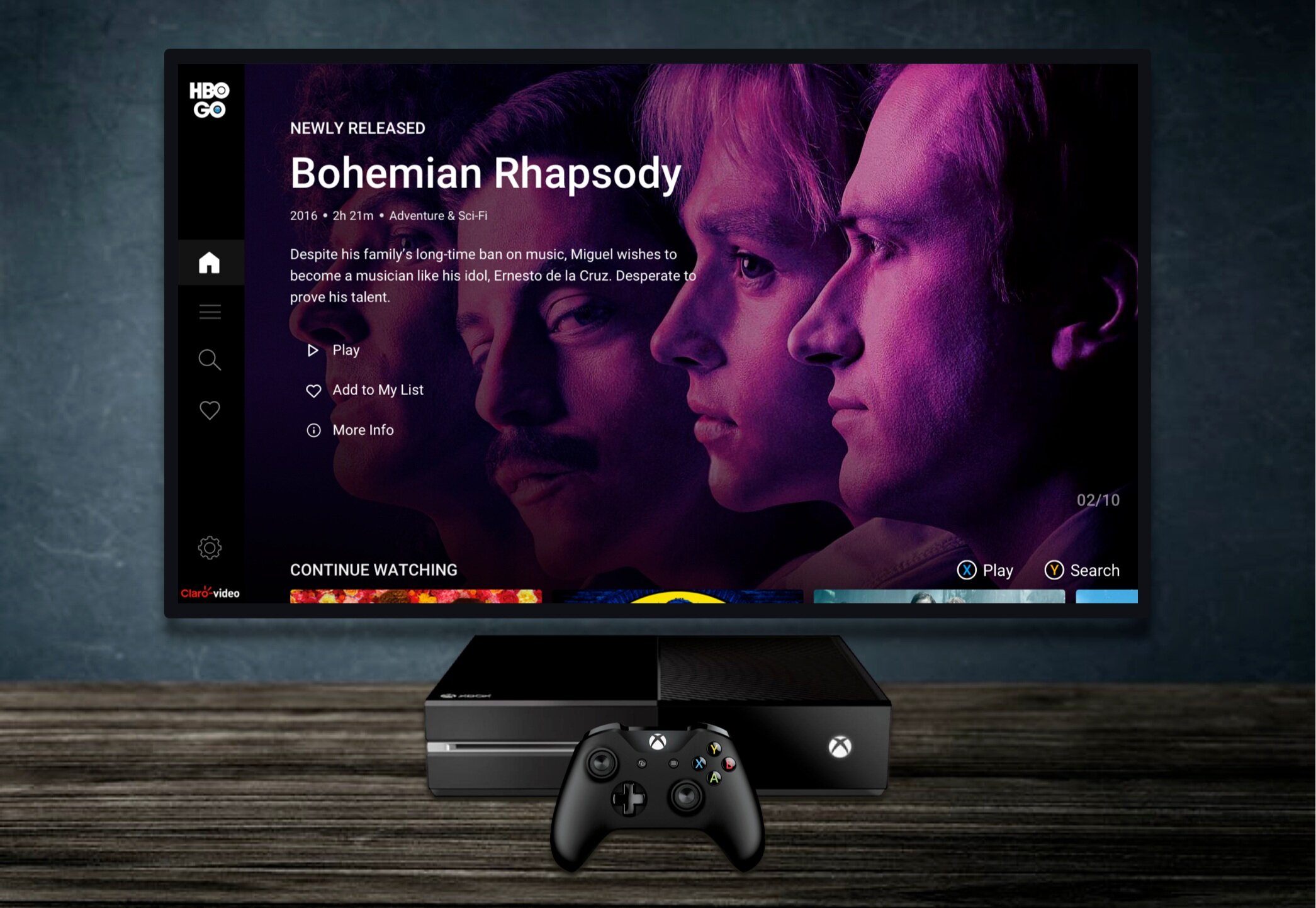
After doing research on our competitors and Xbox style design, we came up with the designs below.
Usability, functionality, and flow are our #1 priorities. We also wanted to make this design feel like part of the redesigns being created on mobile and desktop
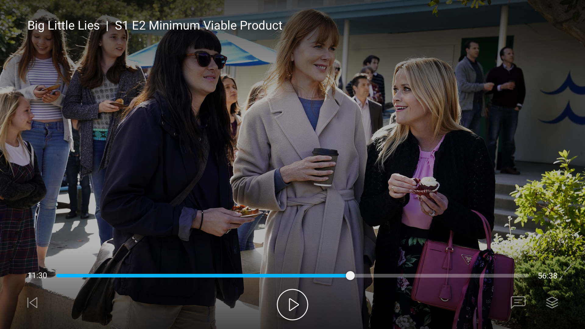
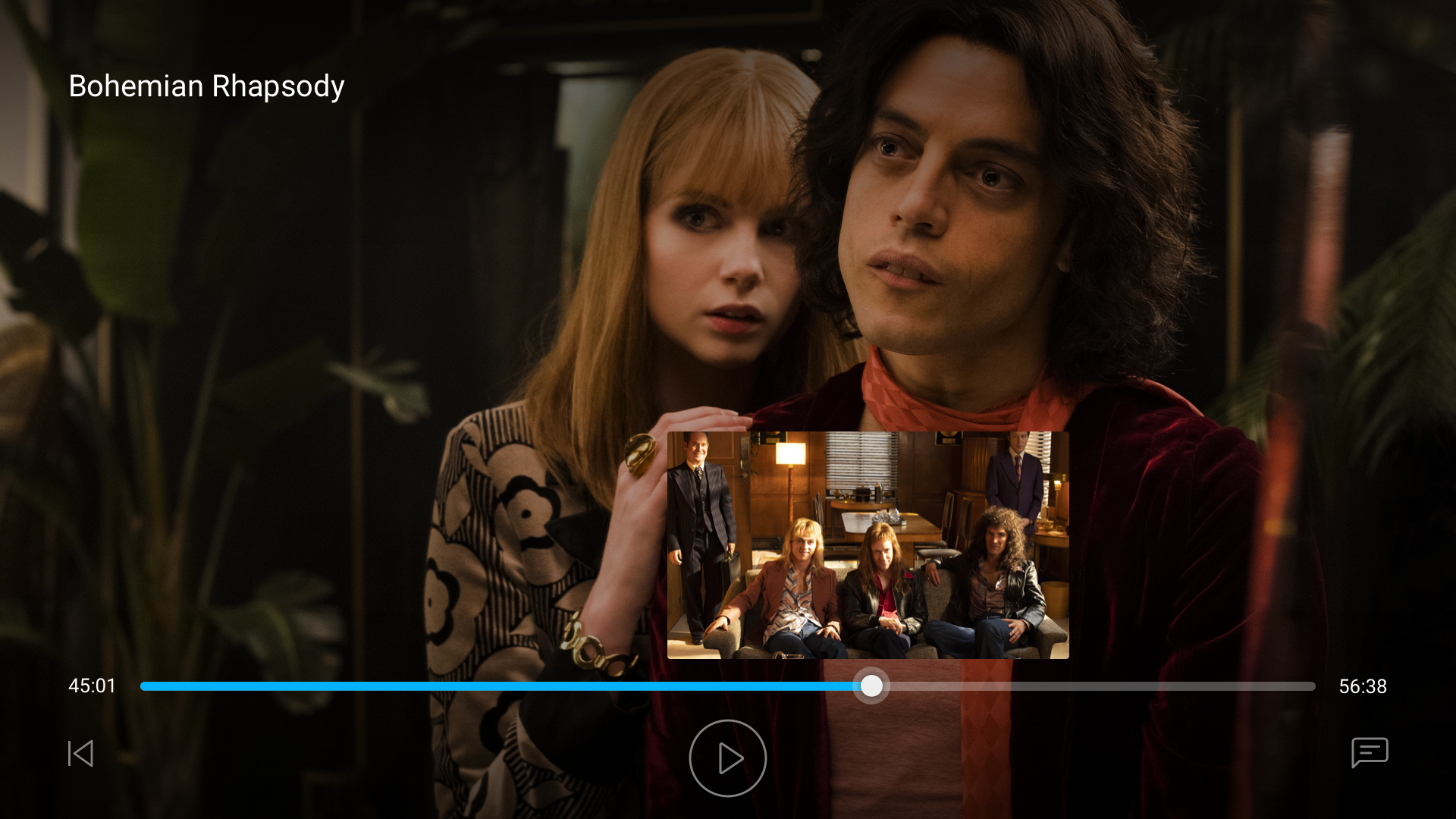
We felt it was important to show controller action buttons on the bottom of the screen because this differs per app. This solution makes it possible for all users to enjoy the platform without having to think twice about navigation
We decided to not have a paywall screen be the first thing that shows because we want users to just right in and view content
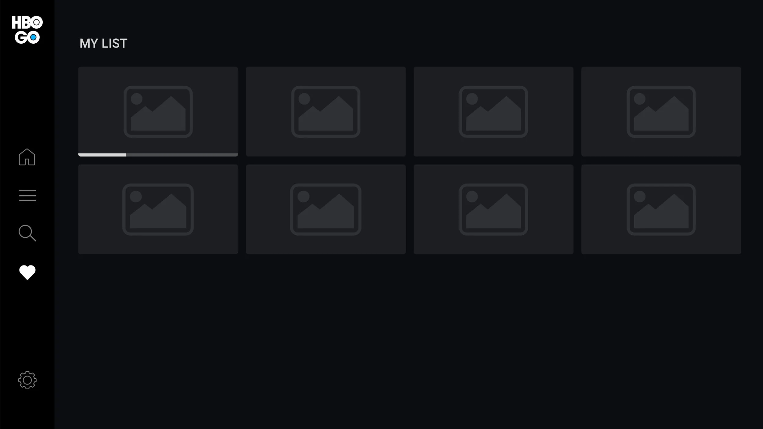
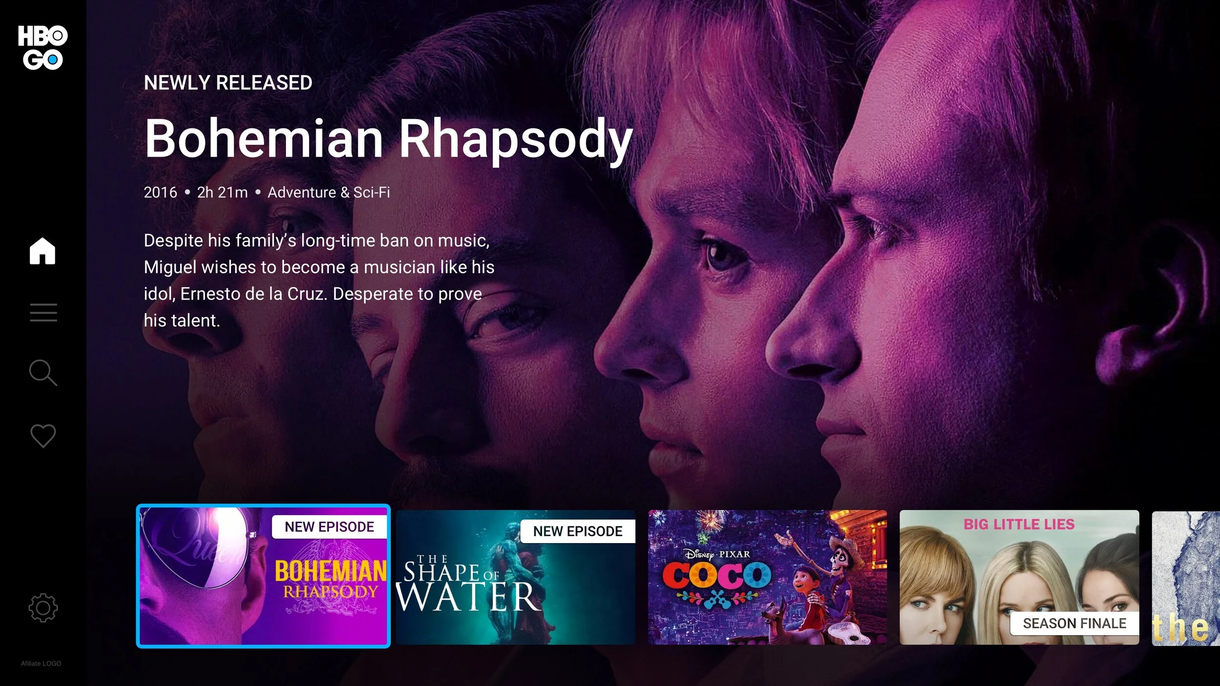
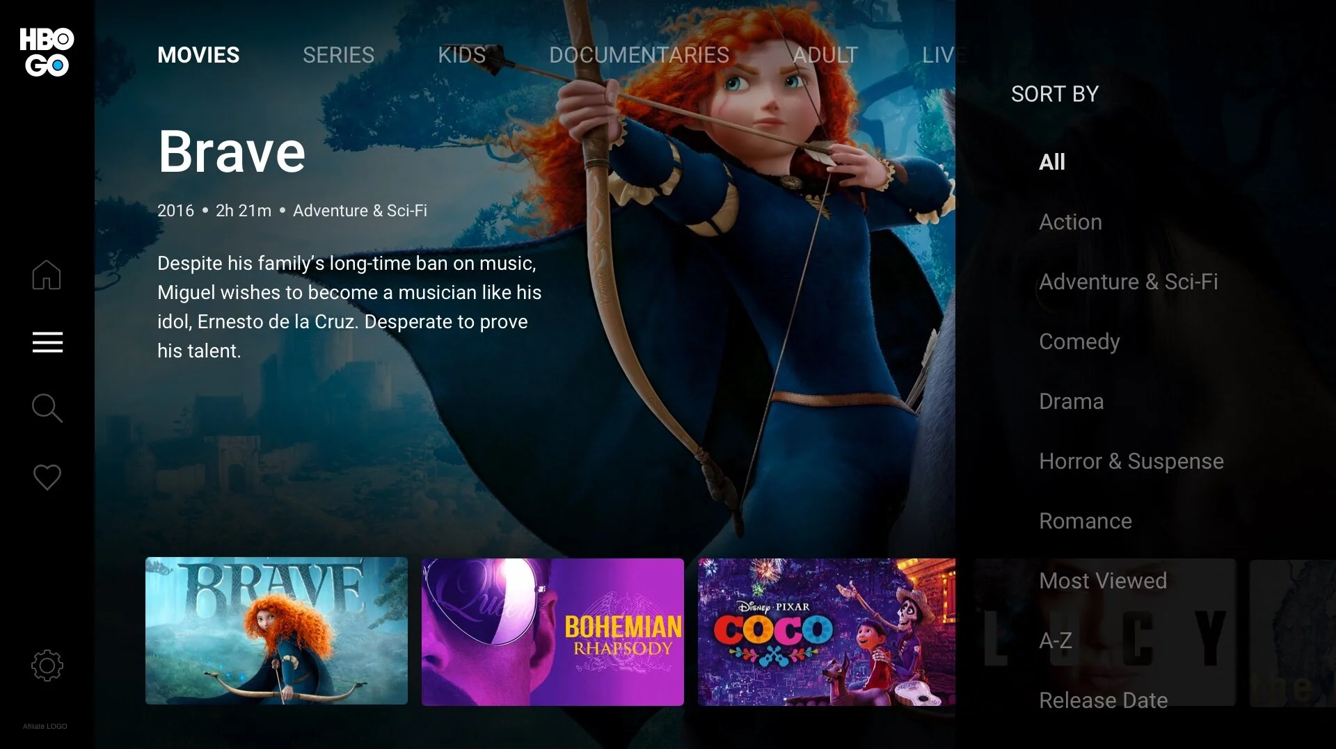
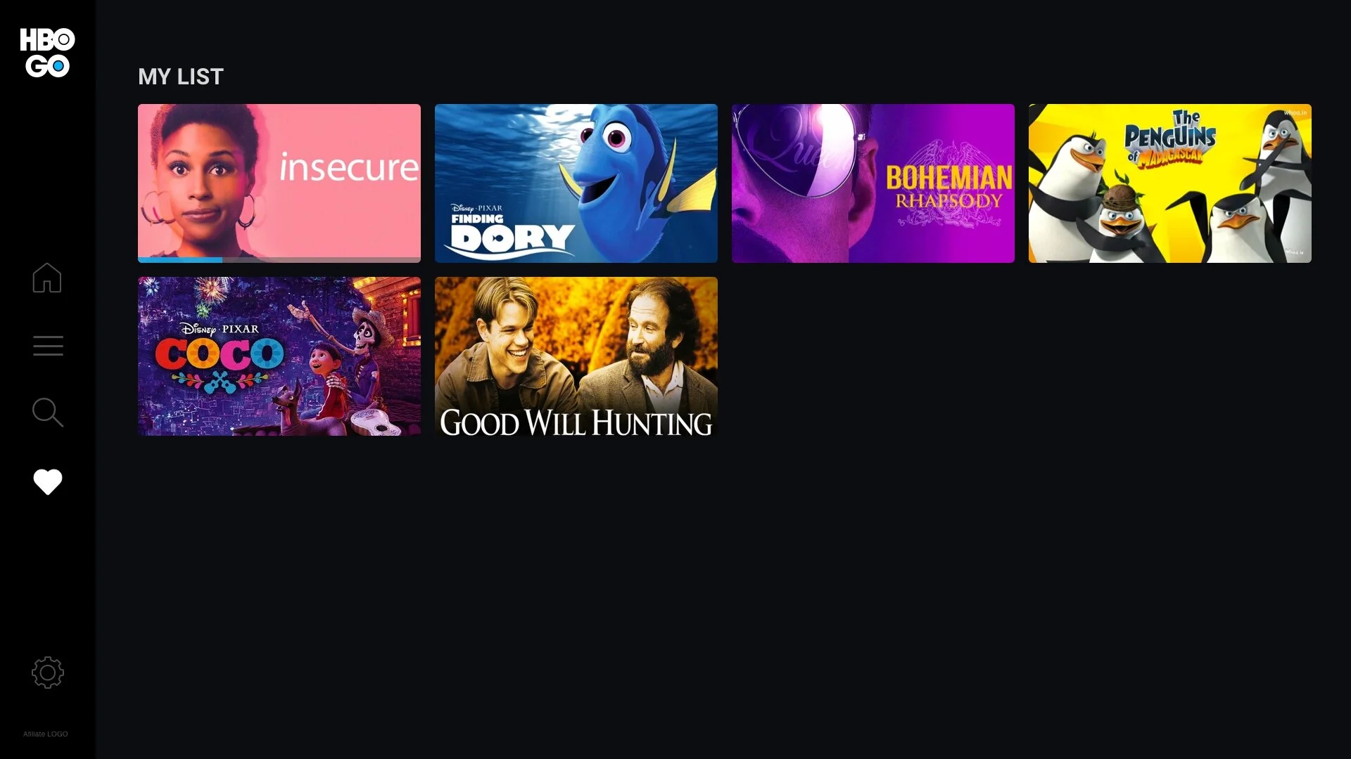
By using a side left menu, we are allowing users to access items easily
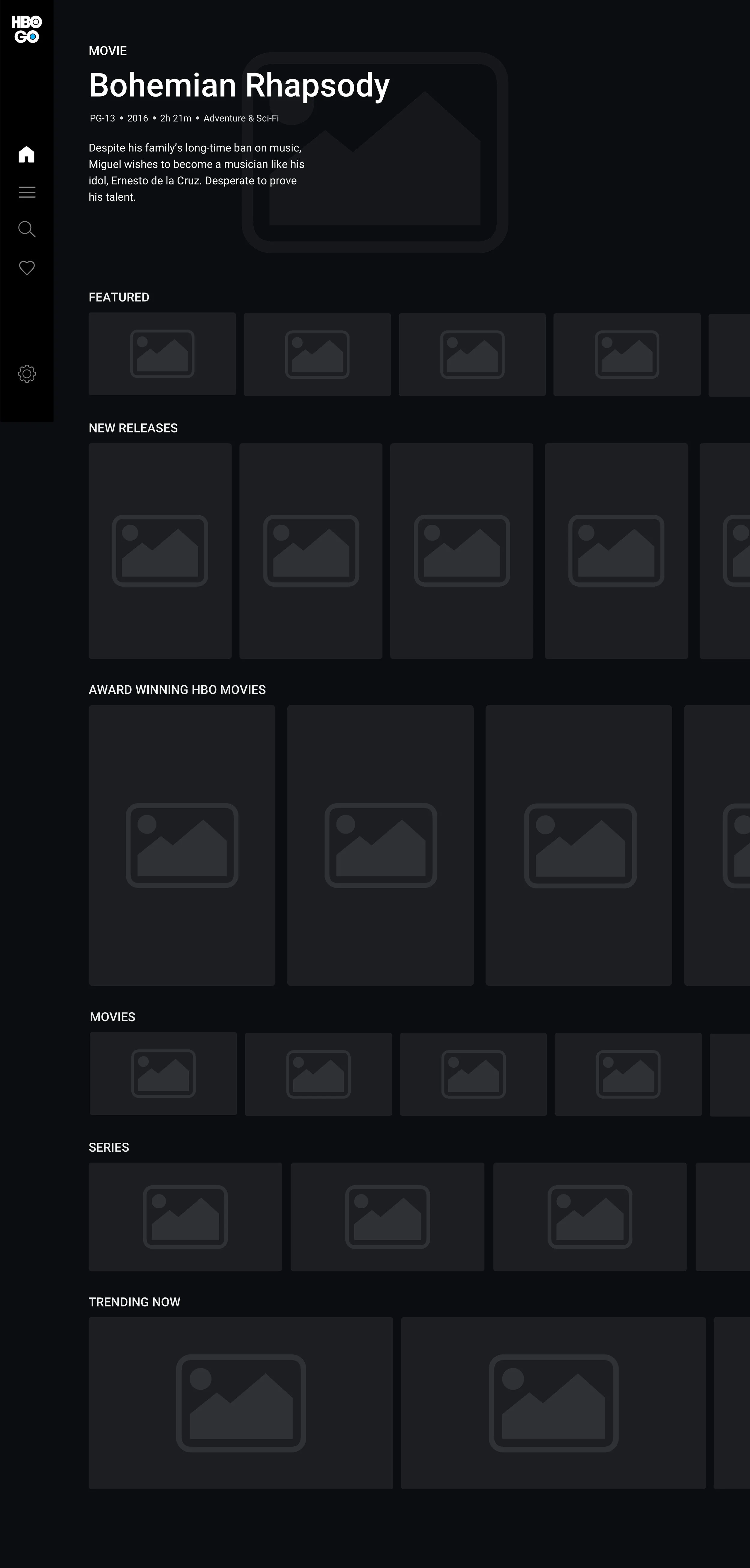
After 5 seconds of hovering on a thumbnail the trailer will show. This is functionality we’ve been wanting to implement on other devices, we had the opportunity to start now. Users will also have the ability to make this full screen
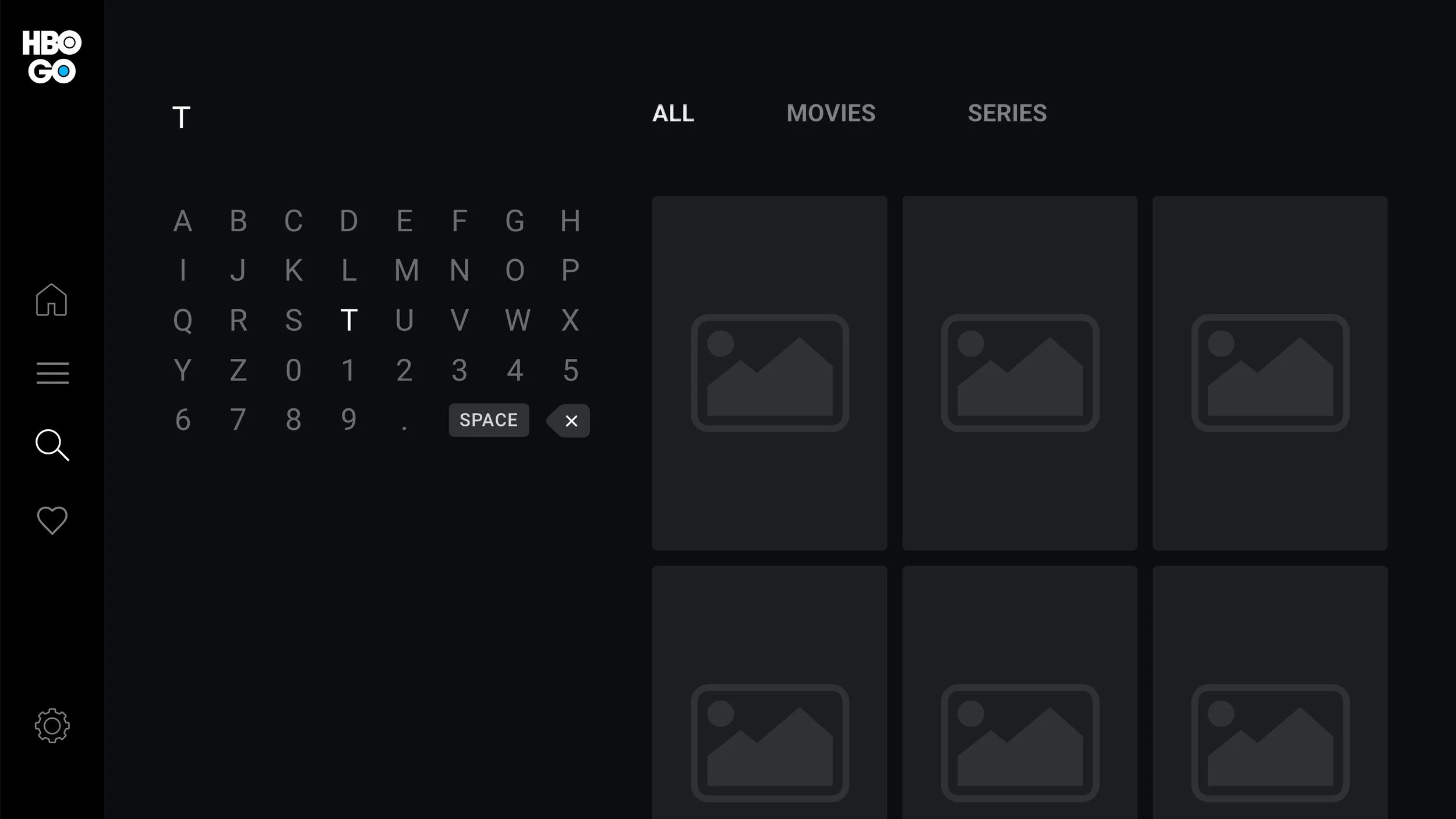
Search is a common functionality users use on our platforms, we decided to make search easier by giving tabs to view content within different categories
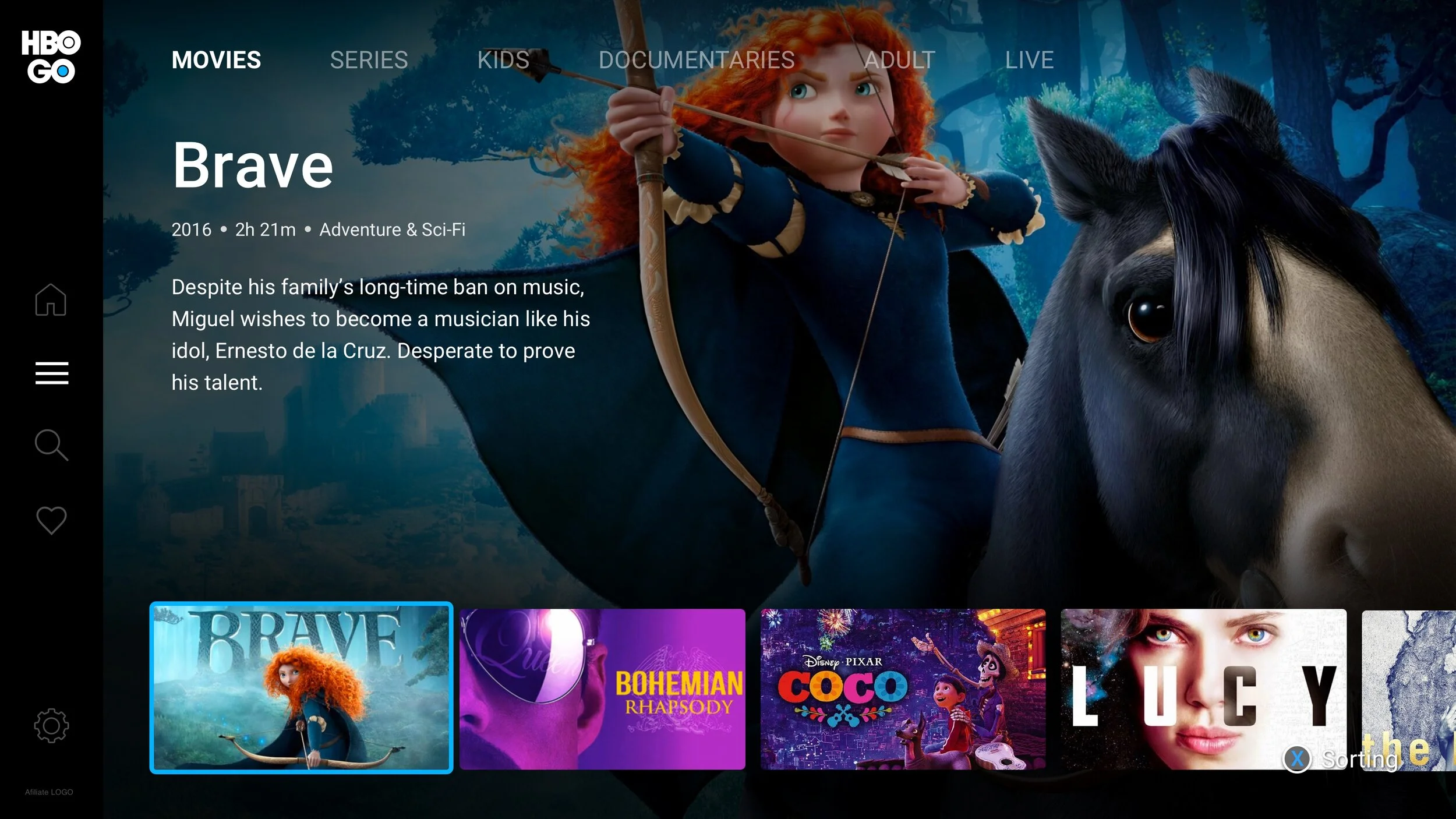
Browse - we wanted to give users the ability to go to different category pages and filter even further
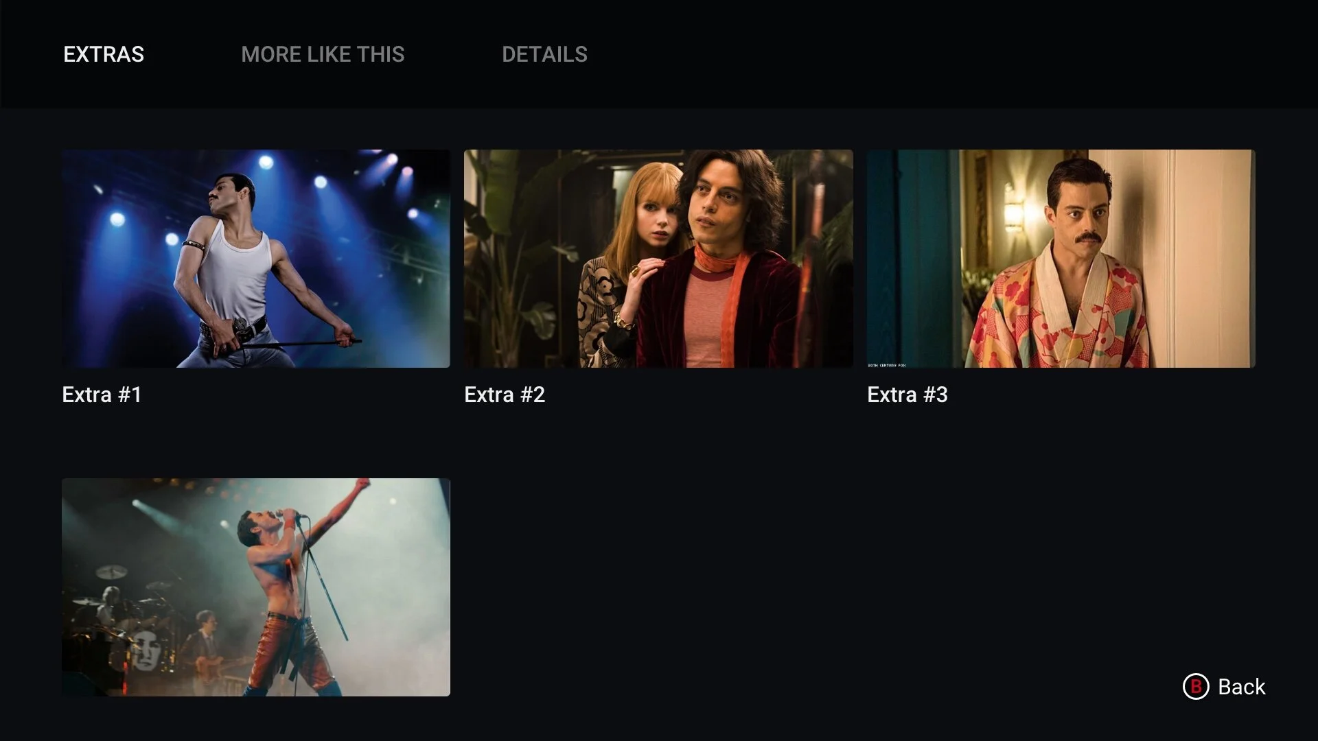
Want to view more content? No problem. There is a “see more” thumbnail that will take a user to a grid with all of the viewing content
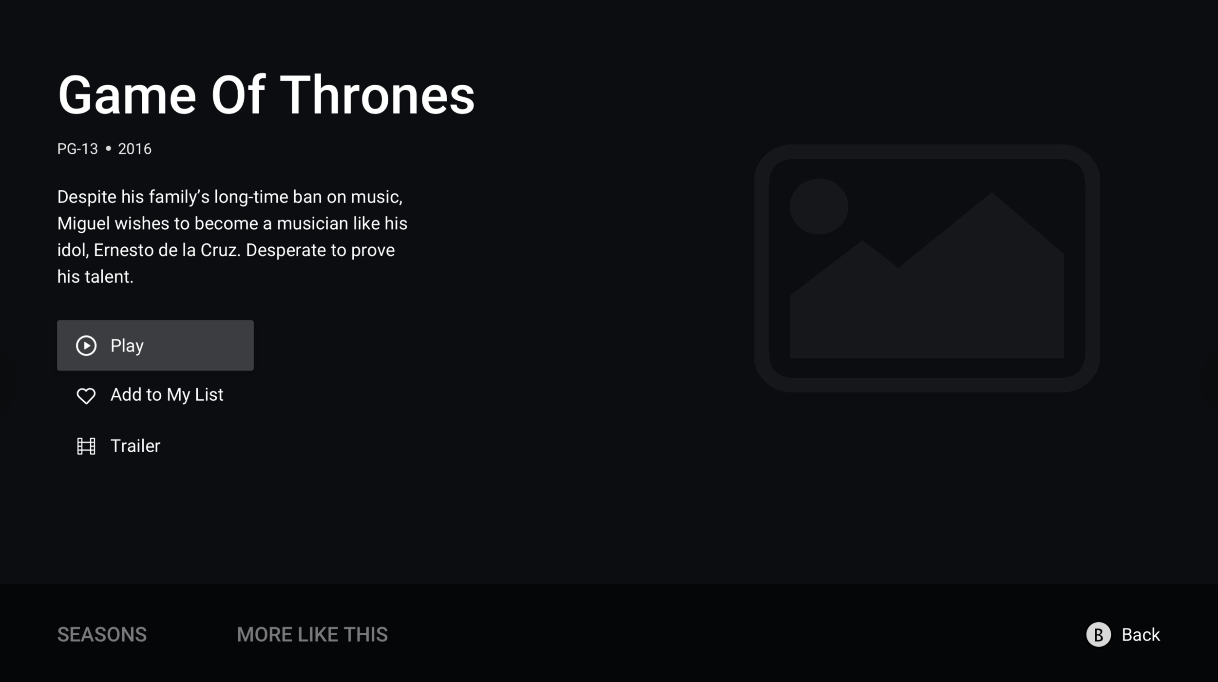
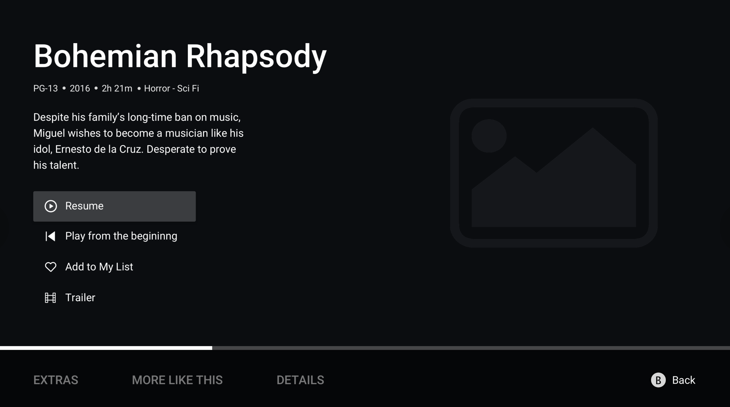
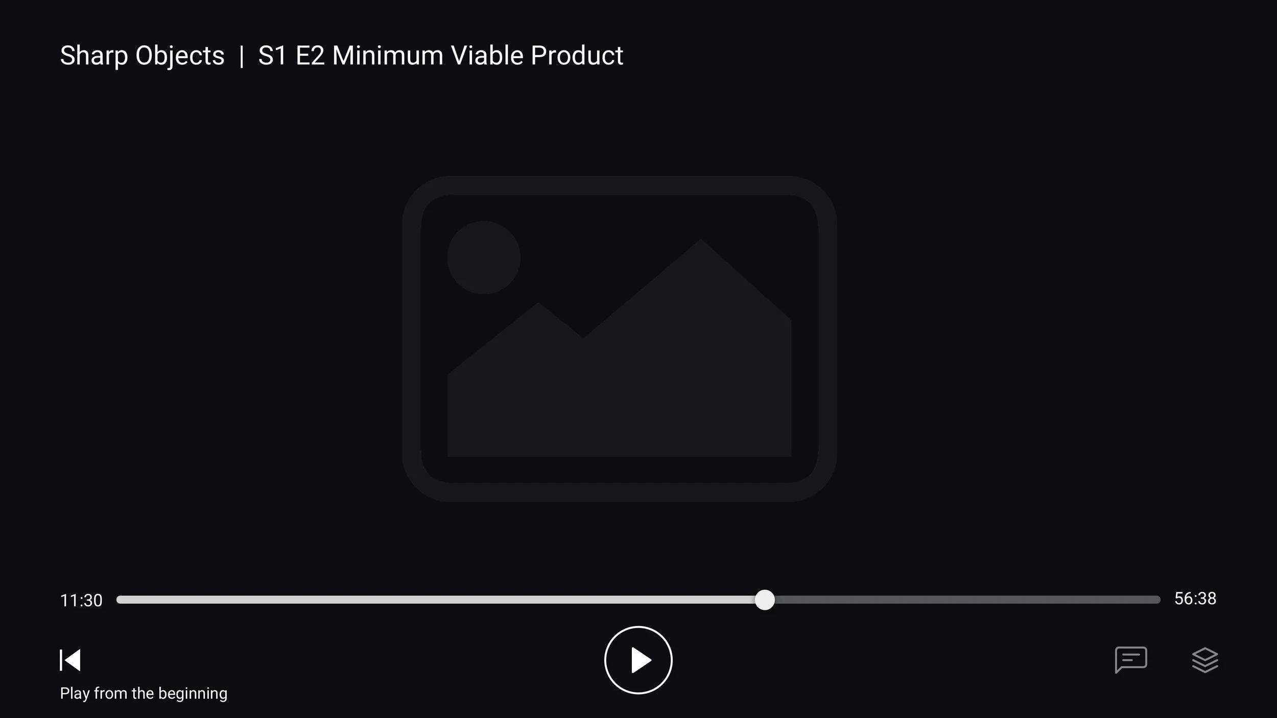
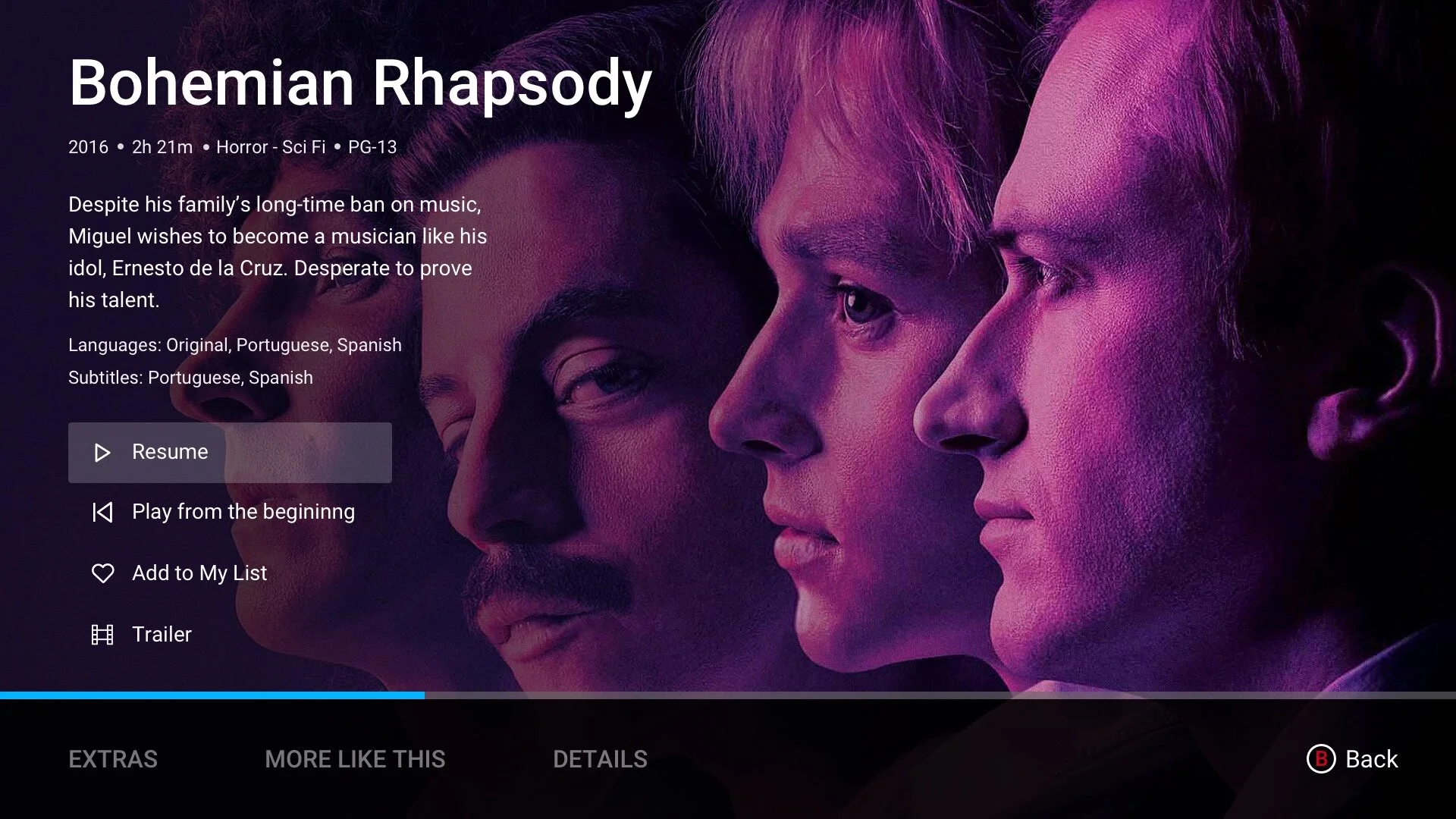
Detail page will show indication of where the users left off, if they have not started
Using as many functionality keypad options as possible to give experts their hidden tricks
Showing visual hints of what the keys on the controller do helps beginner and social users access the pages they want
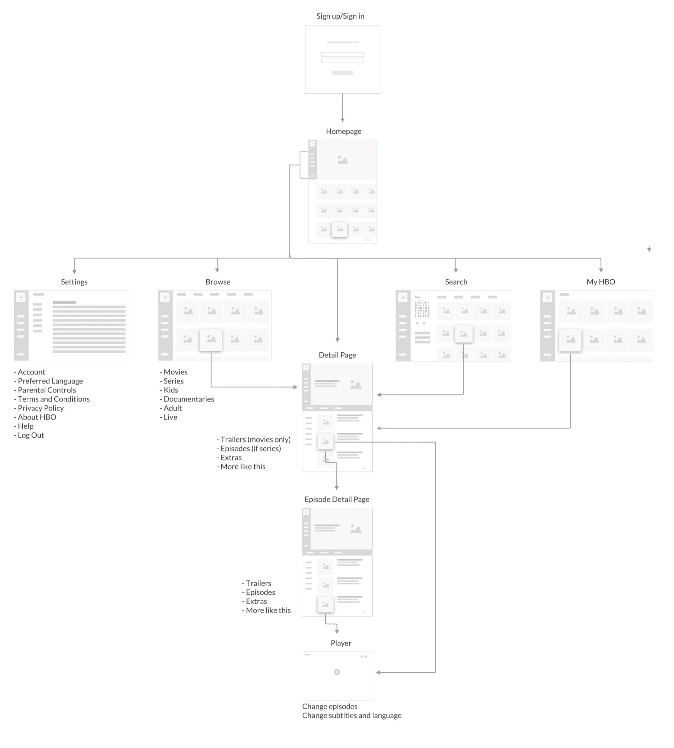
Sitemap
Wireframes
Homepage
Search
My List
Series Detail Page
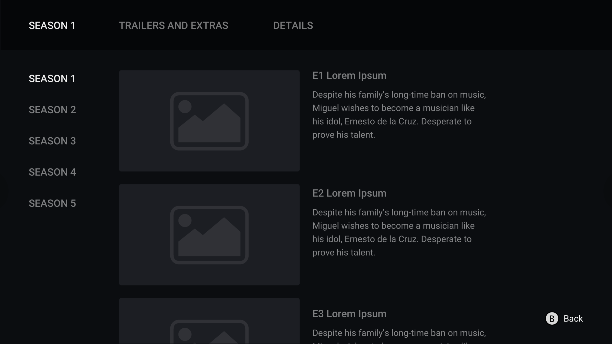
Detailed page scrolled below
Movies Detail Page
Player
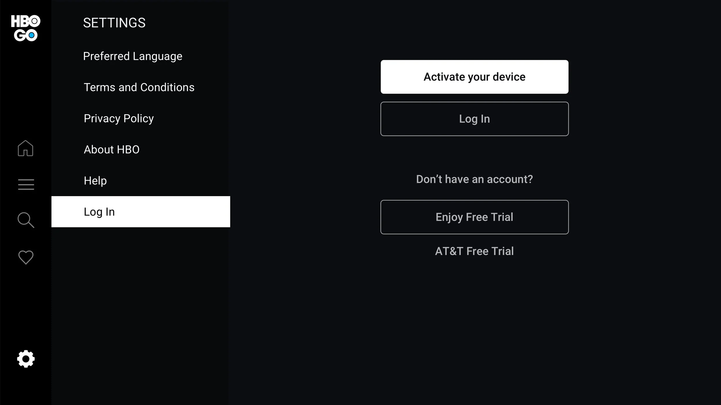
Settings
User testing
We did gorilla testing with xbox users, they liked the application design and functionality.
Liked the side menu, found it to be very accessible
Liked that the full description was shown on the hero
Liked the different thumbnail options
Felt that it was similar to the desktop website and intuitively knew how to navigate
Wanted the ability to have voice commands available
Outcome
Xbox was Launched Early August 2020. In first few weeks had 3k unique downloads and 16.7k plays

