HBO GO Web Redesign
UI/UX Designer
As the streaming industry has evolved, so has the way audiences consume content, and it became apparent that the HBO Latin America website needed a redesign to keep up with the times and competitors.
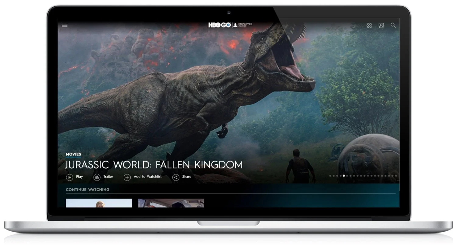
Current design
Questions
How can improve this design and become leaders in the market?
As a result of the heuristic evaluation of our design and UX, the following questions were raised.
Why does the desktop platform use a hamburger menu? Typically used on an Ipad / Mobile design because space is limited.
The website isn’t responsive, how are users working around this issue?
What does Person Icon mean? In most instances, the Person Icon means profile. On the website, this was meant to communicate "My List and Watchlist” This wasn't clear to me or to others on our team.
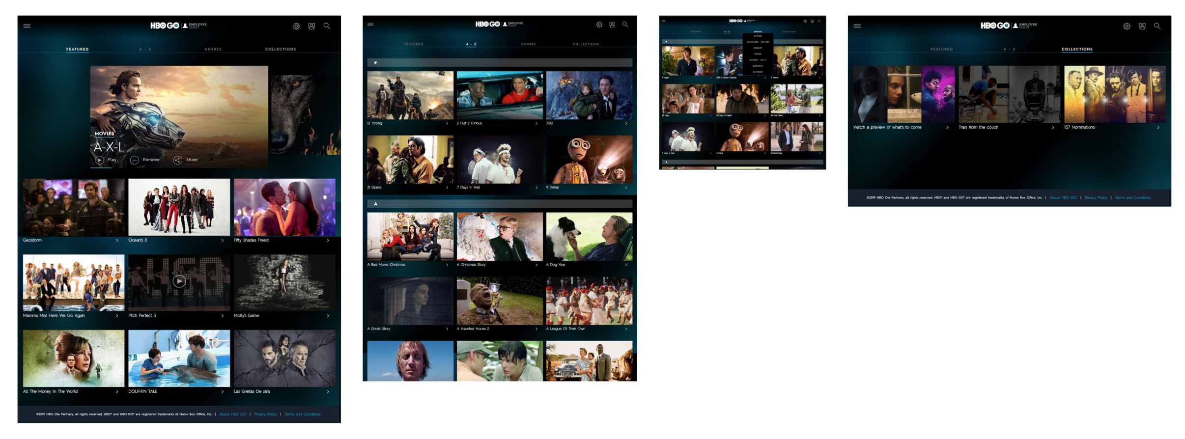
How do users respond to the category page layout? The current design does not allow the user to select the hero image on the category pages. The way the thumbnails are laid out are on desktop prompted me to think that this could be hard to consume and navigate.
How do users navigate A-Z? The webpage does not have an option to scroll to a specific letter so users need to scroll down the entire webpage to get to their desired letter.
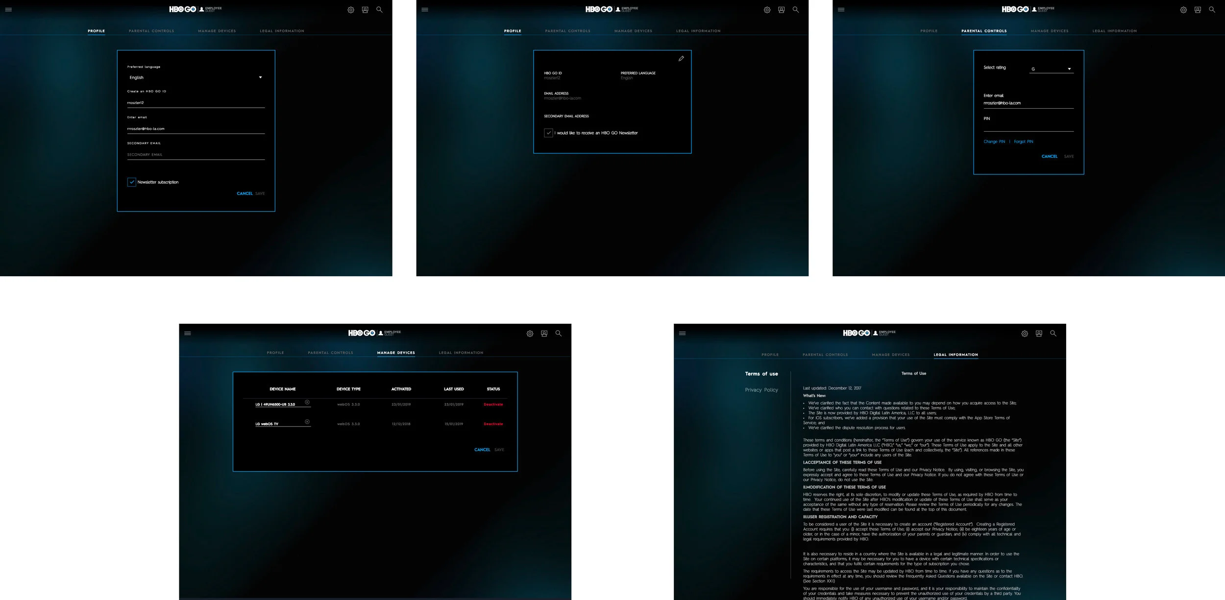
Do users understand what the pencil means when they want to change items on the page? Currently, the only way to edit settings, My List or Watchlist items is to select the pencil and edit.
Do users share content? Is this button being used on Desktop? If, not this needs to be reevaluated.
How does our target find the content they would like to watch? Are they using My List, Watchlist, or Search?
Where are they learning their data from? This helps us develop the look and feel of the site, and build a strategy that reflects their behavior, so we can bring them to our website.
Is it clear how to navigate the website?
Research
To capture feedback and direction from our users by testing the current website. This research serves as a benchmark that will enable us to direct our efforts to improve the website.
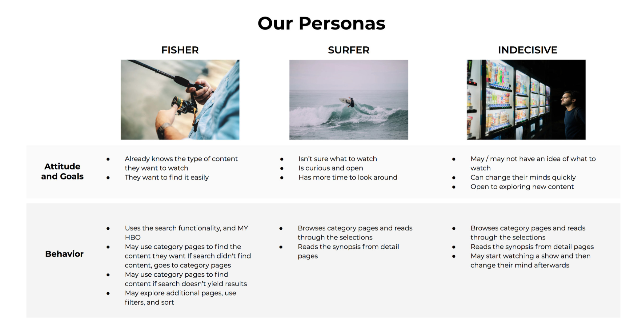
How does our target currently find desired content?
How do they navigate through the website?
Key learnings
Usability Insights:
Users struggled with navigating the website on smaller resolutions because the current website is not responsive
Users have a difficult time navigating and watching content when the website does not fit their screen. As a result, users leave the website
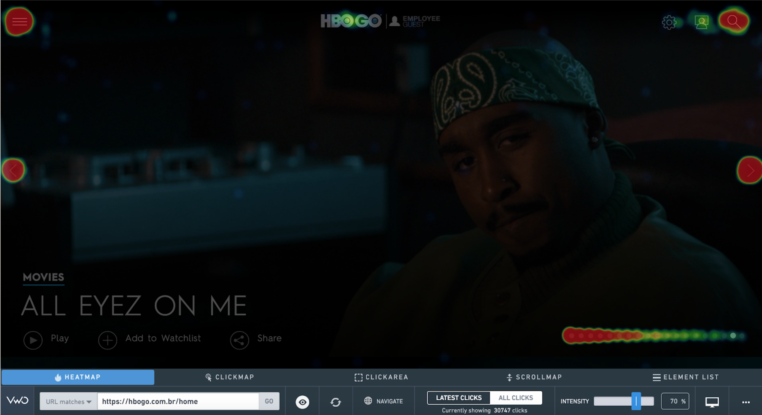
The bounce and exit rate are pretty high. Users are struggling to navigate the website to find the content they like
Users are primarily playing content from the homepage after they click play on the description
User are only viewing up to 5 hero images on the homepage
Users split their time between search and going to categories
Users spend a lot of time using the search functionality, vertical scrolling requires users to work for their content - users are getting frustrated and leaving
Users are spending too long on the Search page
Majority of users do not share content on desktop
On average, users spend too long scrolling down to find content. Users will then check another section or leave the platform
Users did not understand how to use the pencil in Setting and My HBO to edit
Users currently have a difficult time editing and changing settings. User are spending longer than average figuring out how to change their settings and manage devices
Users thought Setting pages were pop ups
Users did not have enough content on the homepage and were forced to go into detail pages
It takes users a long time to scroll down this page. Users either scroll down to find what they want or give up and leave the page
On recent heat-map a large number of users did not use the A-Z scrolling to the best of its ability.
Recommendation
Total website redesign, with updated code that will provide the opportunity for A/B and multivariate testing, in a manner that satisfies the different consumer needs across all platforms.
Ideation
Brainstorm Session:
The UX and UI teams were tasked with a redesign facelift. The majority of the functionalities would need to stay the same. Our teams spoke about how we can solve our users’ needs.
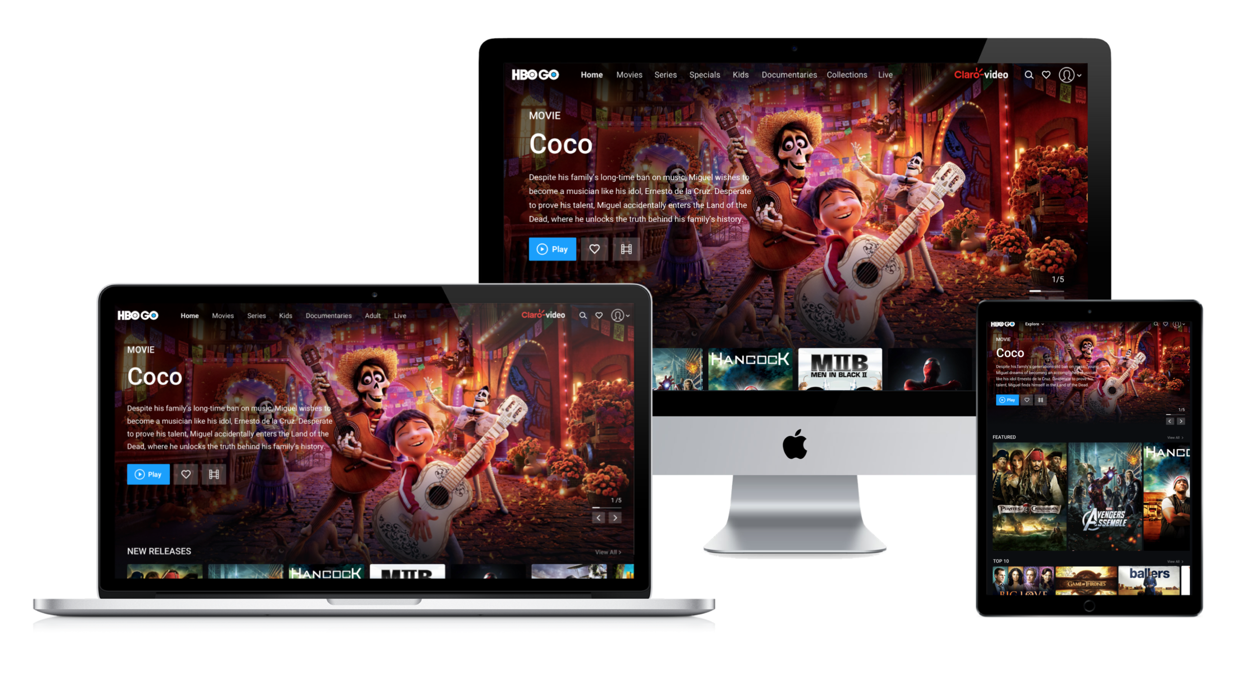
Responsive website to solve all users screen needs
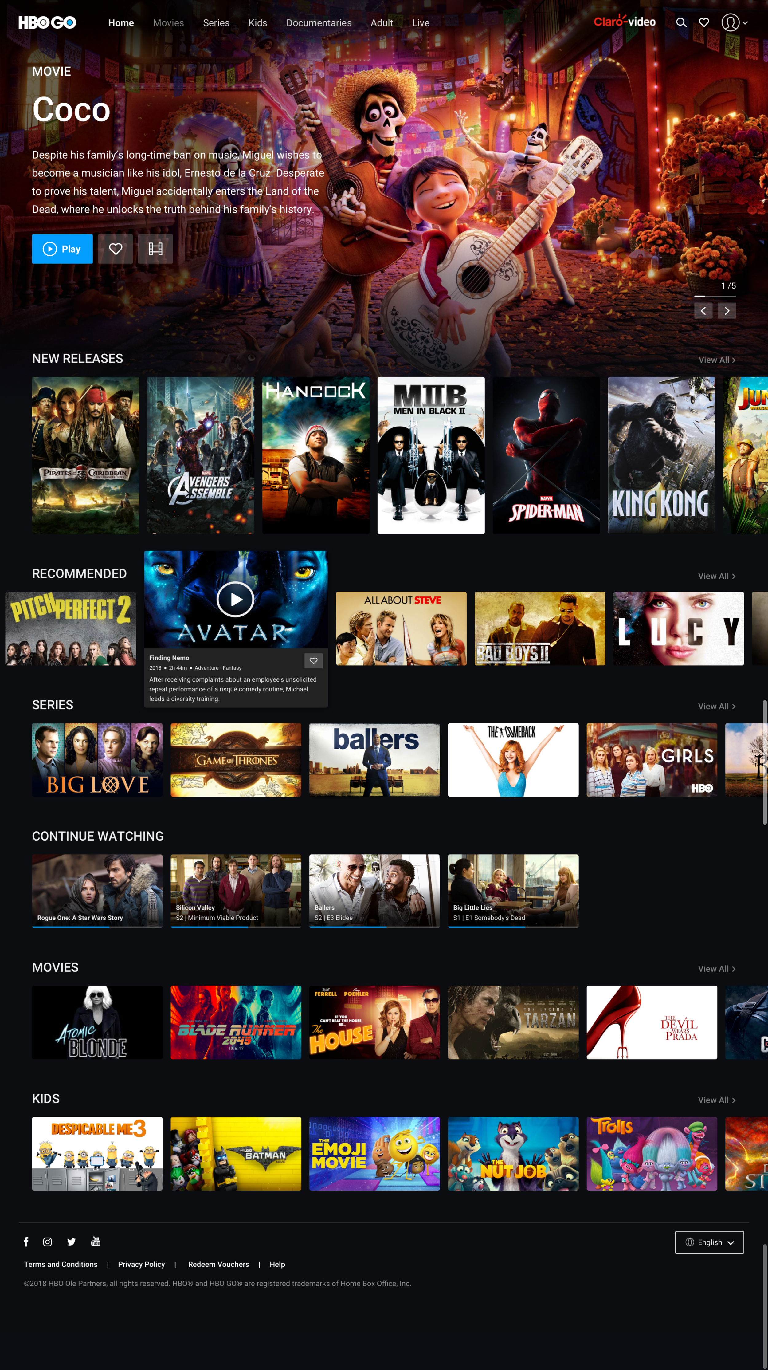
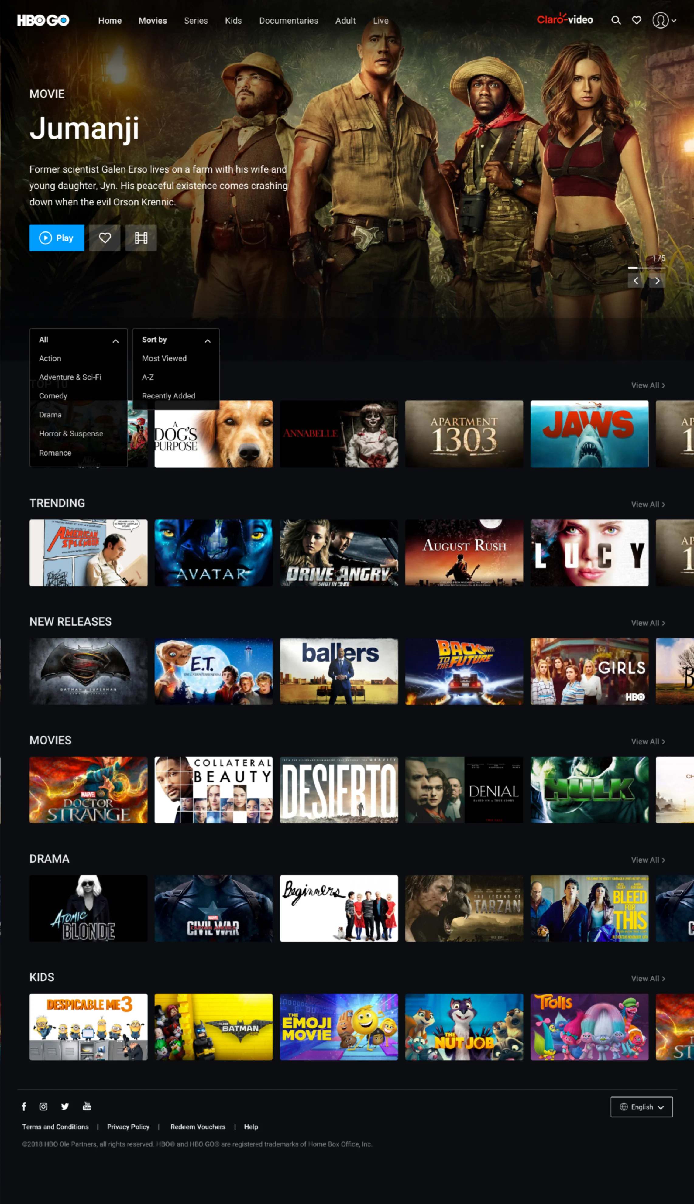
Top nav bar for easier navigation. Making the carousel the main attraction. We cleaned up the hero locations to display the content better
Description and ability to play from the homepage removes the need for unnecessary clicks. It’s intuitive to click the thumbnail to play
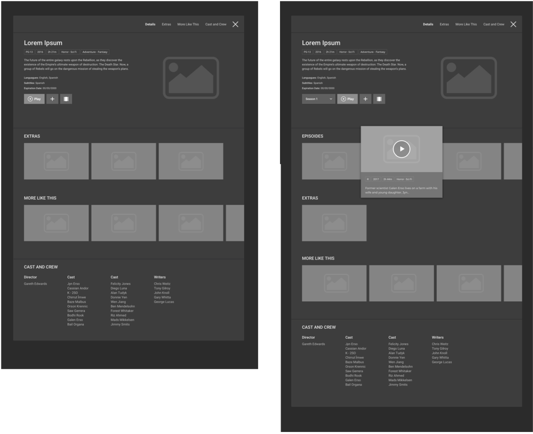
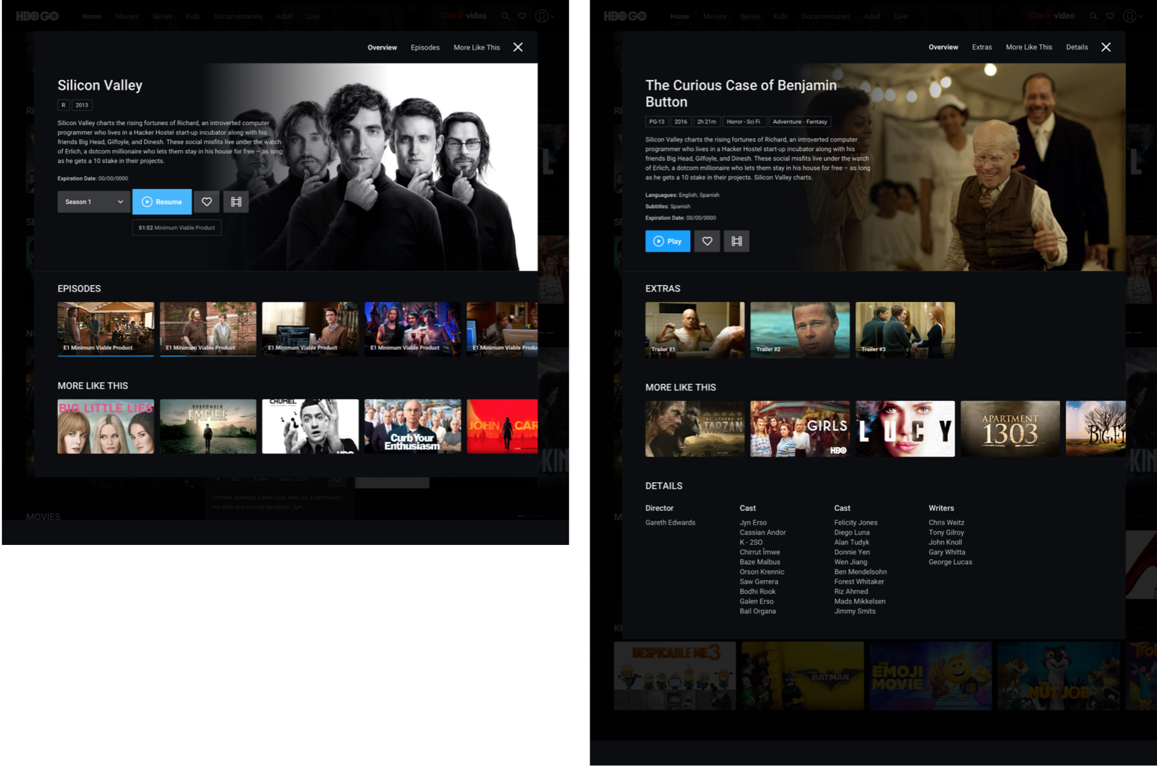
Users can play episodes, trailers, and extras without leaving the page!
Continue watching the carousel on the homepage
Add more carousels on the homepage so users don’t have to leave the page
Detail pages display on overlays/popups to facilitate navigation, while still displaying all the relevant information
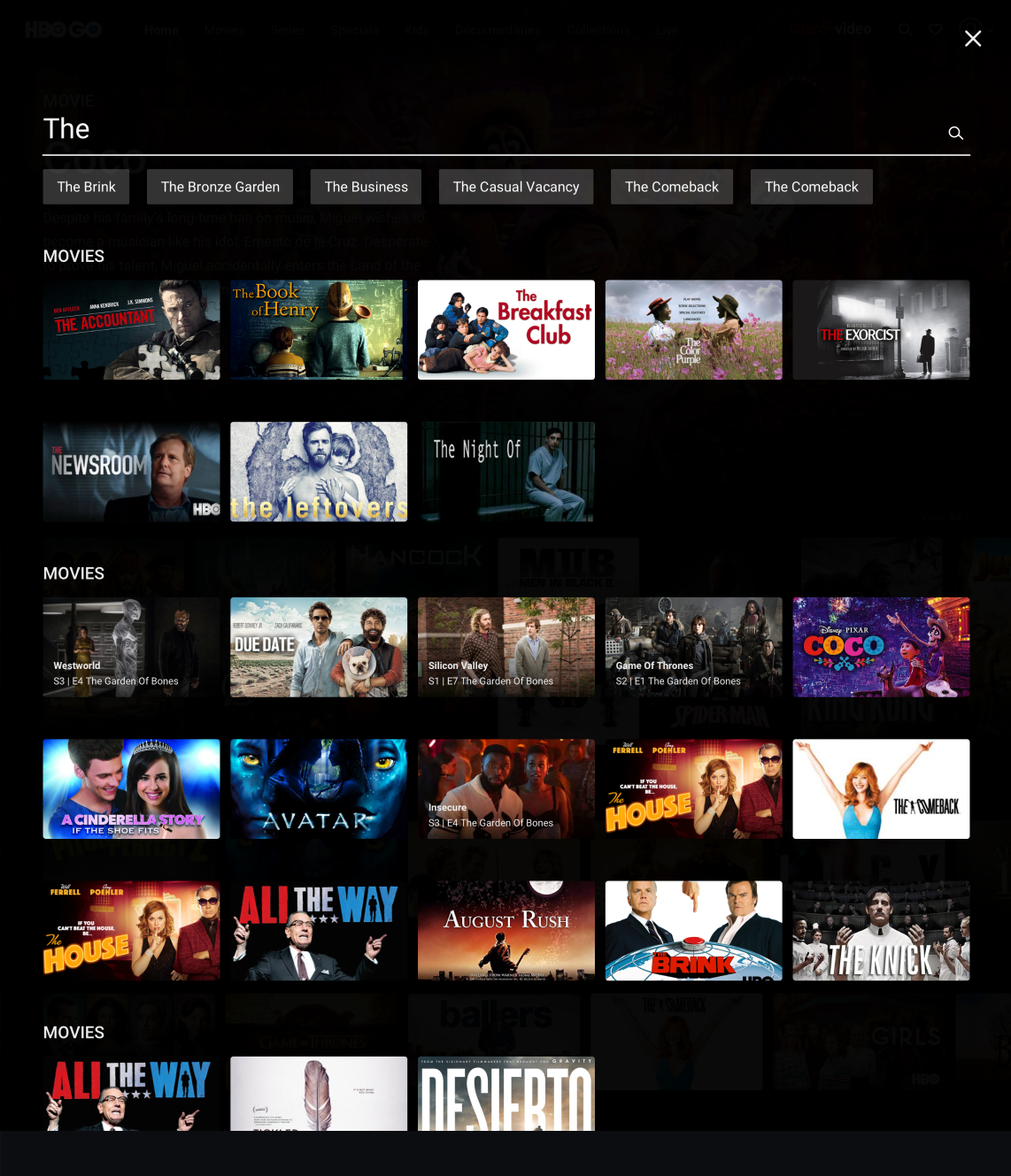
Vertical scrolling allows users to see content from different categories without scrolling all the way down “Search” brings attention to the simplicity of the page Users should be able to find their content quickly
Simplifying navigation on category pages makes it easier for users to find the shows they want. Users will scroll less with more thumbnails on the page. The ability to play from thumbnails makes it simple and easy to watch content
By placing a clickable alphabet on the side, users can navigate to the letter of their choice. This will reduce scrolling and user frustration.
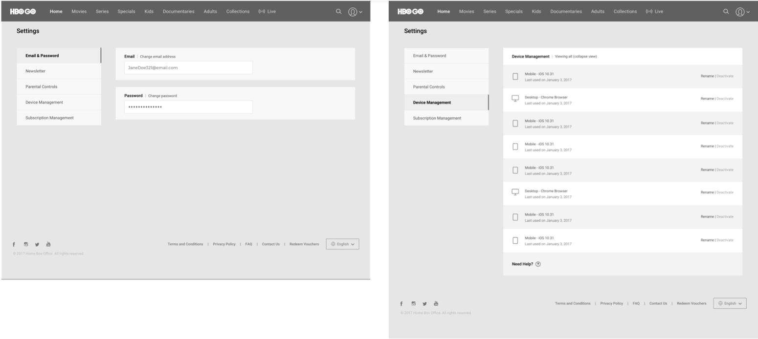
Making Settings easy - We simplified everything with an easy menu (on the left-hand side). Removing edit pens because users found them confusing
Make iconography clearer
We’ve added a “More Like This” section to keep users watching what they like. Users can watch something they enjoy and see more like it, without leaving the page!
We made the kids page playful and more kids friendly
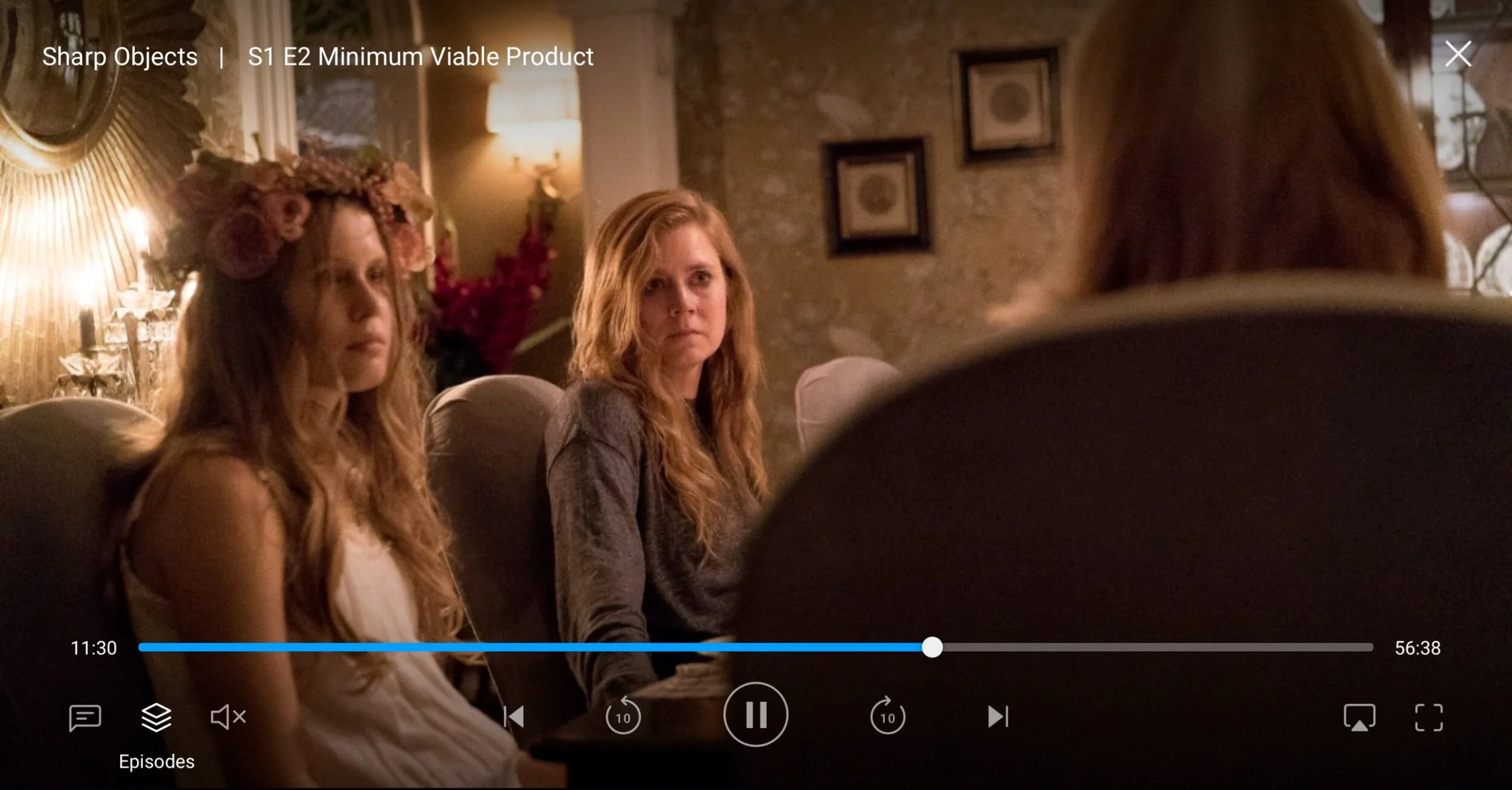
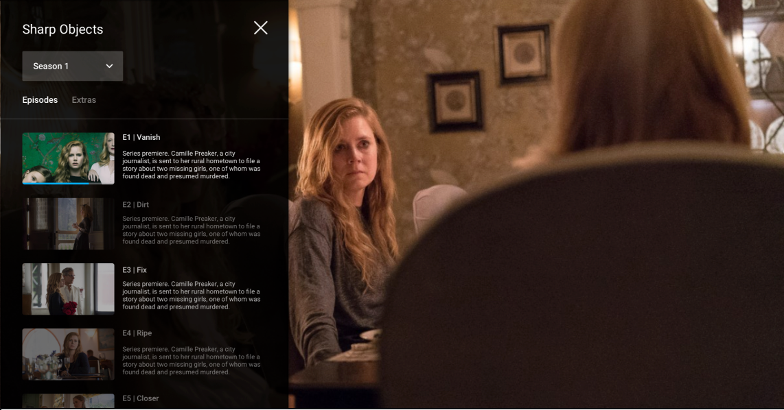
Adding an episode changer in the player to easily change switch season and episodes
Give users the option to customize different views in the category page
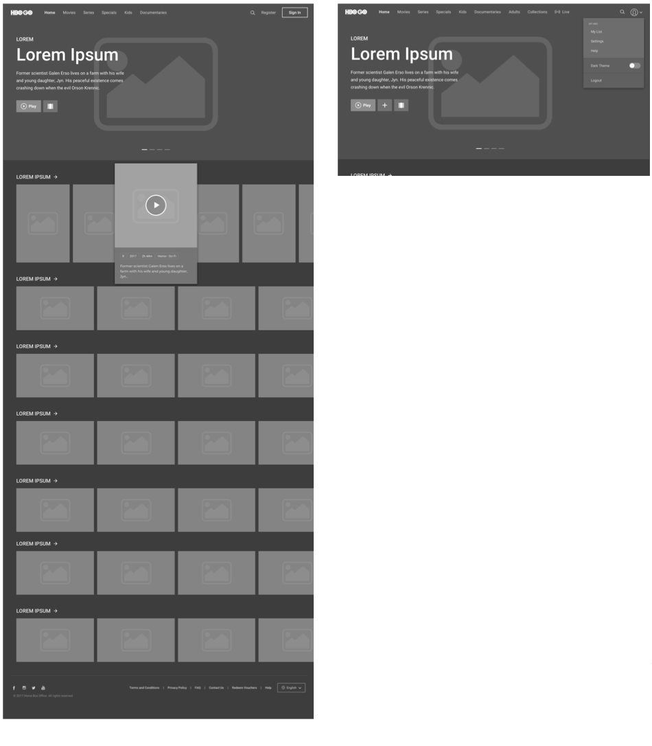
Wireframes
User testing
We tested the desktop design with users to get an understanding of how others viewed the application
Key Learnings
Users understood how to navigate, hover and use the application to find and learn about desired content.
Users found the hero indicators to be too attention-grabbing and found that they took their focus away from the hero content
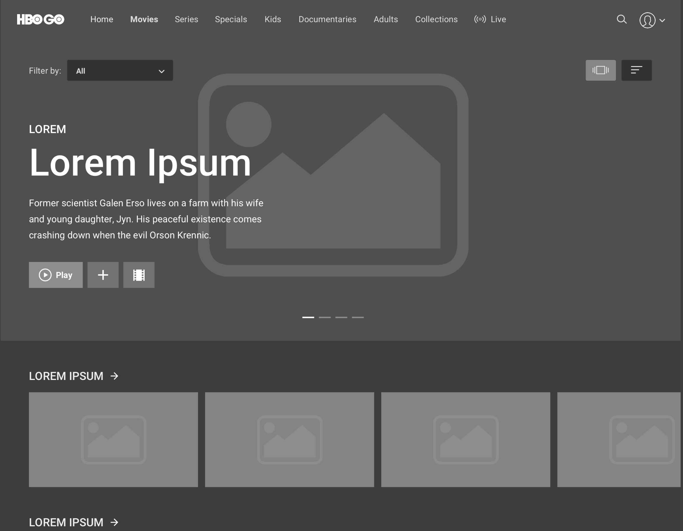
Users were confused with the different viewing options buttons in the category page
Allowing users to filter within the category page yielded a positive result, however when we asked users to sort by by A-Z, users had a difficult time finding the sort button
High fidelity wireframes
Updated changes made based on feedback:
Put the hero pagination on the lower right-hand side to allow the hero image to be front and center
We removed the viewing options in the category pages to make things simpler
We lowered the filters to help users find them intuitively
Homepage
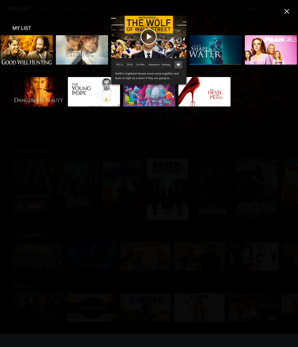
My list
Category page
Search page
Detail page
Playback
Settings
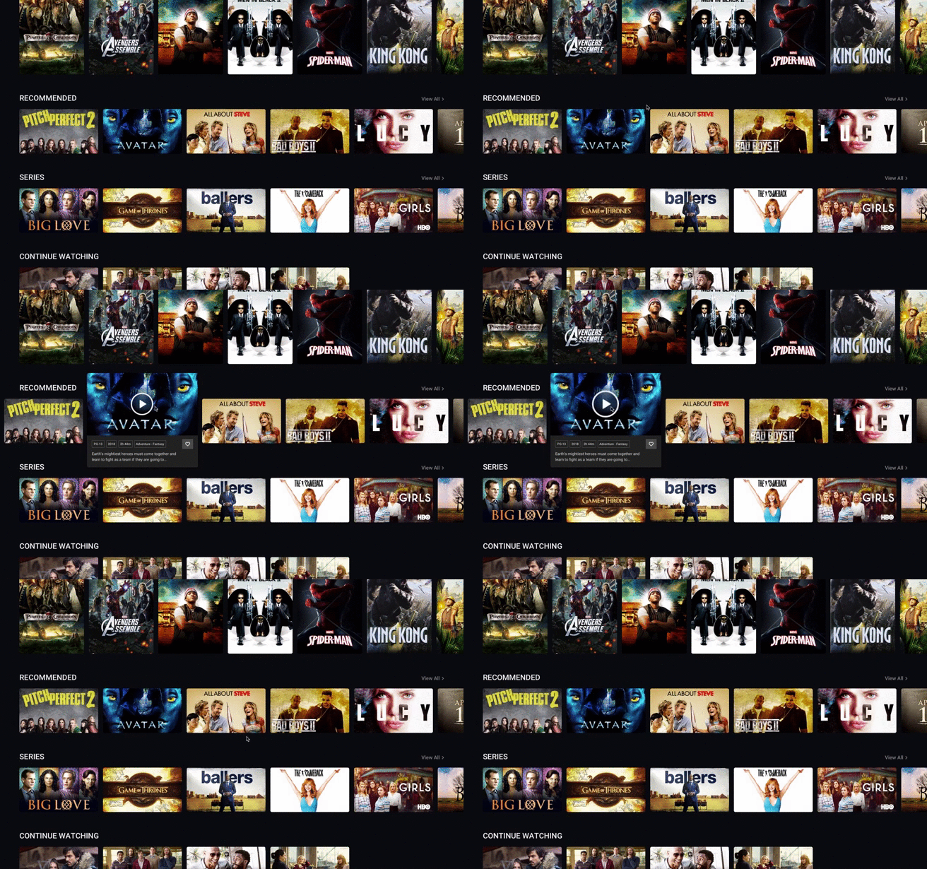
Animation of how a hovered thumbnail
Final result
Outcome
Time spent streaming increased by 183% and views per user increased 31%.

