Mcdonals Hacer Scholarship
A website redesign for McDonald's scholarship program, Hacer.
Current website
The problem
Hacer is McDonald's college scholarship program. Applications were lower than in previous years.
Website was not easy to navigate
Application did not indicate that it was only available on desktop
The website could be confusing as it was in English and Spanish
External factors that contributed to the low applications per our research:
2016 election results/political climate
Hispanics are less likely than some other groups to enroll in a 4 year university, attend an academically selective college and enroll full-time
HACER requires students to attend a 4 year university
Questions asked
Identify the pain points of the potential user's experience on the website. To do this, I explored the following questions:
Were the eligibility and requirements easy to find?
Was the content still relevant to the target?
Did the messaging clearly define the purpose of this website?
Was the layout consistent with the McDonald's website?
Was the application easy to find?
Was it easy to find tips for students to get into colleges and universities?
Could parents easily get information about the US education system?
ADA compliant?
This website caters to prospective Hispanic students in English and to their parents who are searching for information in Spanish Parents and students interacted differently with the content across channels, so optimizing the channel for the two personas coming to the website was important.
From the data gathered, the personas did not change:
The primary target is prospective students. I examined what prospective students are looking for when they view scholarship websites.
Their answers were:
Am I eligible?
What are the requirements?
How can I apply?
These learnings were valuable. Since this is what prospective students are looking for, they should be on the homepage.
Answers to pain points:
Answer 1: With this layout, the eligibility and requirements were hidden in a down arrow. A down arrow in the center of a page normally invites users to scroll down, not to "open for more information," Therefore, eligibility data would have seemed unavailable to many who visited the site.
Answer 2:Yes. The content was still relevant, but needed to be more prominent.
Answer 3: Was the website's purpose clear? Yes, the purpose was clear, but fact that McDonald's dedicated time and resources to help Hispanic students get into to college was not apparent because it was hidden behind a down arrow. I took away the arrows and now visitors can see how much McDonald's helps.
Answer 4: Was the website consistent with the rest of the rest of McDonalds.com? The answer was no.
Answer 5: The "apply" button was shown, but users who didn't know if they were eligible, might not use it. I wanted to clarify this so that eligible users could access this important information.
I placed eligibility and requirements prominent on the first page, so visitors could see if they were eligible and could then apply.Answer 6: Finding tips for students was a bit difficult. Items were grouped together that don't necessarily belong. This is something I chose to rectify.
Answer 7: The students' page (in English) displayed a "Spanish" option button. When pushed, the Spanish parent pages appeared. This needed to be corrected.
Answer 8: The Website was not currently ADA compliant. This was corrected.
Ideation
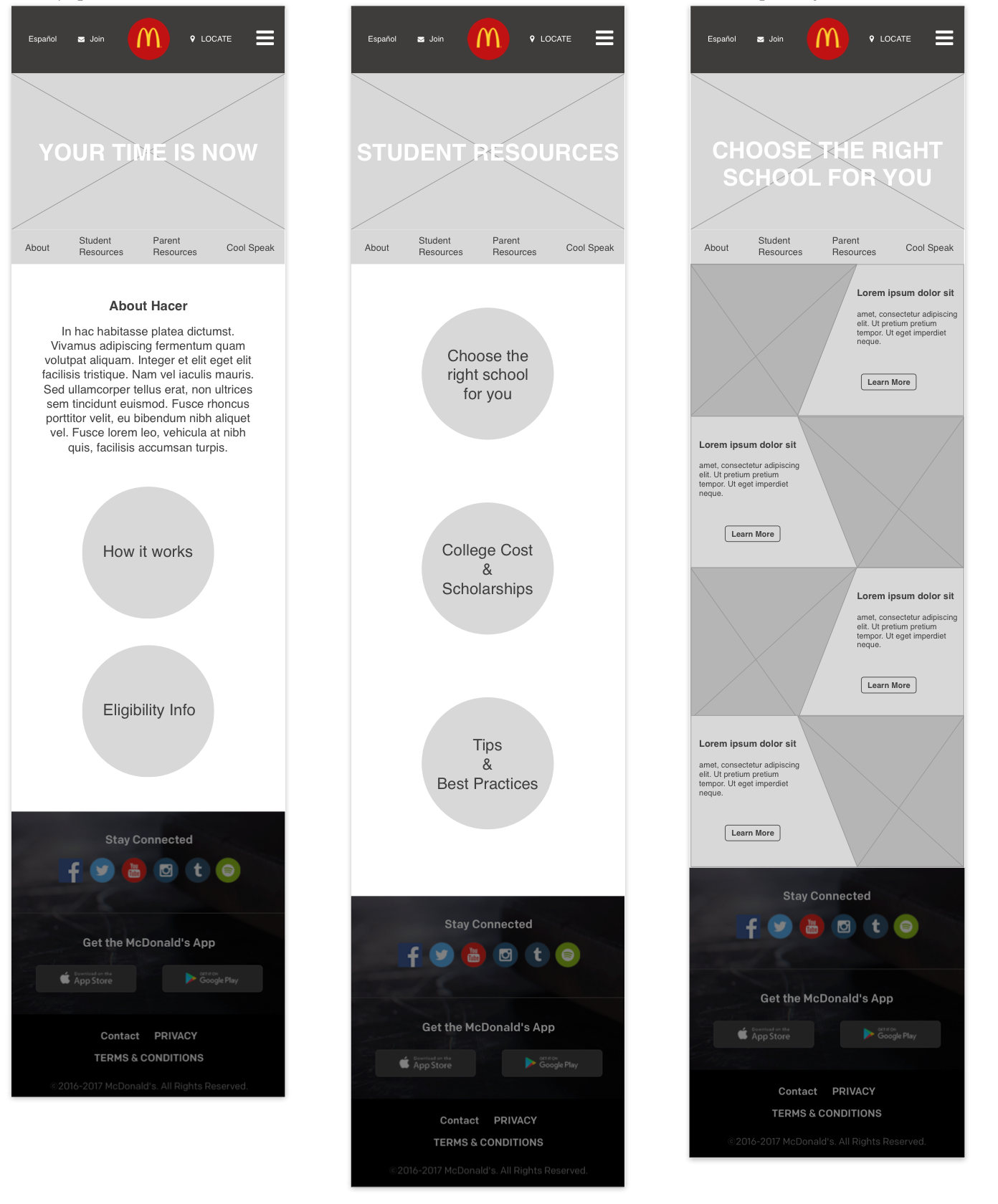
Concept ideation for low-fidelity prototypes
Our team decided two versions of wireframes should be created, Template and Non templated. For the template version I focused on desktop because the client and I already knew what mobile would look like. I only created one version of resources because Student and Parent Resources would use the same template.
Template version
Non - Template version
Sitemap
Sitemap
Prototype
Homepage - Template
Homepage and Student/Parent Resources-Non-Templated
Student Resources - Template
Parent Resources - Template
I presented both options to our team and we decided that Hacer would follow the template version, the current layout of the McDonald's website. We want to stay consistant to the brand.Since it will live on the McDonald's website and the template structure already exists, so development would be faster and didn't require a developer. The wireframes were approved by the client.
Homepage and Eligibility
Student Resources
Parent Resources
ADA compliance
The client asked that we make this ADA compliant. The designers and I worked together to meet the standards required. I focused on the changes within the CMS code and template and placed designer's assets.
Checkout the live website: McDonald's Hacer
Outcome
We went through every After working with the strategy team, the website launched in late 2017. We learned that 2017-2018 application cycle was a monumental year! The most submitted applications since this program was created. Hooray!! I'm glad I had the opportunity to work on such a great project.


